
The Oxbow Bozeman
CLIENT: Roundhouse
PROPERTY MANAGEMENT: Roundhouse
INTERIOR DESIGN: Vida Design
PHOTOGRAPHY: Gabe Border
Objective
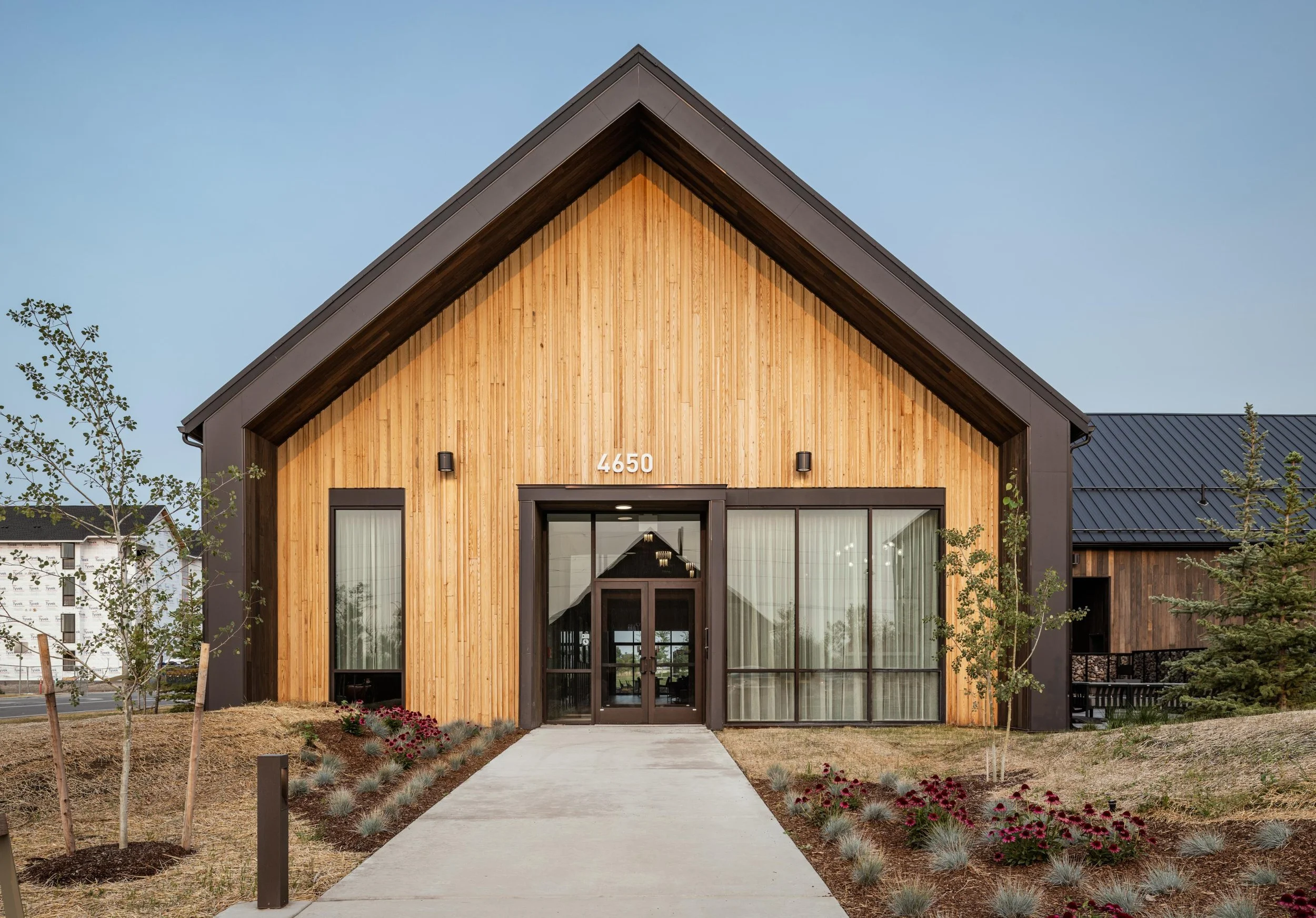
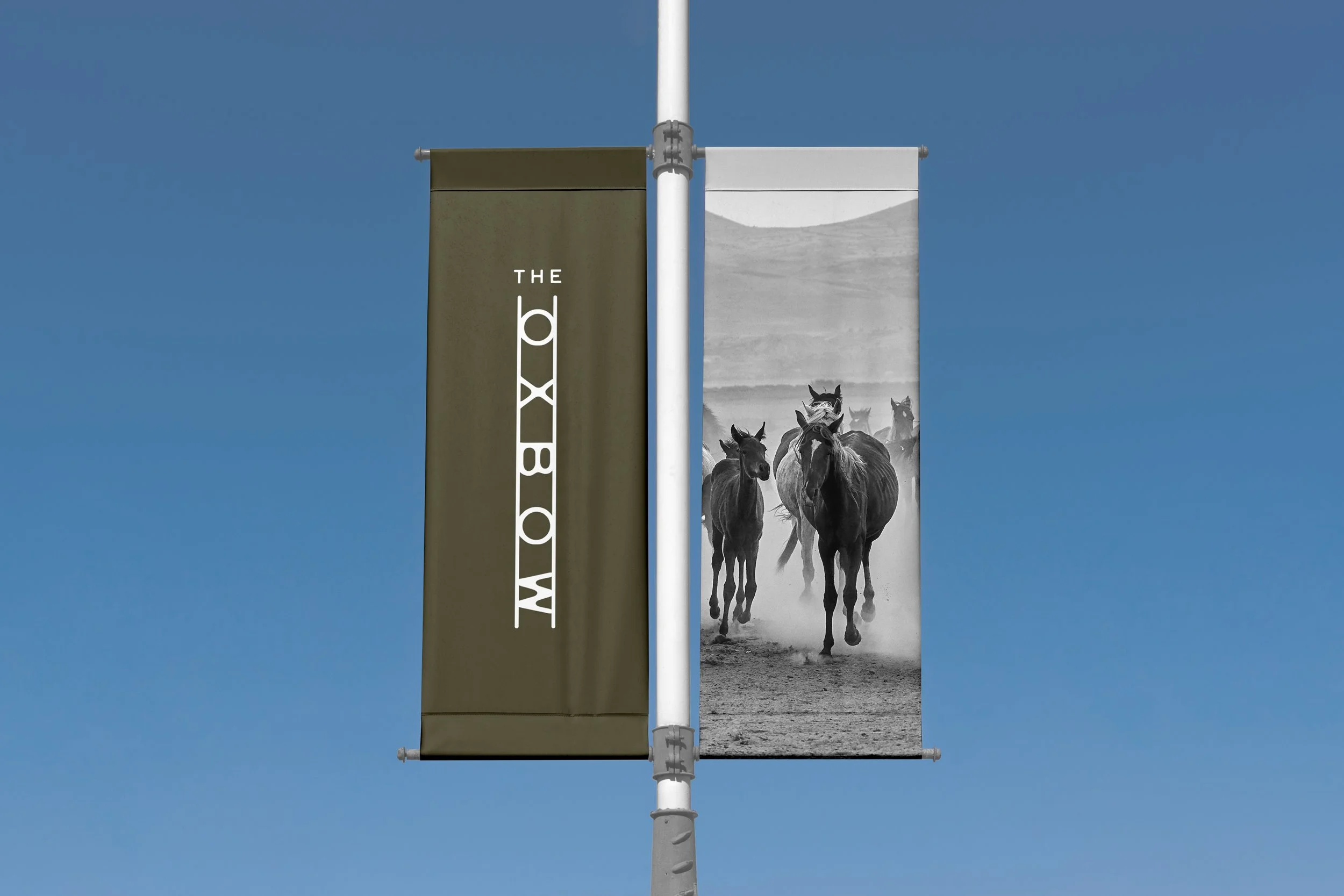
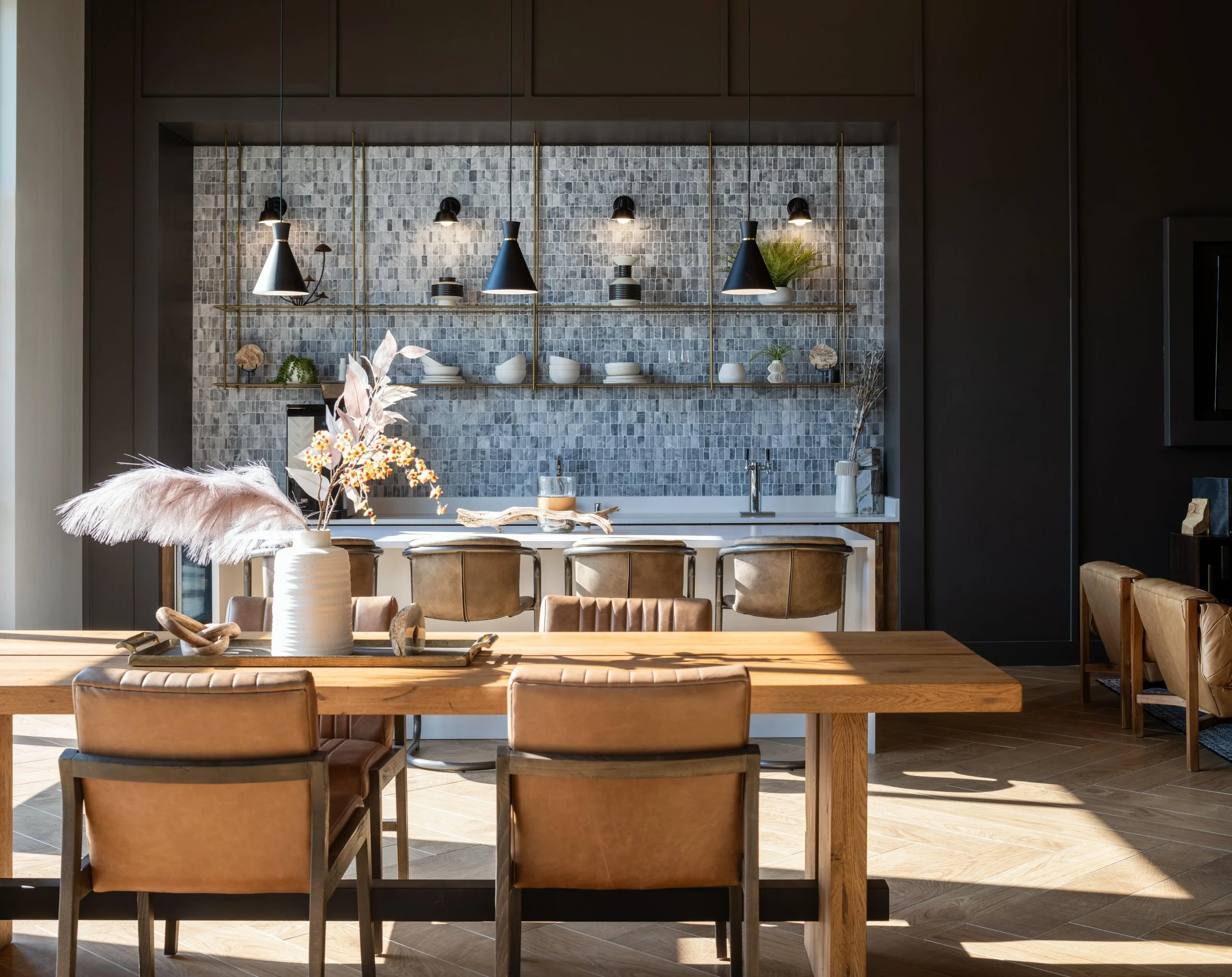
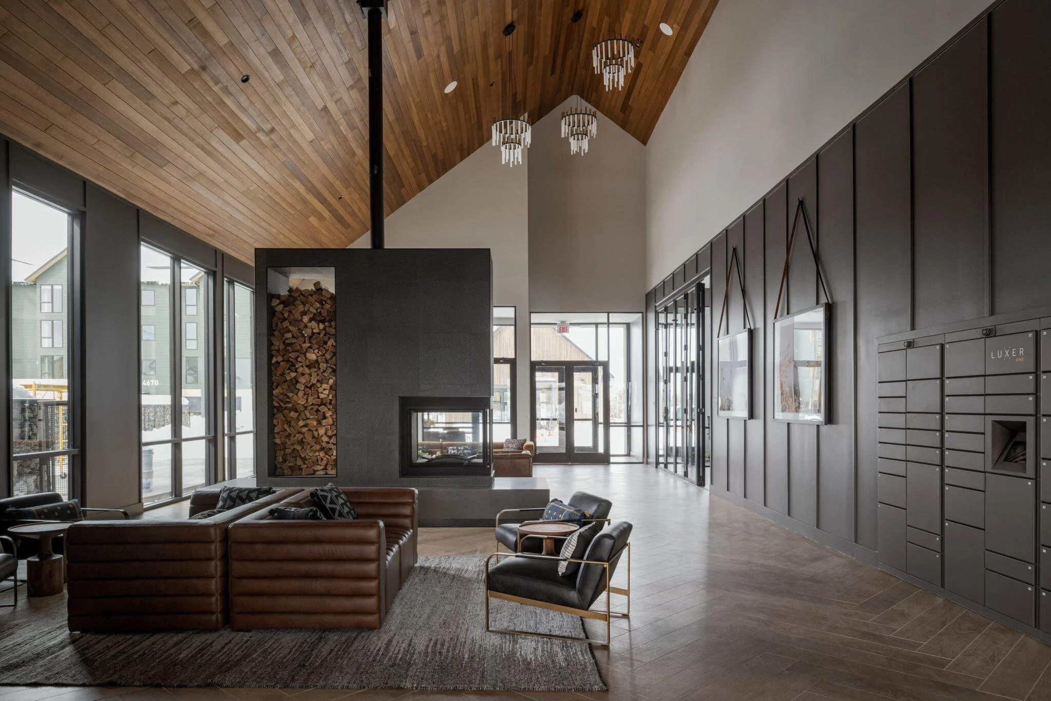
The Oxbow is a large master-planned apartment community in Bozeman, Montana — a village of ten residential buildings, a clubhouse, a fitness center, and a neighborhood park set under a full Gallatin Valley mountain backdrop. A community at that scale, in one of the fastest-growing corners of Big Sky Country, needed a bold name and identity to anchor the project and warm enough to feel like home. We created the brand from the ground up — name, identity, and a complete brand toolkit that carried from the first lead-gen splash page and fence wrap all the way to the signs residents pass every day.
Our Role
• Brand Development
• Naming
• Brand Identity
• Brand Guidelines
• Marketing Copywriting
• Lifestyle Photography
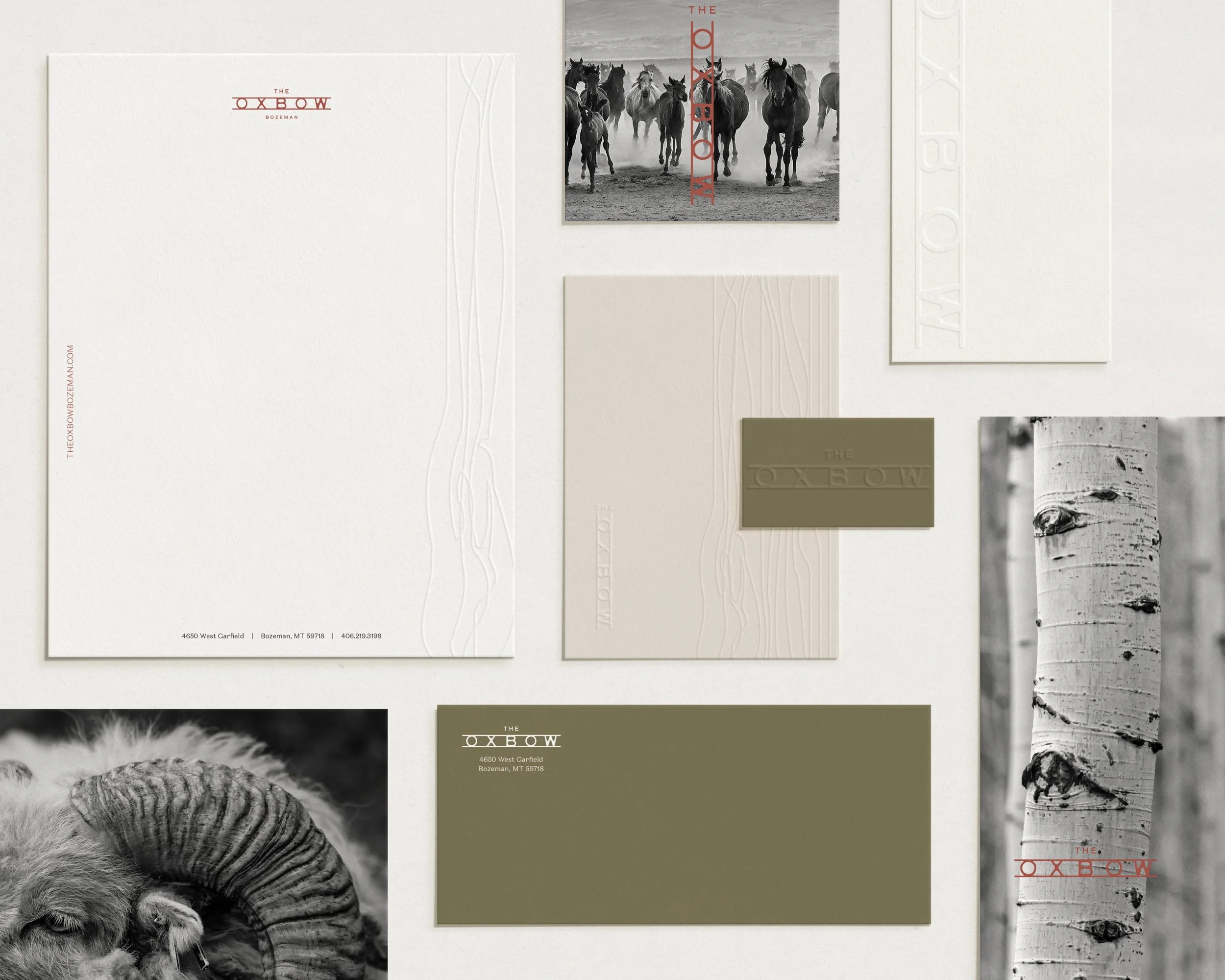
• Print Collateral
• Permanent Wayfinding Signage System
• Marketing Signage
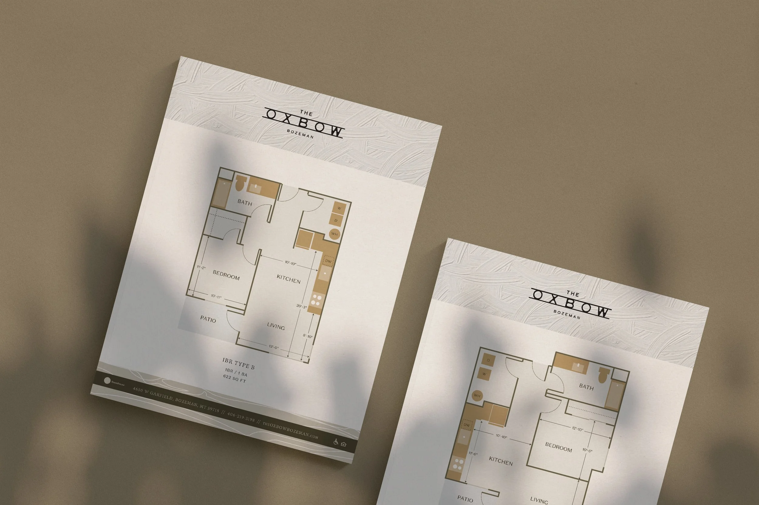
• Branded Floor Plans and Site Plan
• Website Design + Development
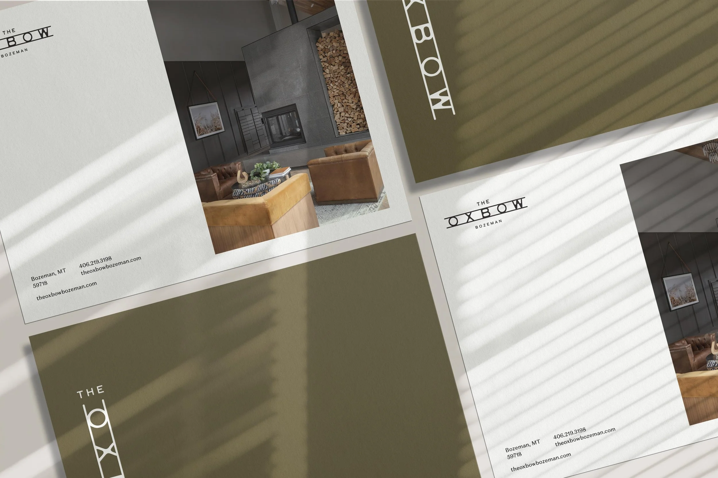
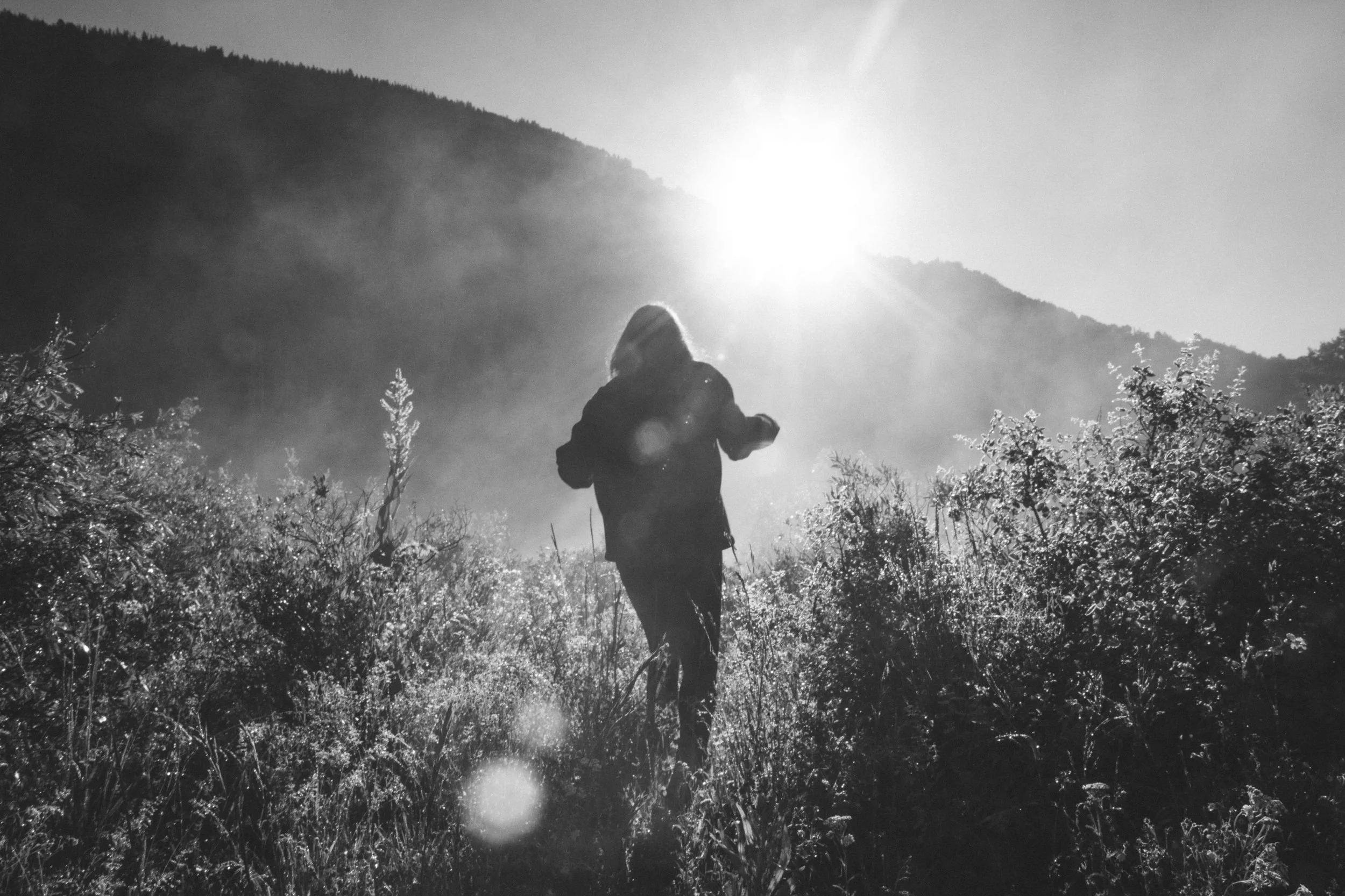

Bozeman draws people for a particular kind of life — world-class skiing, hiking, cycling, and fishing at the doorstep, with Yellowstone an easy day trip and the comforts of a growing city close at hand. The name Oxbow, borrowed from the wide, curving bend a river carves through a valley, roots the community firmly in that Montana landscape: shaped by the land, unhurried, and built to last. It captures the promise of the place — peace and quiet, with plenty of buzz — for longtime locals seeking a fresh start and new arrivals ready to plant roots.
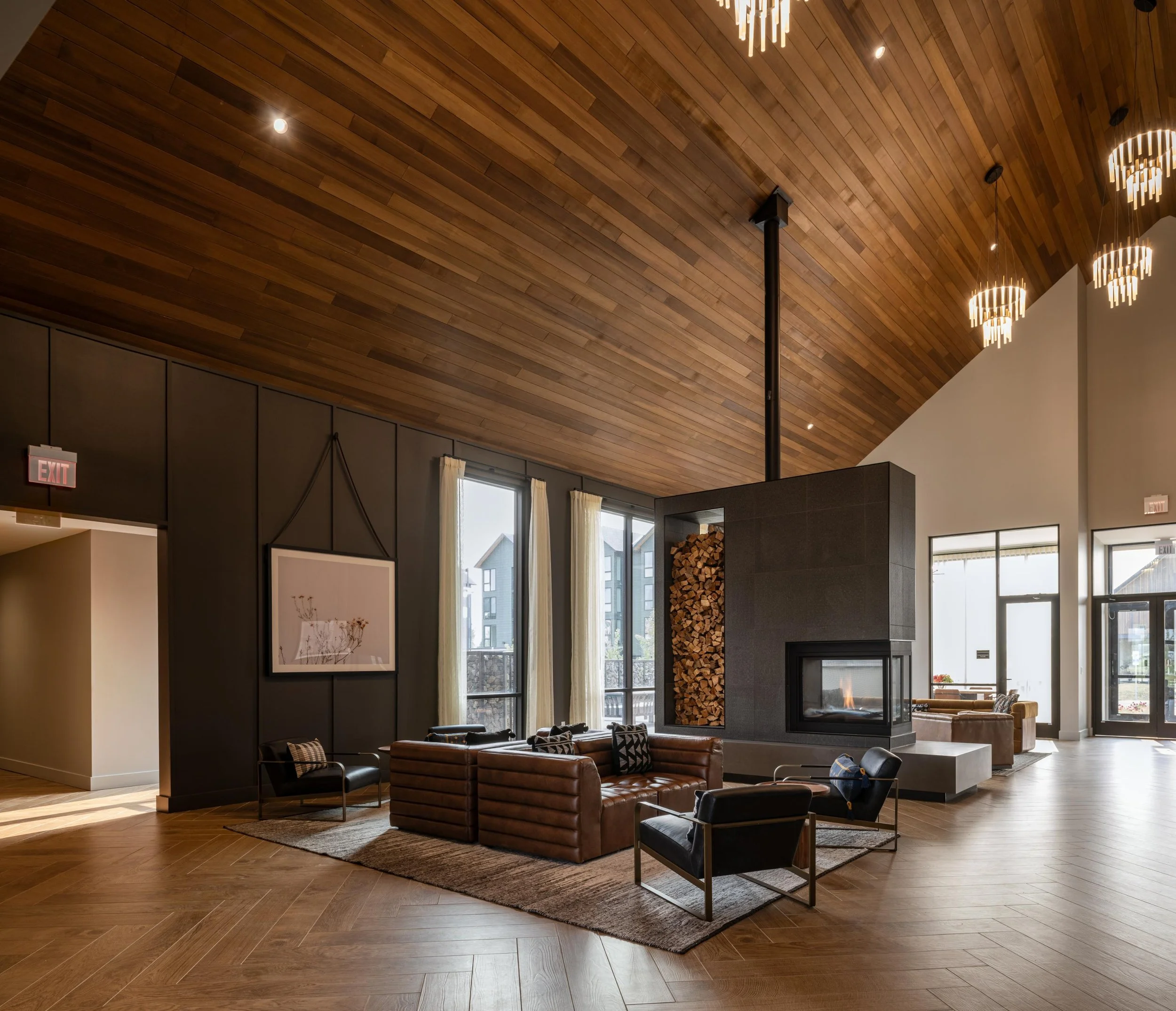
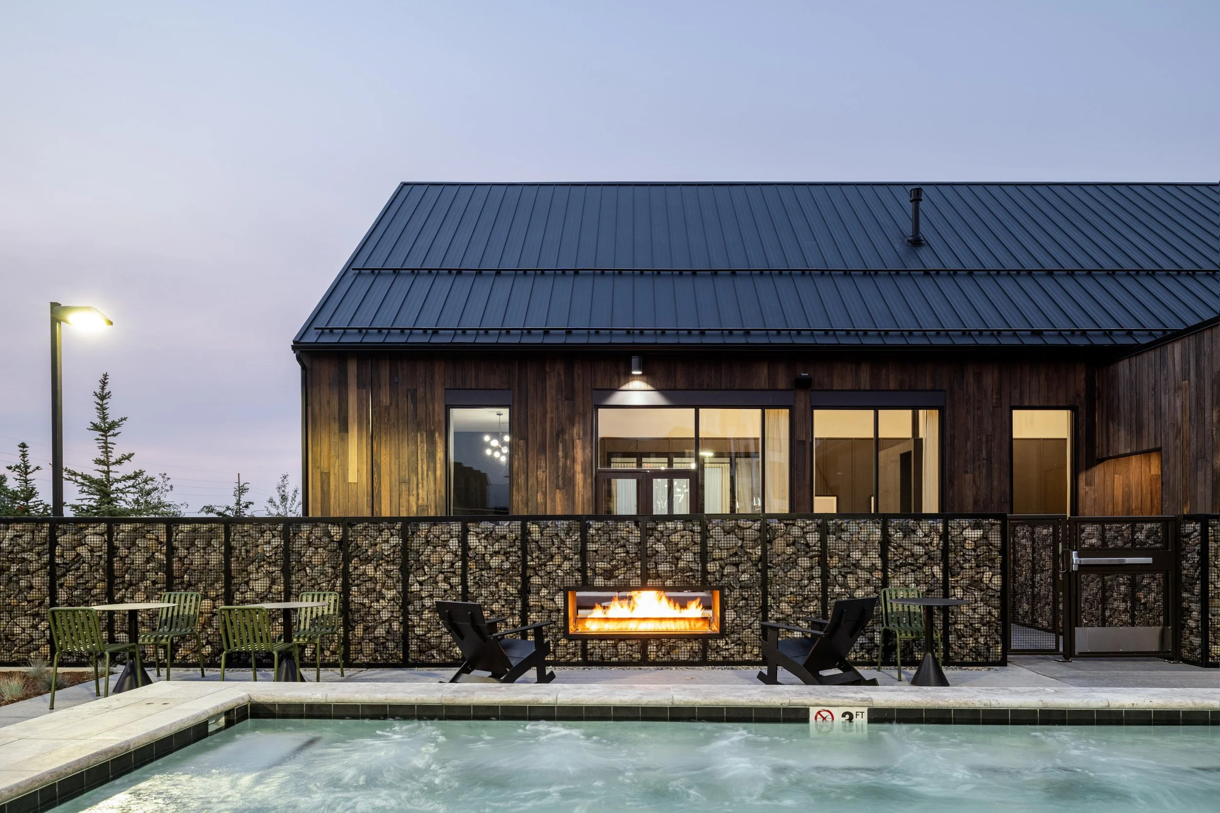
The brand shaped everything from the leasing collateral to the wayfinding that guides residents across the grounds, keeping one clear identity across a sprawling site. After construction wrapped, photographer Gabe Border shot the finished interiors and exteriors, capturing the cedar-accented architecture, the aspens and native landscaping, and those unobstructed mountain views exactly as residents experience them.
The Story

Brand Direction
The identity draws its palette straight from the valley — warm gold and sand, earthy terracotta and moss, deep charcoal and oxblood — a grounded, natural range that feels at home against Montana light and cedar. A flexible pattern system, drawn from the brand's organic lines, extends the look across collateral, signage, and website.