The Cline
Client: Carmel Partners
Property Management: Greystar
Lifestyle Photography: Dave Estep Photography
Video Production: Ryan Cory
Objective
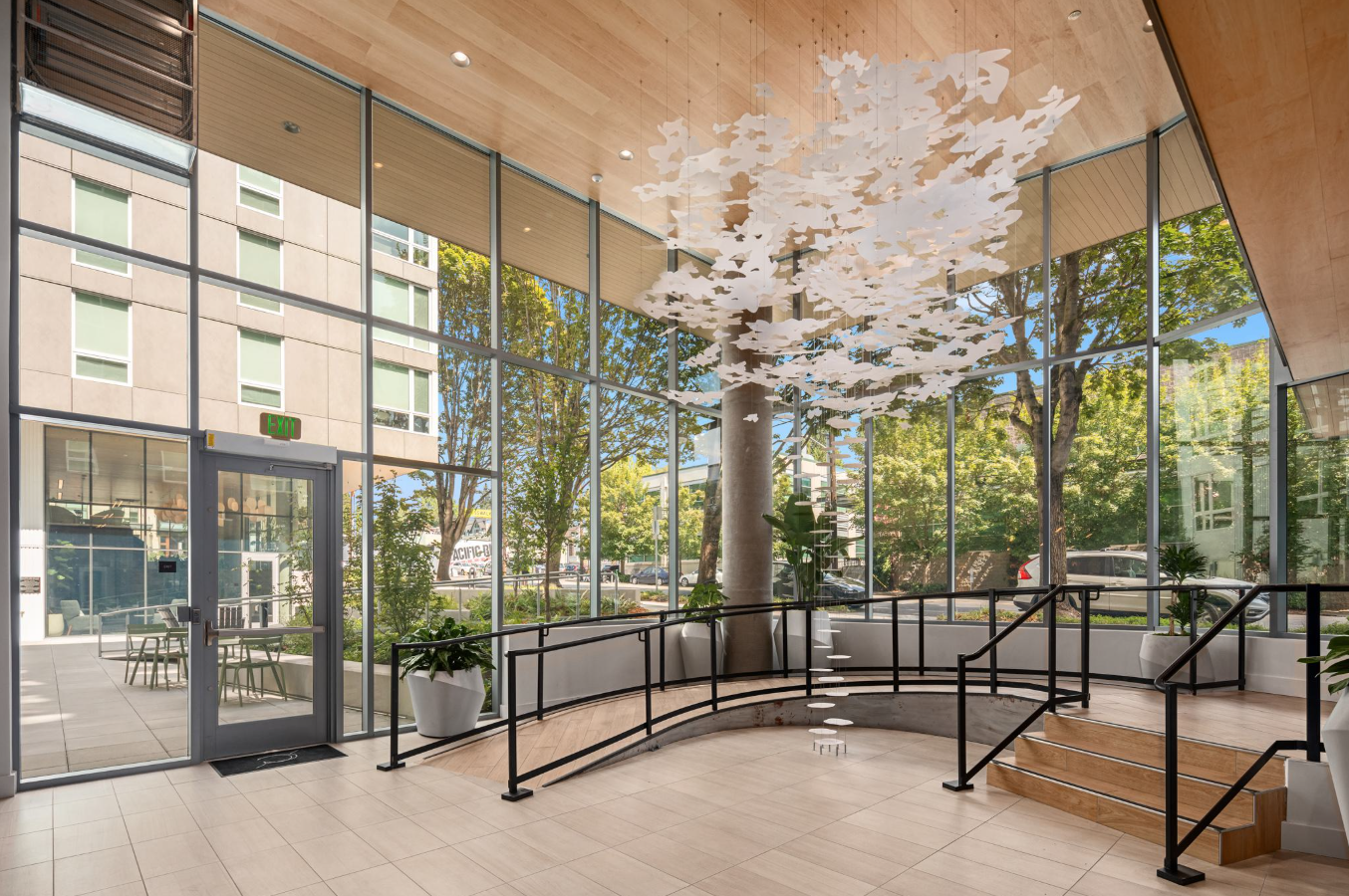
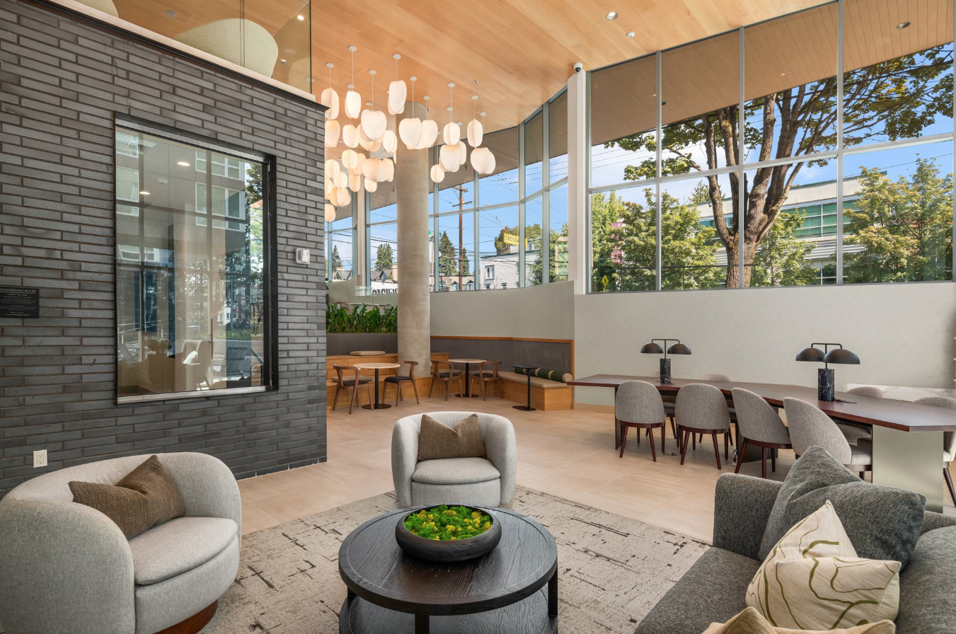
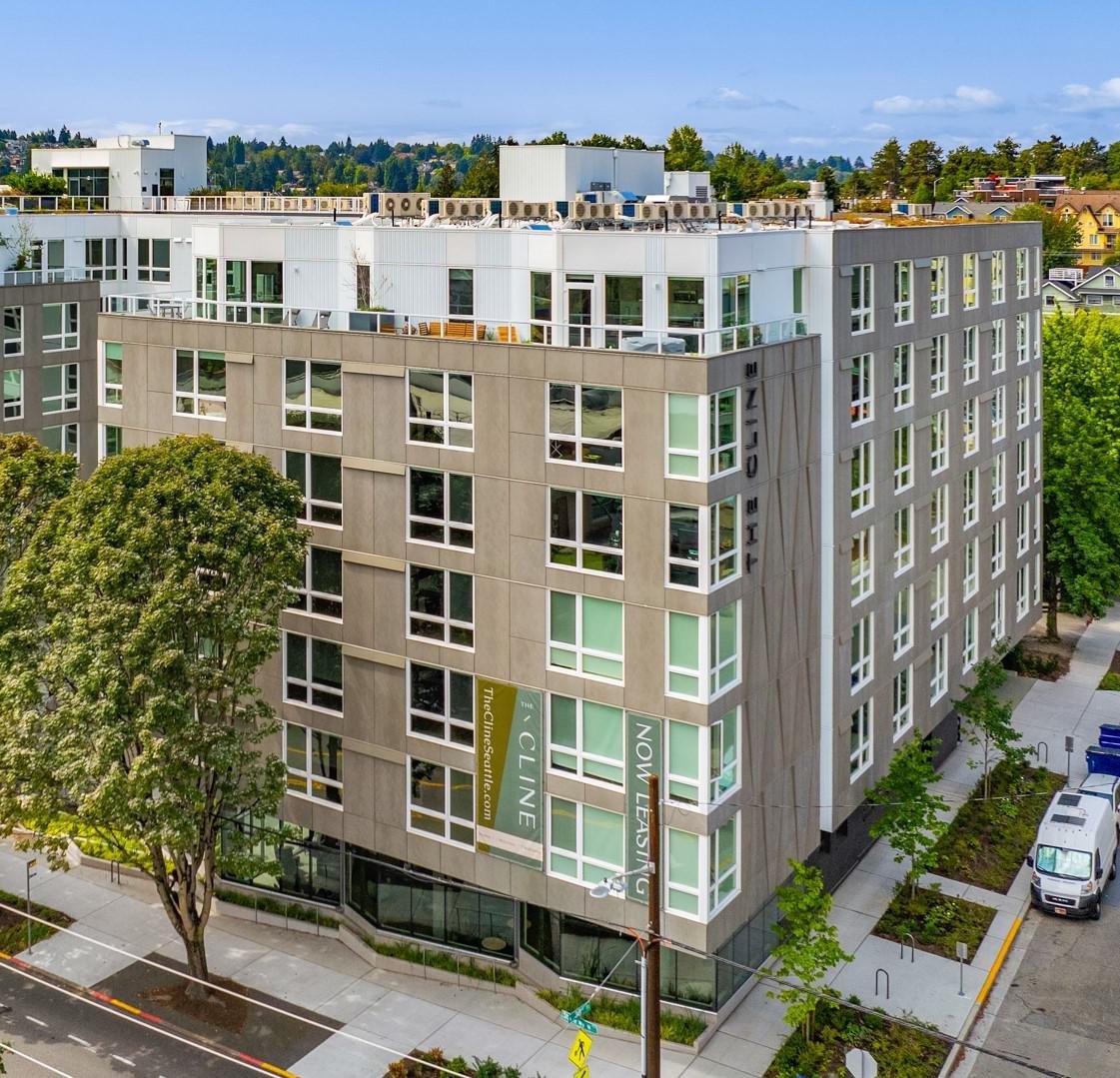
The Cline is located on Stone Way North, right on the border between two of Seattle's most desirable neighborhoods — laidback Wallingford on one side, quirky, vibrant Fremont on the other. Standing taller than its neighbors and surrounded by treetops, the building needed a brand that felt as rooted and forward-looking as the corridor it anchors. We developed the brand story and positioning from the ground up, named the project, and built an identity to match — and the brand concepts we created went on to inform the interior design direction, so the architecture, the interiors, and the brand all grew from the original brand concept around the tree-lined street leading to the water.
Our Role
Brand Development
Naming + Positioning
Brand Identity
Brand Guidelines
Marketing Copywriting
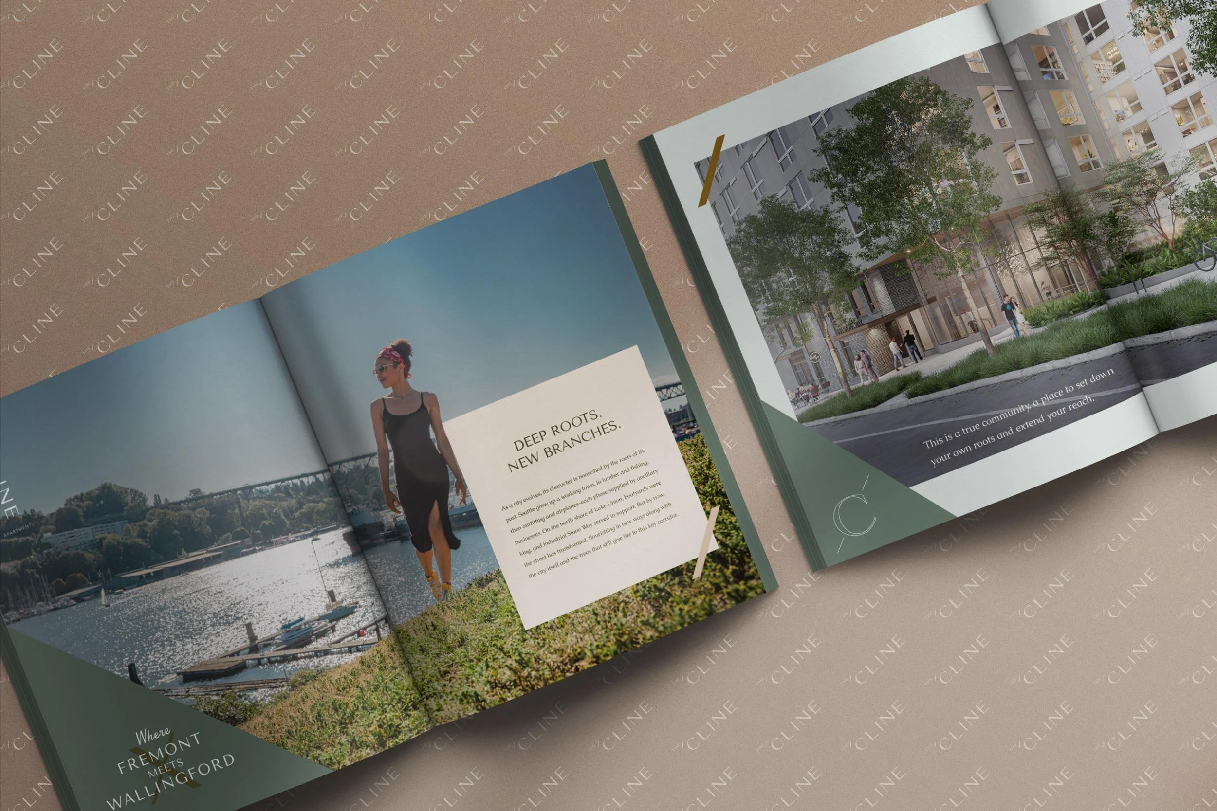
Print Collateral
Marketing Signage
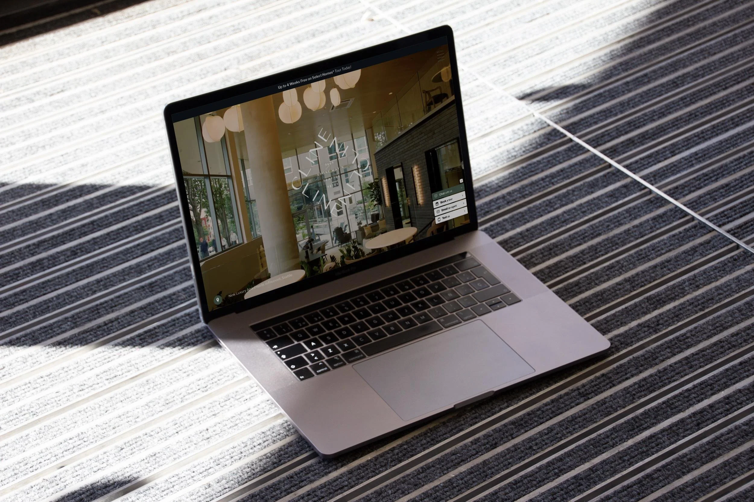
Website Design
Lifestyle Video Campaign
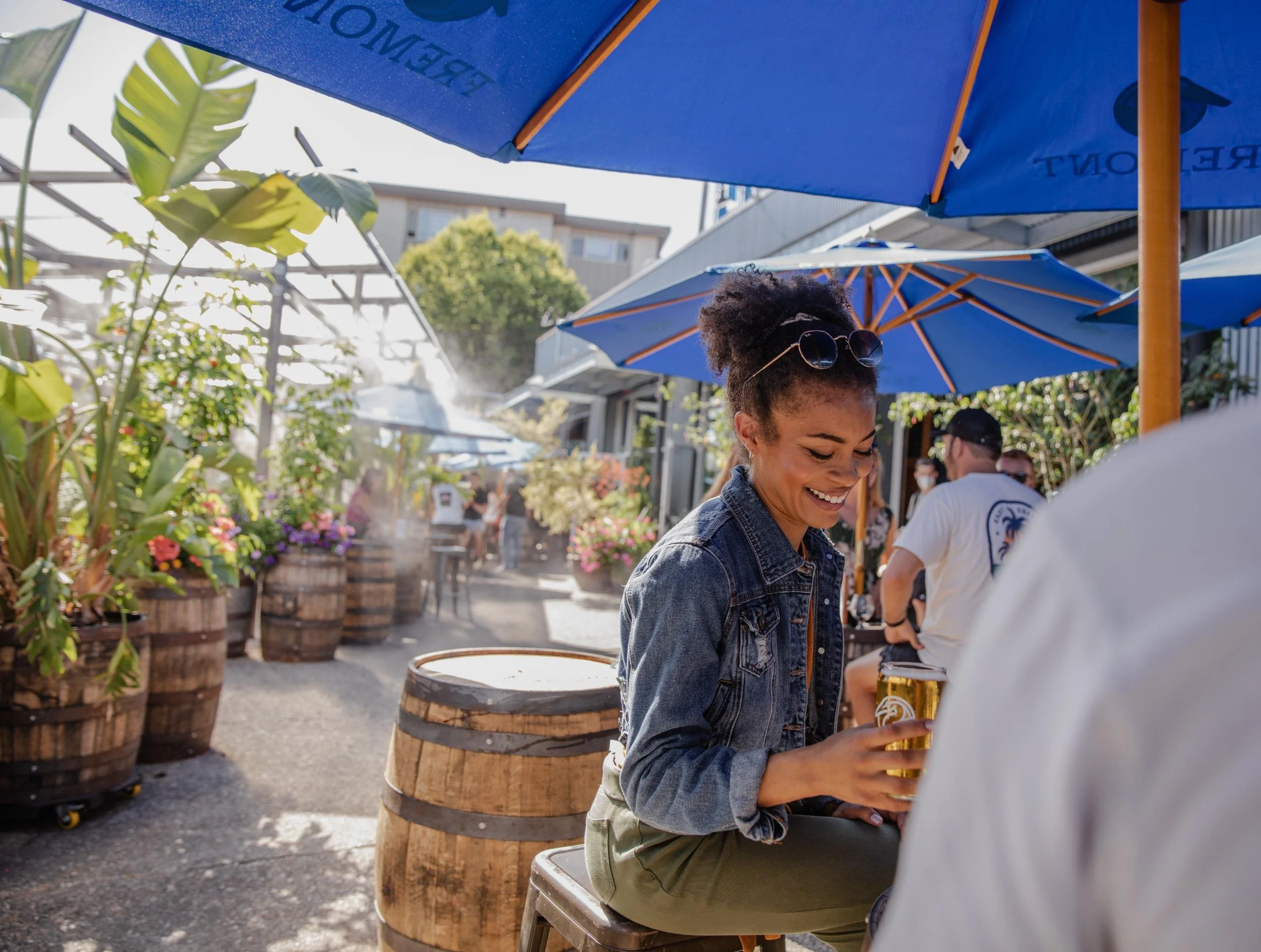
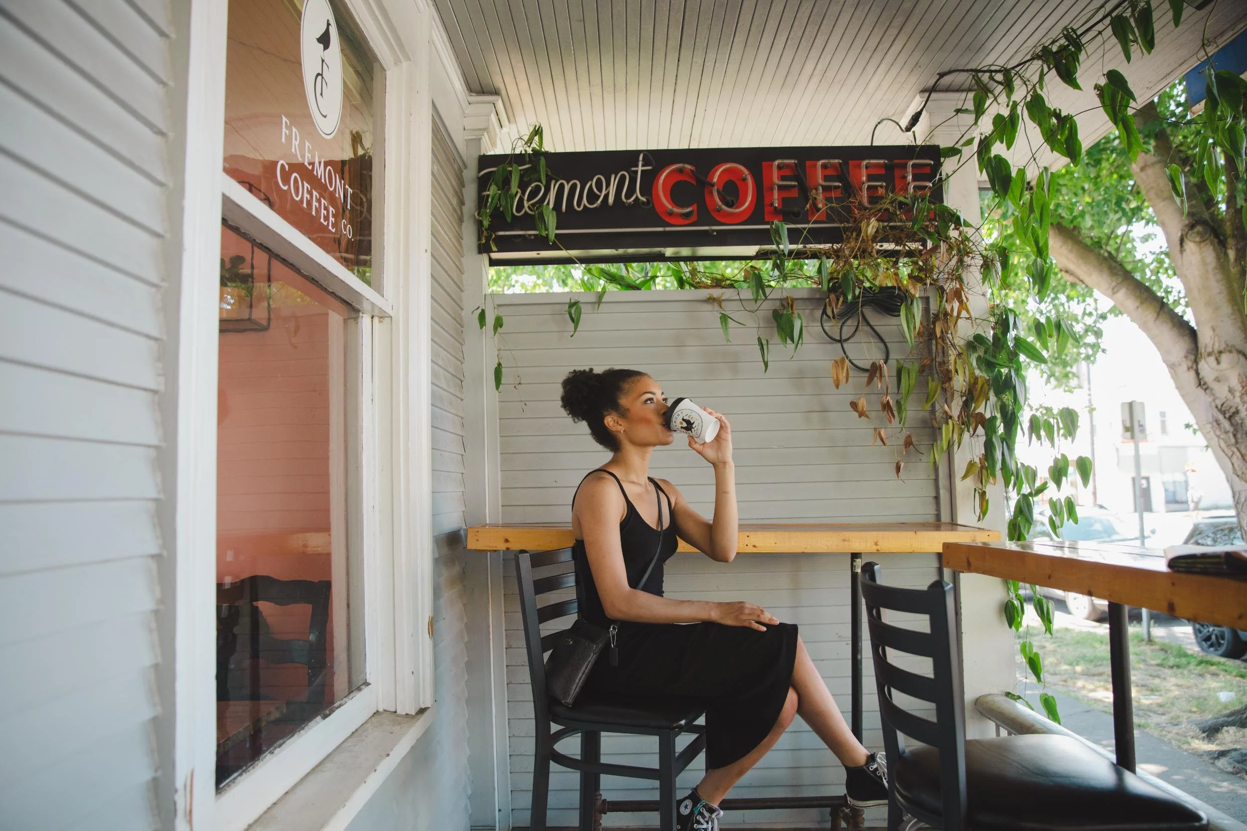
Lifestyle and Neighborhood Photography
Art Direction

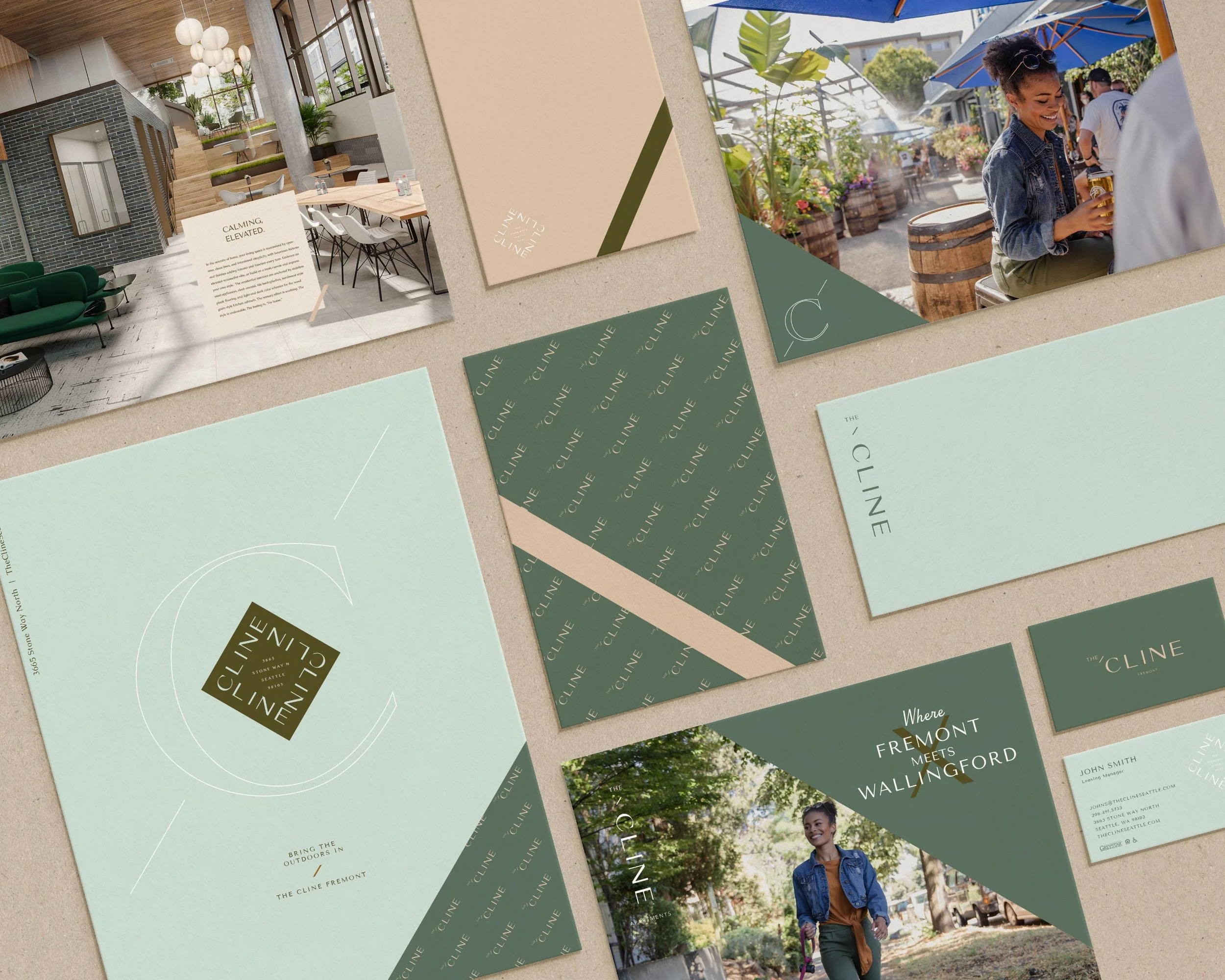
The Story
As a city evolves, its character is nourished by the roots of its past. Seattle grew up a working town — lumber, fishing, boatyards along the north shore of Lake Union — and industrial Stone Way served in support. Today that street has transformed, flourishing alongside the city and the trees that still line this key corridor down to the water. The Cline sits at the center of that reimagining: deep roots, new branches.
The brand was built around the idea of urban nature — a place where Northwest greenery and outdoor access meet the energy of the city, with no need to compromise. A transit paradise with an 89 Walk Score and 94 Bike Score, just blocks from Lake Union and the 20-mile Burke-Gilman Trail, The Cline offers a front-row seat to the cityscape with just enough distance to breathe. The positioning leaned into that sense of rising and thriving — deep roots, new branches; embrace your urban nature — speaking to people who want to stay grounded while expanding into new directions.


Brand Direction
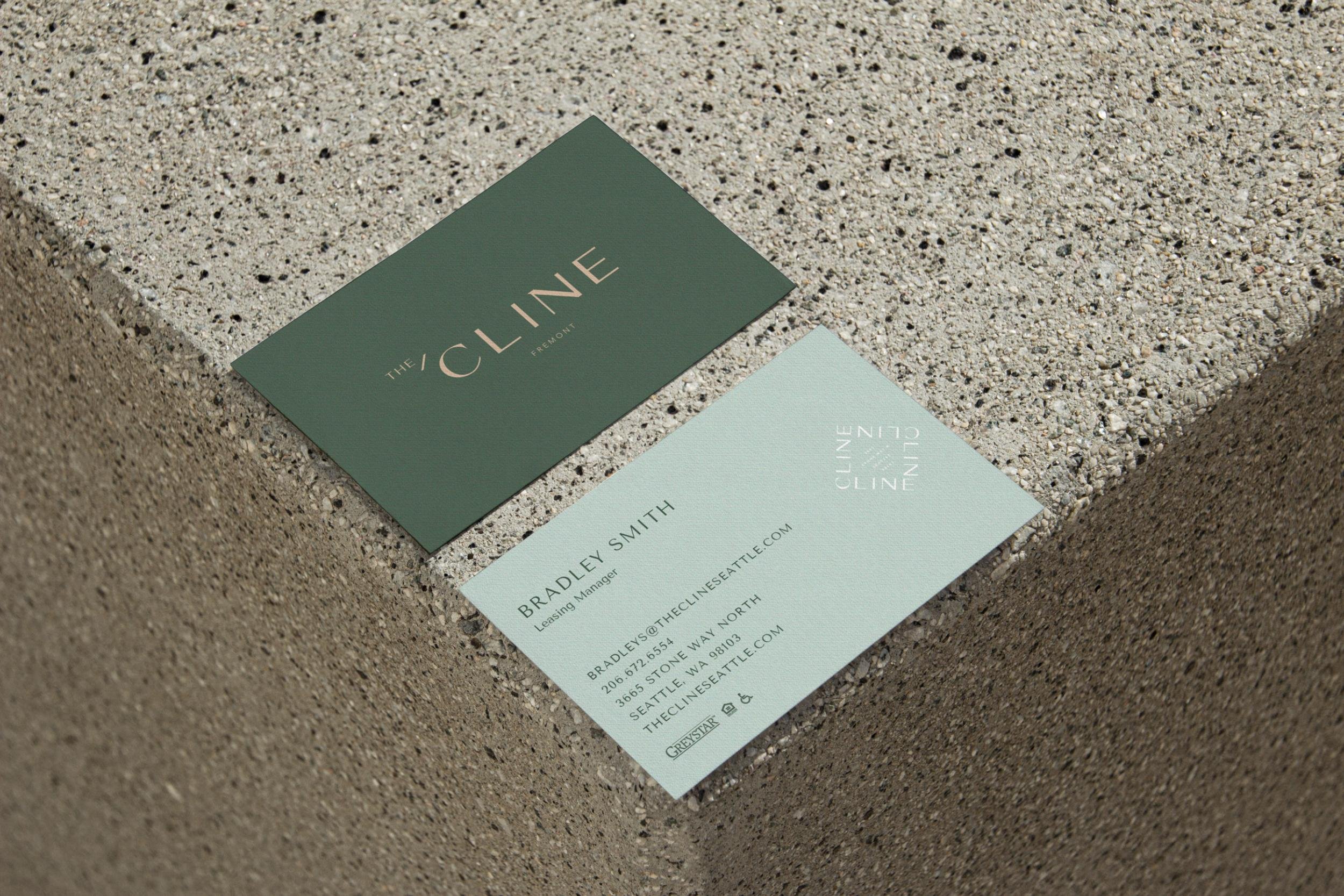
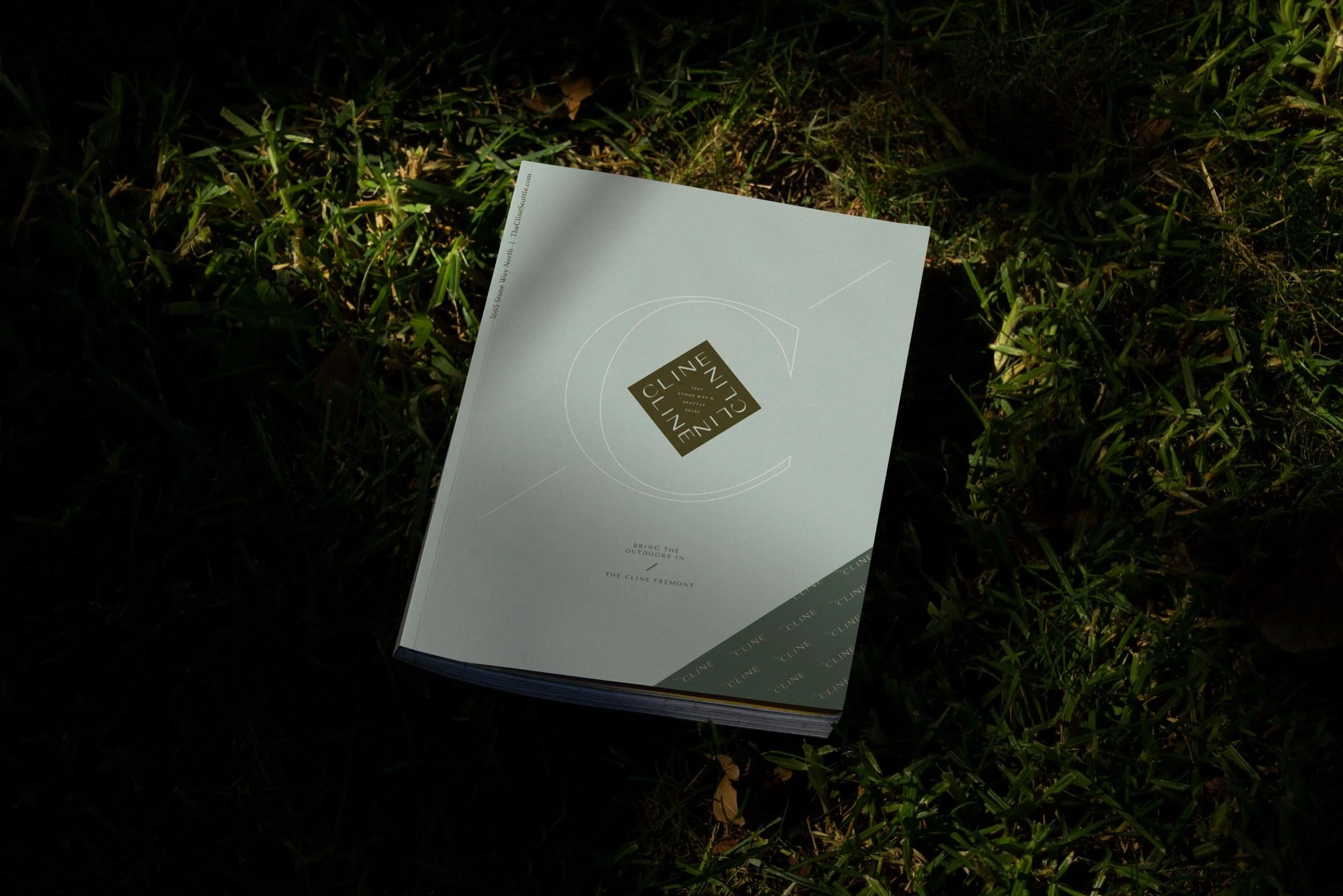
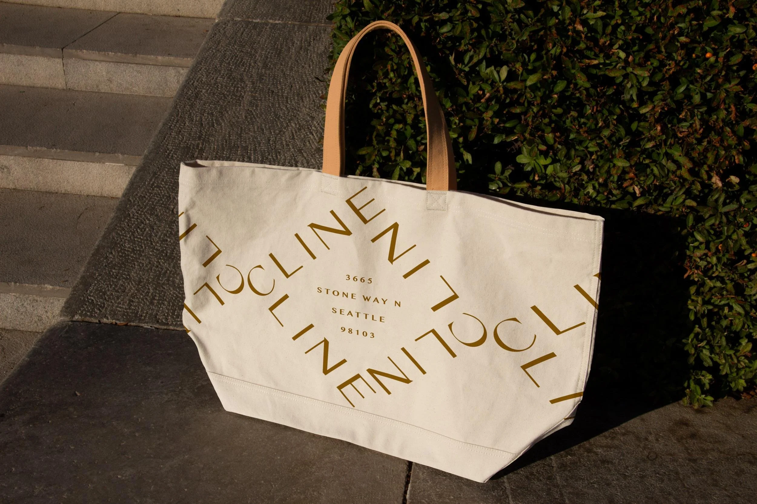
The visual language is drawn straight from the natural setting — leafy, evergreen, and quietly elevated. A palette of soft sage and pale green, olive and a bright chartreuse spark, warmed with golden ochre and grounded by deep ink and warm gray, gives The Cline an organic, nature-inspired calm. A flexible logo system that shifts gracefully across the palette lets the brand feel airy, natural and inviting.

Brand Toolkit
Everything was built so the brand could carry one cohesive idea from the exterior to the website. From the brand story and concepts that guided both the identity and the interior design direction, we developed the full brand identity, brand style guidelines, and the marketing copy that gives every page its voice. From there the brand extended into the moments that matter most for lease-up — a splash page to gain momentum, print collateral and digital brochures, and marketing signage including window graphics, banners, and wind masters. Our team art-directed a lifestyle video shoot to capture the vibe of the neighborhood and the amenities and residences of the community. We did a lifestyle photography pre-construction to capture the neighborhood for a temporary splash page. After construction, we designed a custom website built on the developer's proprietary website template — all under a single art direction so The Cline reads as one clear idea.