Lunara
CLIENT: Xing Hua Group +
PROPERTY MANAGEMENT: Indigo Real Estate
Objective
Mercer Island is one of the most sought-after addresses in the Seattle area, but it hadn't seen a new apartment community since 2016. The rentals already on the island had dated interiors, generic corporate branding, and not much personality. Lunara, a new community in the Mercer Island town center, was a chance to raise that bar. Our work began with a competitive study of nearby properties to find where Lunara could stand apart. From there we developed the brand story, positioning, and resident persona, then created the name, the identity, and the brand guidelines. We also wrote the marketing copy and designed the brochure and developed the website design, wayfinding signage and marketing signage.


Our Role
• Brand Story and Positioning
• Naming
• Brand Identity
• Brand Guidelines
• Brand Elements + Patterns
• Typography System
• Photography Style Direction
• Brand Toolkit for In-House Use
• Wayfinding Signage
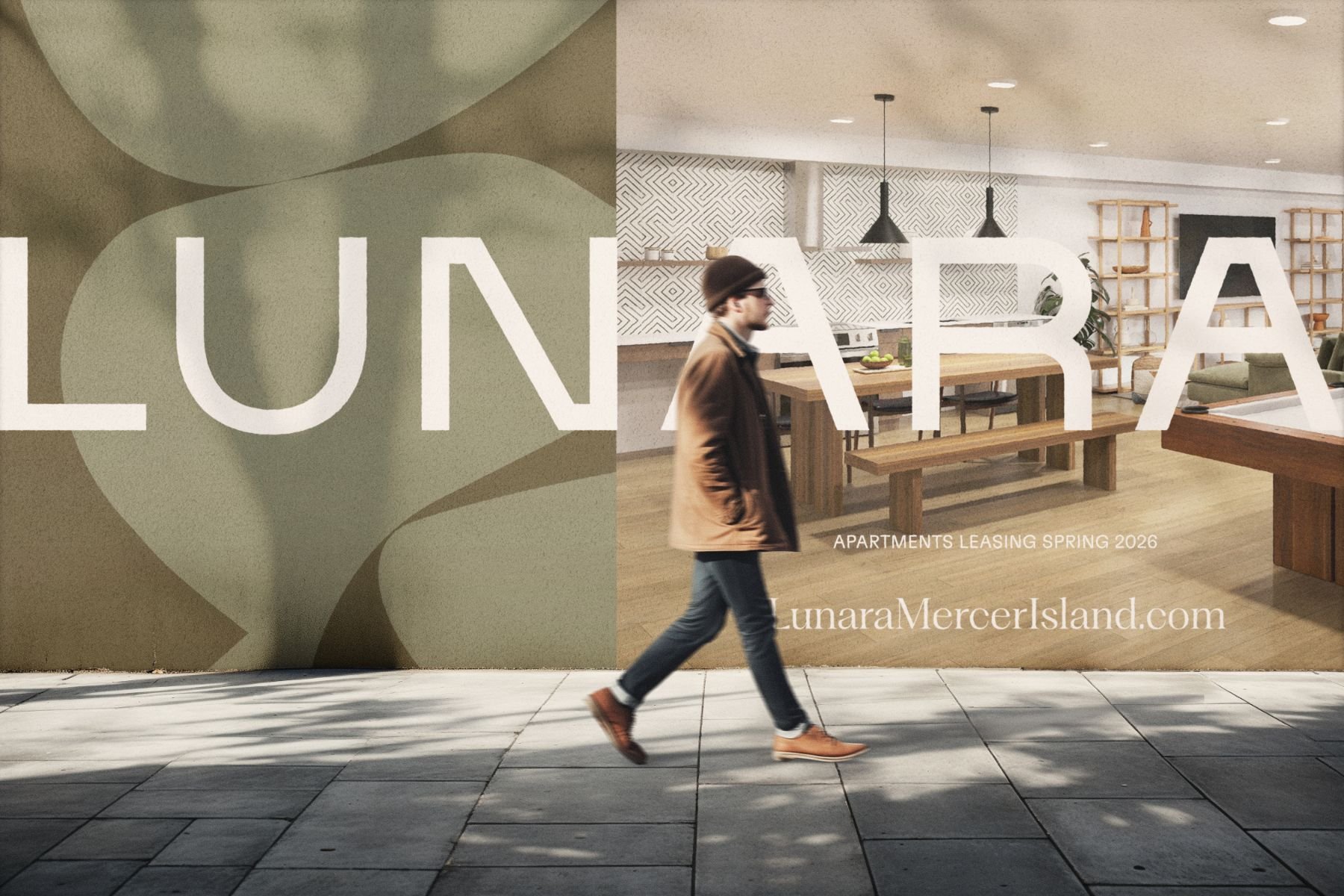
• Marketing Signage
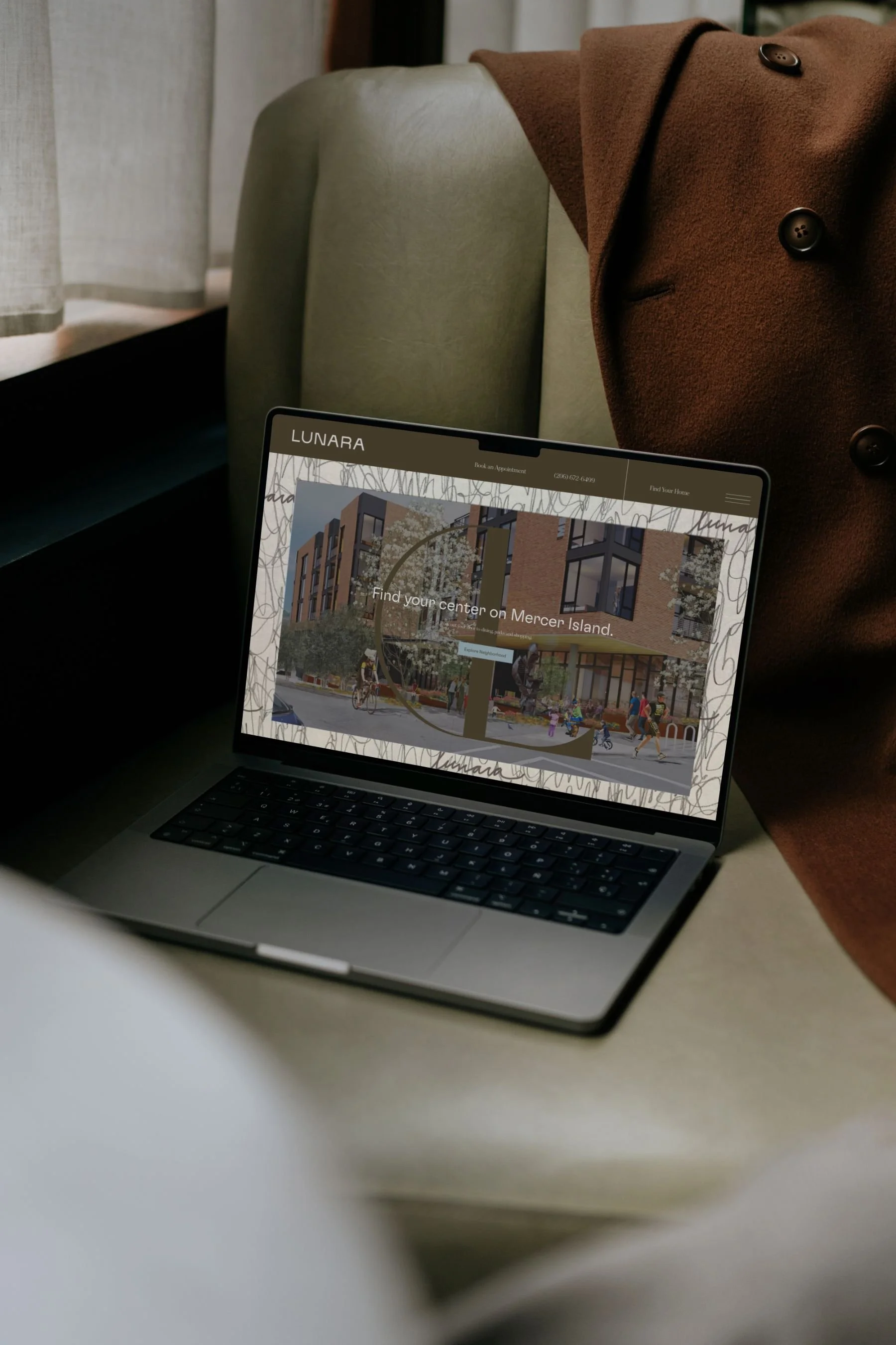
• Website Design
• Print Collateral
The Story
Mercer Island feels like a getaway. Trails wind down to Lake Washington, the Cascades rise on the horizon, and La Fête Patisserie, Sano Café, and Met Market are a short walk away. Yet the East Link light rail and I-90 put Bellevue and Seattle within minutes. The brand was built on that contrast between island ease and city access, and it gave residents permission to slow down.
The brand's central line, Savor the day, celebrates small moments when time seems to stop for a beat: the first sip of a new favorite cabernet, a paddleboard ride home as the sunset turns the sky purple, a dinner with friends where the conversation just flows. We wrote for people with high taste and low tolerance for stress. They're renters by choice, often working in tech or medicine, and they want a calm, well-designed place to land without losing touch with culture. The name Lunara, with its crescent-moon "L," suggests that same unhurried rhythm. It's serene, a little celestial, and it moves at its own pace. Throughout the copy, lines like Pick your pace. Find your rhythm. and Social by design. Serene by nature. invite residents to live on their own terms.

Brand Direction
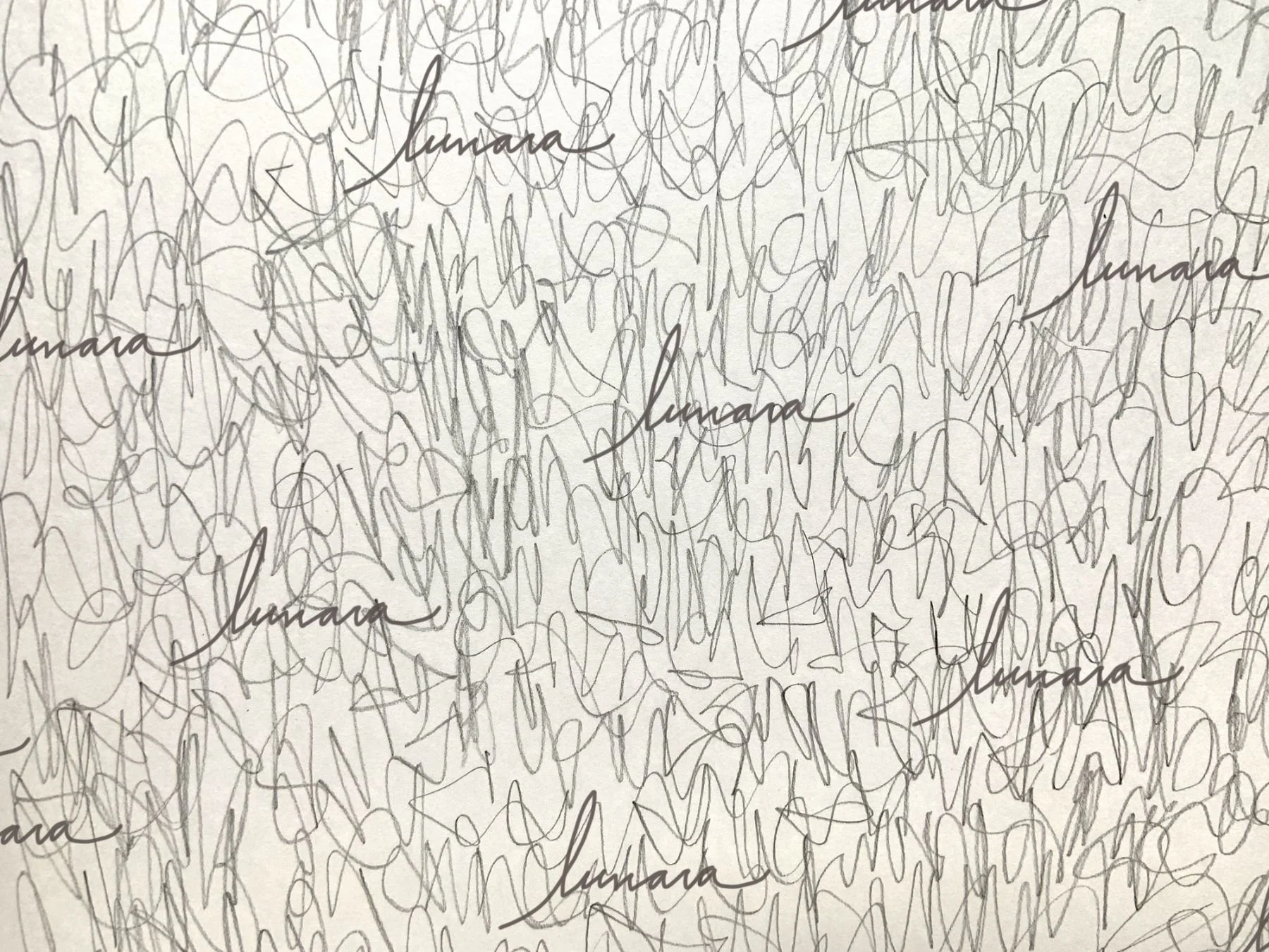
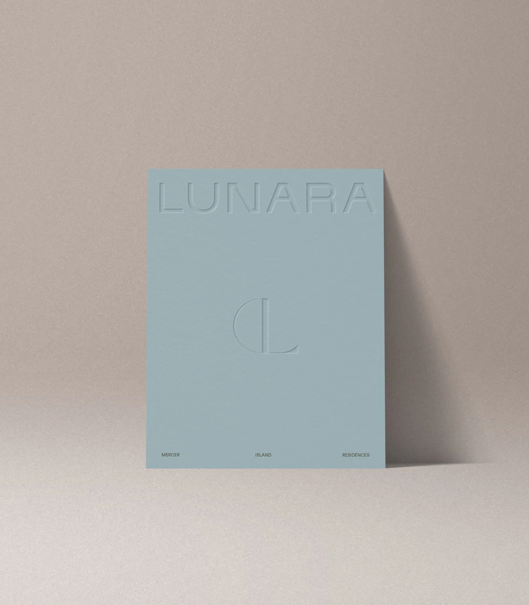
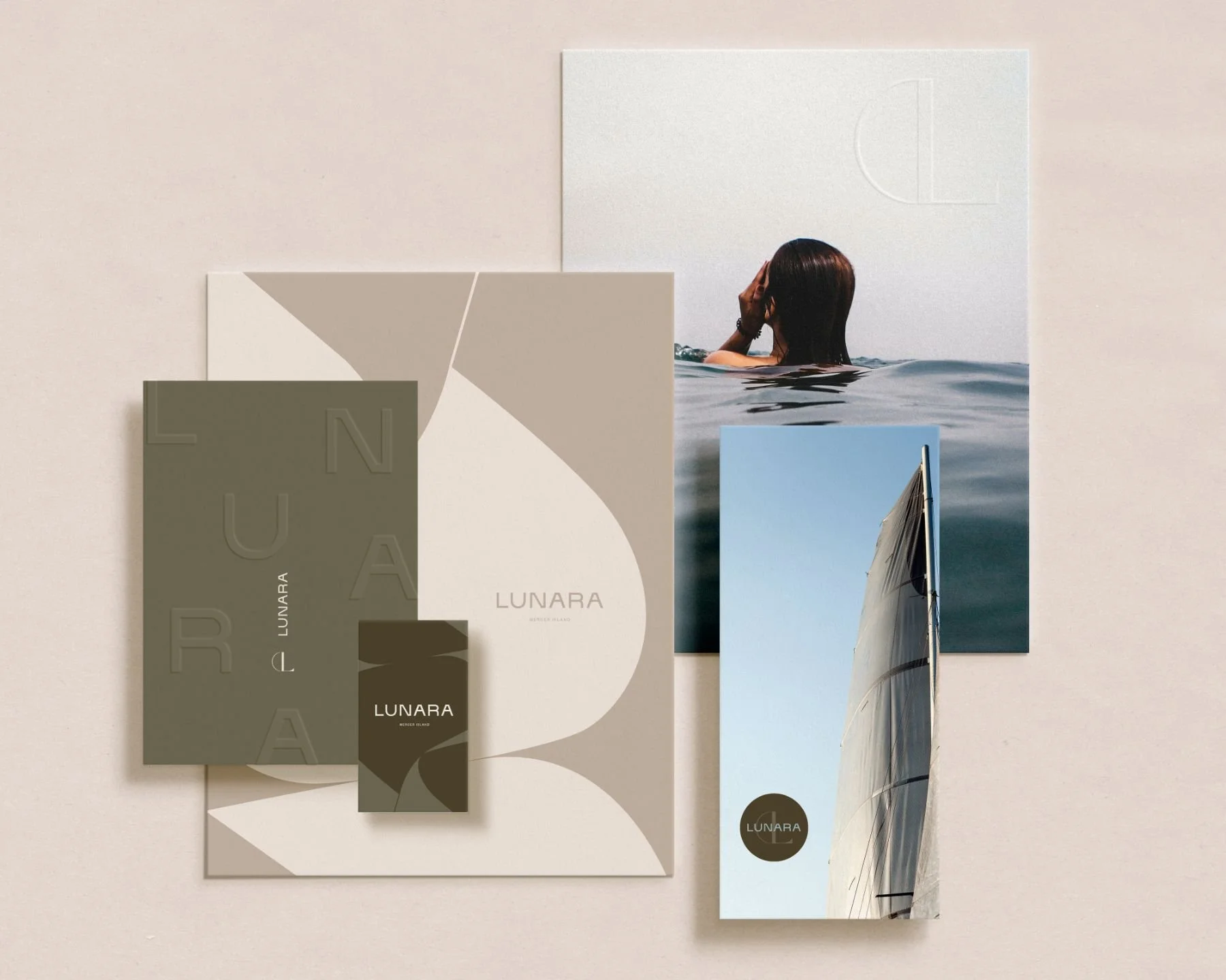
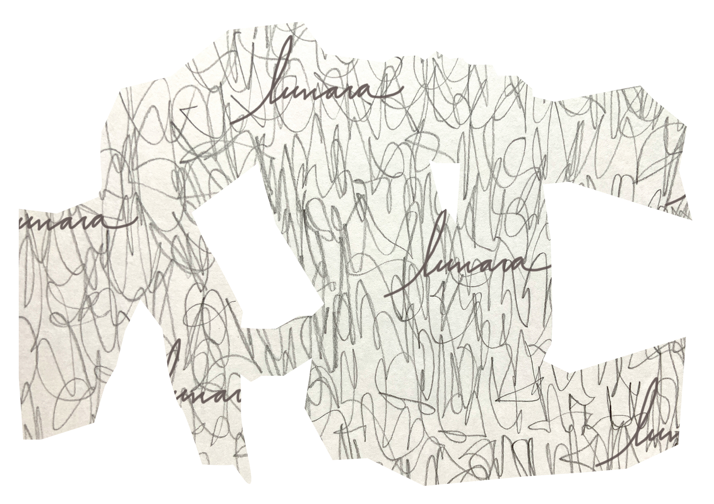
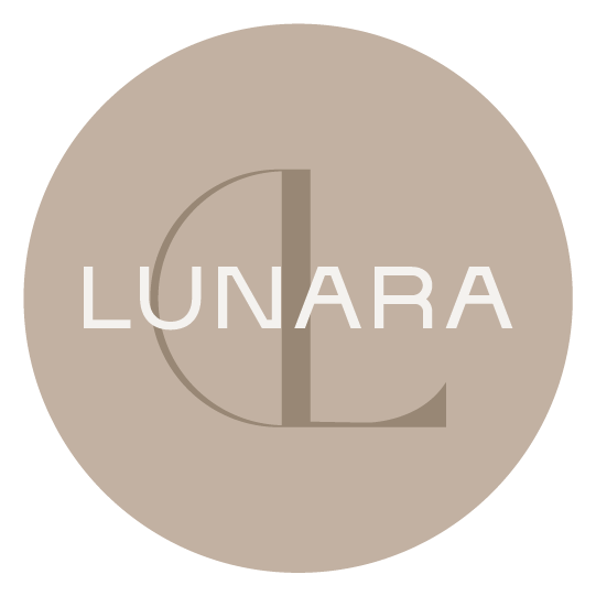
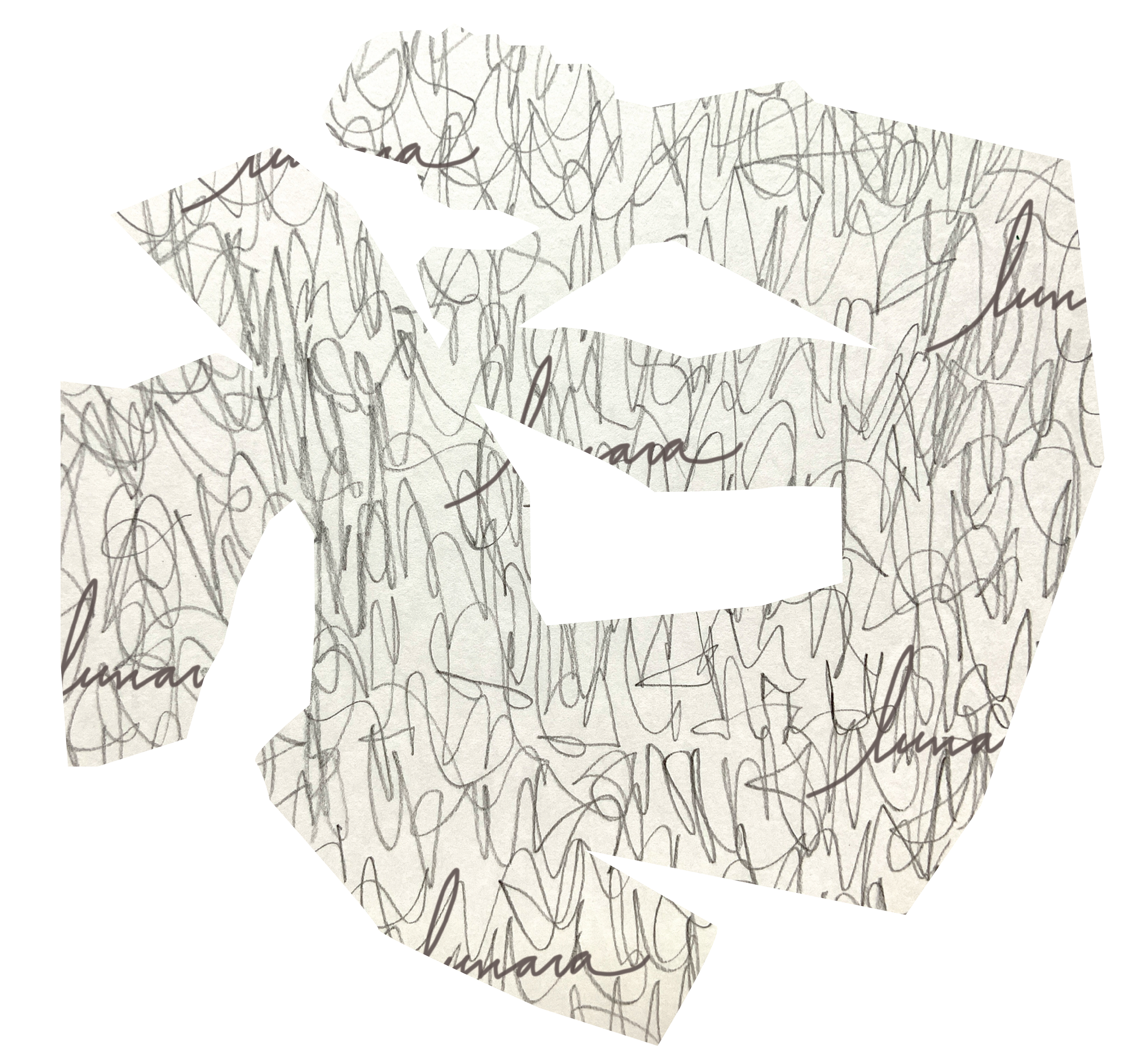
The look is airy and restrained, with a Scandinavian-inspired simplicity that matches the spa-like calm of the interiors. The palette uses earthy olive, sage, rust, and clay, softened by almond and cream and cooled with cornflower blue and slate. Together, the colors feel as warm as the wood tones inside and as fresh as the lake outside. The identity centers on the Lunara wordmark with its Mercer Island tagline, and it extends to vertical and circular lockups, a crescent-moon "L" monogram, and a matching badge. A set of large-scale patterns (abstract arcs and shapes, loose scribbles, and oversized letterforms) brings movement and a handmade quality to walls, windows, and print.

Brand Toolkit
The competitive study, persona, and positioning shaped every decision that followed. Once the strategy was in place, we created the name and logo suite, defined the palette, type, and patterns, and curated a stock photography library that captures the calm, sunlit, lakeside mood of island life. All of it is documented in a set of brand guidelines that any partner can pick up and use. Our marketing copy runs through the overview, location, amenity, and residence messaging. The smaller format brochure brings it together with a custom map of the town center, Luther Burbank Park, and the Light Rail. In the end, Lunara feels composed, grounded, and inviting, with a quiet confidence that fits Mercer Island.