
Tidewood
CLIENT: Carmel Partners
PROPERTY MANAGEMENT: Greystar

Objective
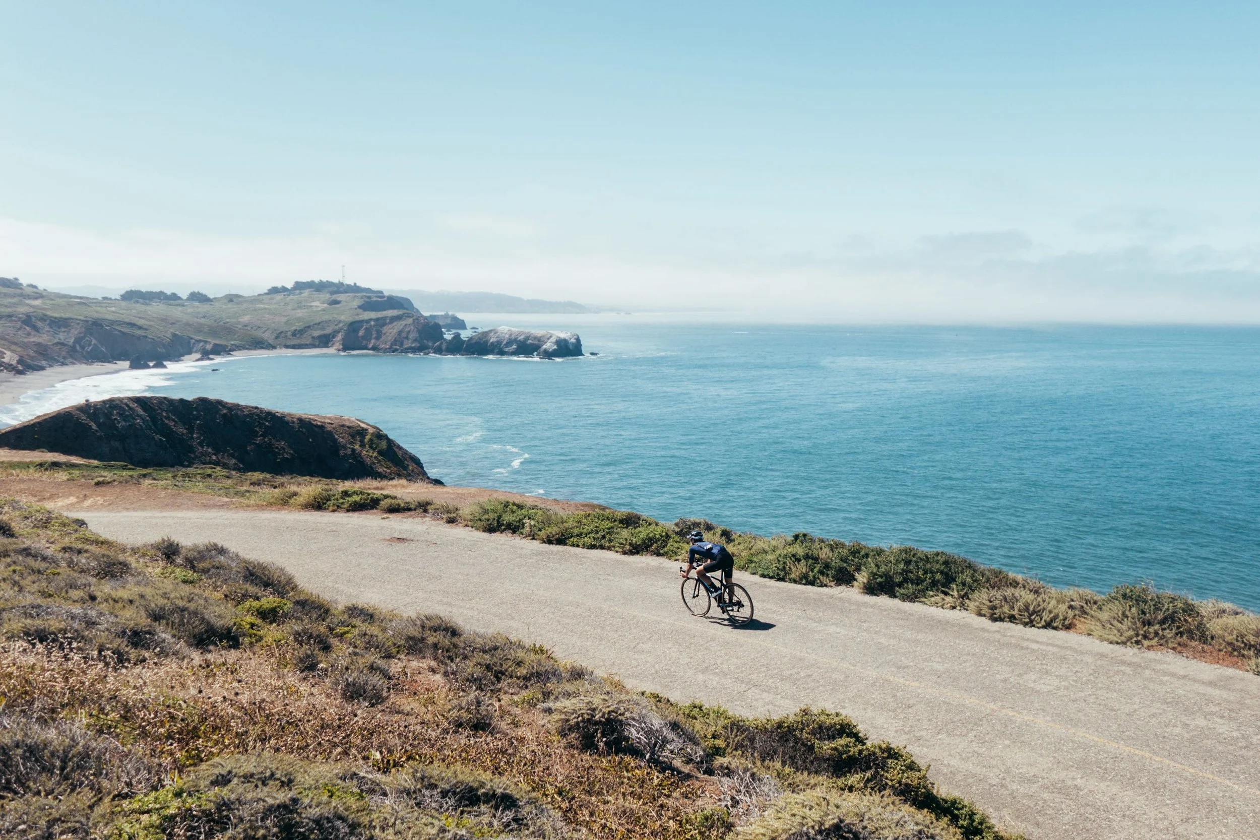
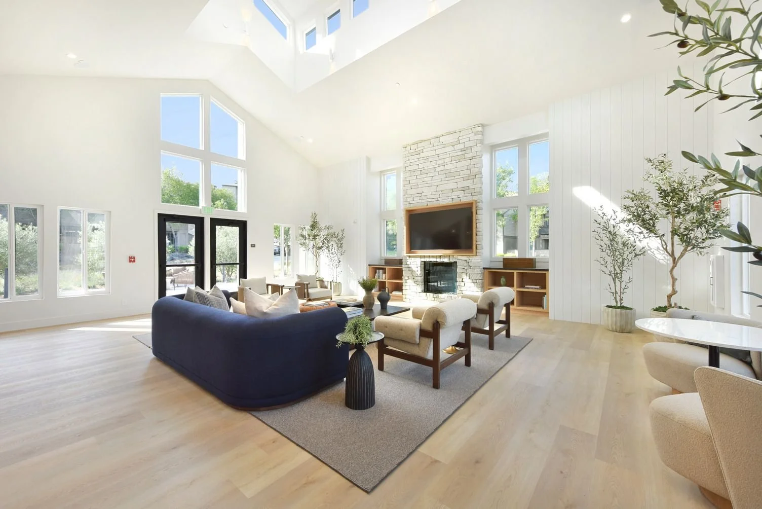
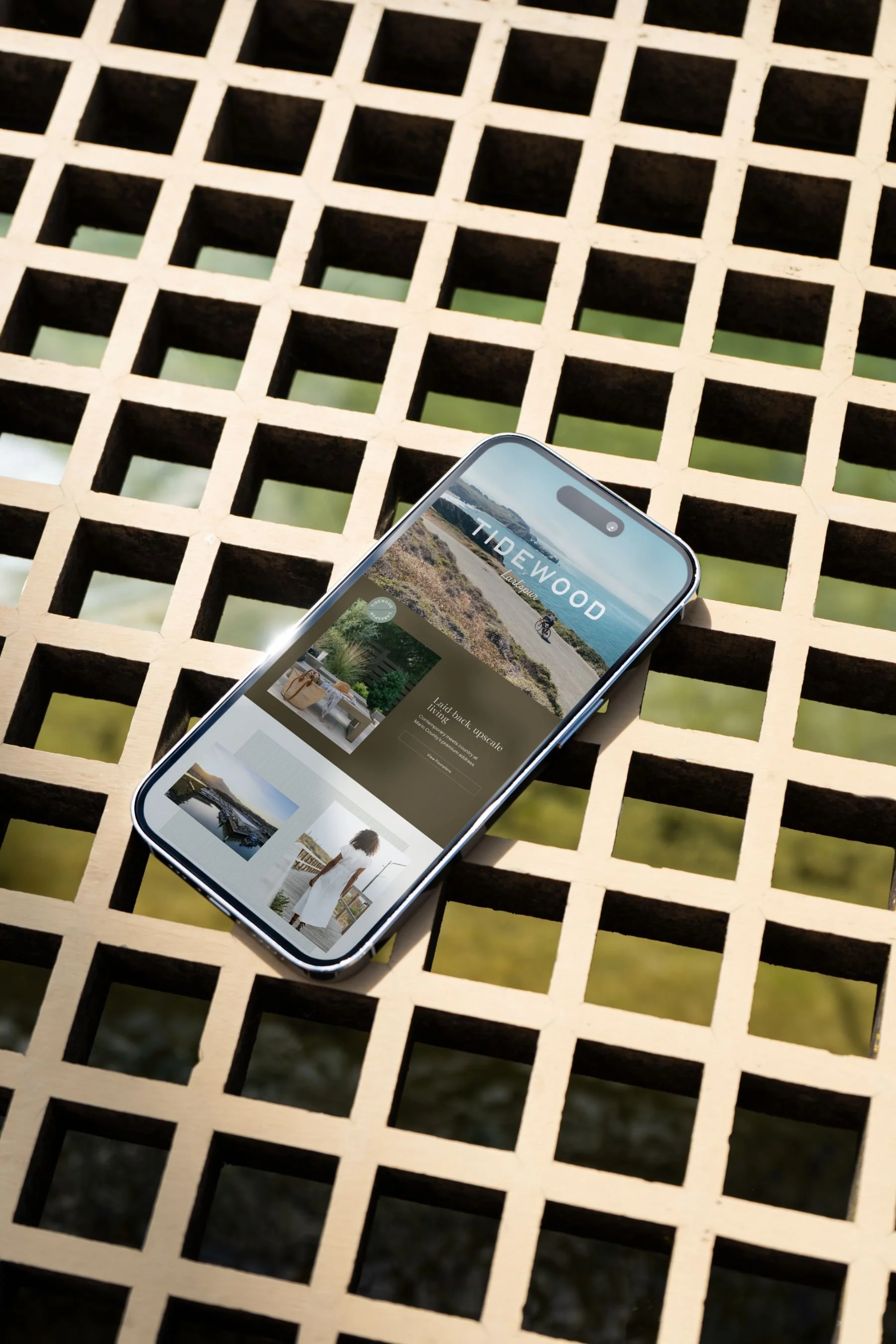
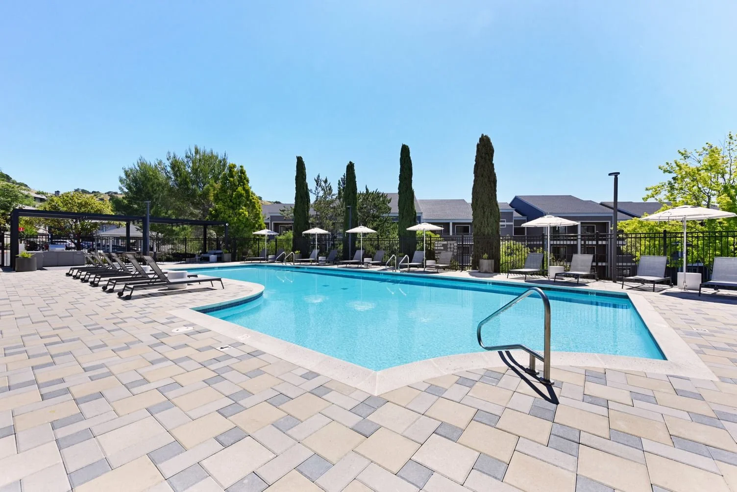
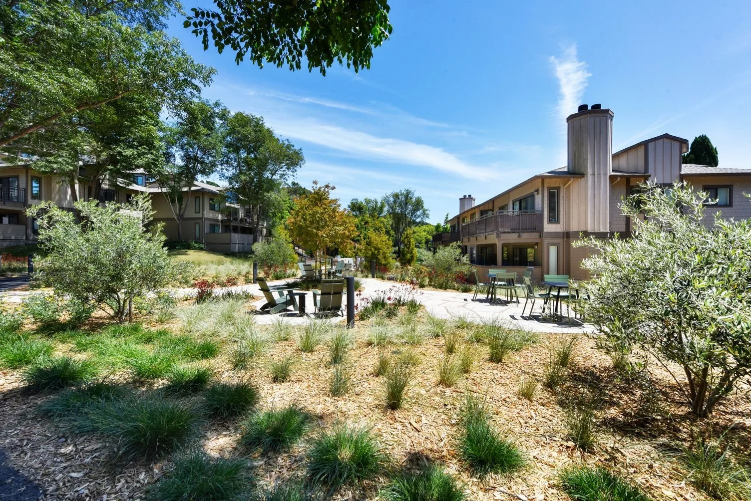
Tidewood is a garden-style community set into the Larkspur hillside — at the foot of the Larkspur Ferry and across the street from the Marin Country Mart. The residences are surrounded by the trails, bike paths, and waterfront that make Marin iconic. Formerly known as Larkspur Courts, the community came to us for a full rebrand and repositioning: a chance to reintroduce a beloved, mature property, freshly renovated, as the premium address its location deserves. We started at the beginning — developing the brand story and positioning, and then naming the community and developing all of the assets and materials for the marketing team.



Our Role
• Brand Positioning and Story
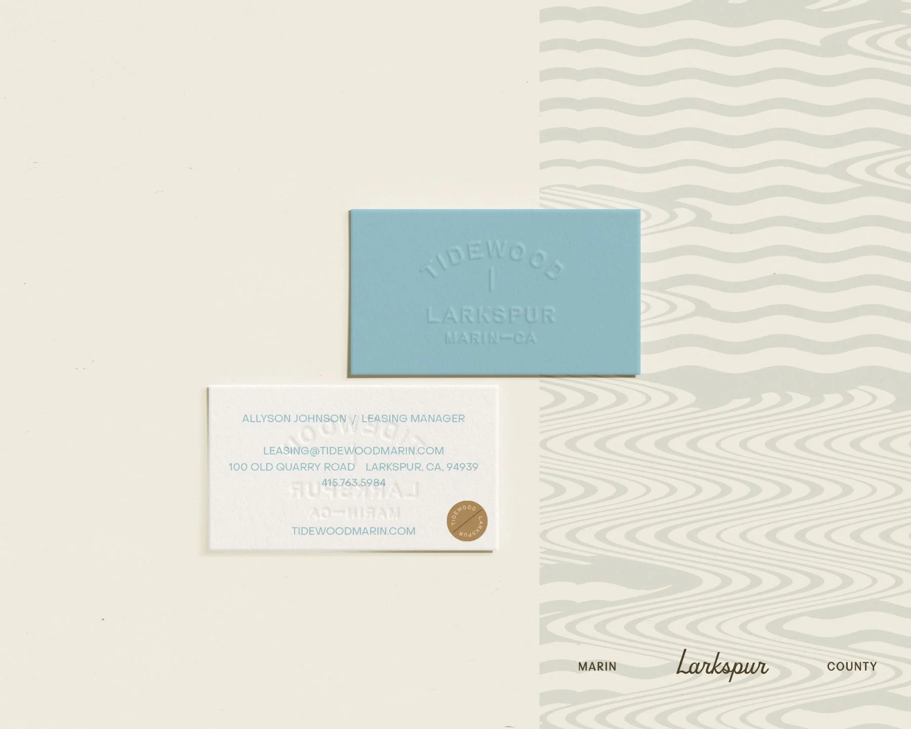
• Brand Identity
• Brand Guidelines
• Brand Elements + Patterns
• Typography System
• Photography Style Direction
• Brand Toolkit for In-House Use
• Website
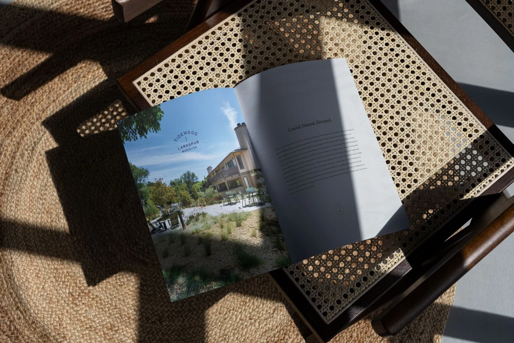
• Marketing Collateral
• Email Drip Campaign
The Story
Coastal. Natural. Elevated. Larkspur is climbing — quite literally, from the beauty of the bay to the majesty of the redwoods to the peak of Mount Tamalpais, an area that soars with the natural and revels in the outdoors. But it rises in the metaphorical sense too, reaching for new heights as the truest expression of Marin County living. It's where modern meets country and creates something new, vibrant, and utterly unique — and the only place something as special as Tidewood could exist. Start the day with coffee on the balcony and a marine breeze, hit the trails or bike paths, hop the Larkspur Ferry into San Francisco or the SMART rail up to Sonoma, then come home to a contemporary, peaceful space to relax and recharge.
The name Tidewood captures exactly that meeting point — water and woods, the bay and the hillside — in a single word. The positioning was built for Marin's new doers: established, active professionals who bike as often as they drive, who moved from the city for a bit of calm but still want it close, and who are fiercely protective of their free time. Upscale but free-spirited, refined but approachable, polished but relaxed. It's the ideal mix of adventure, convenience, and laid-back ease — the place to build a well-balanced life.


Brand Direction
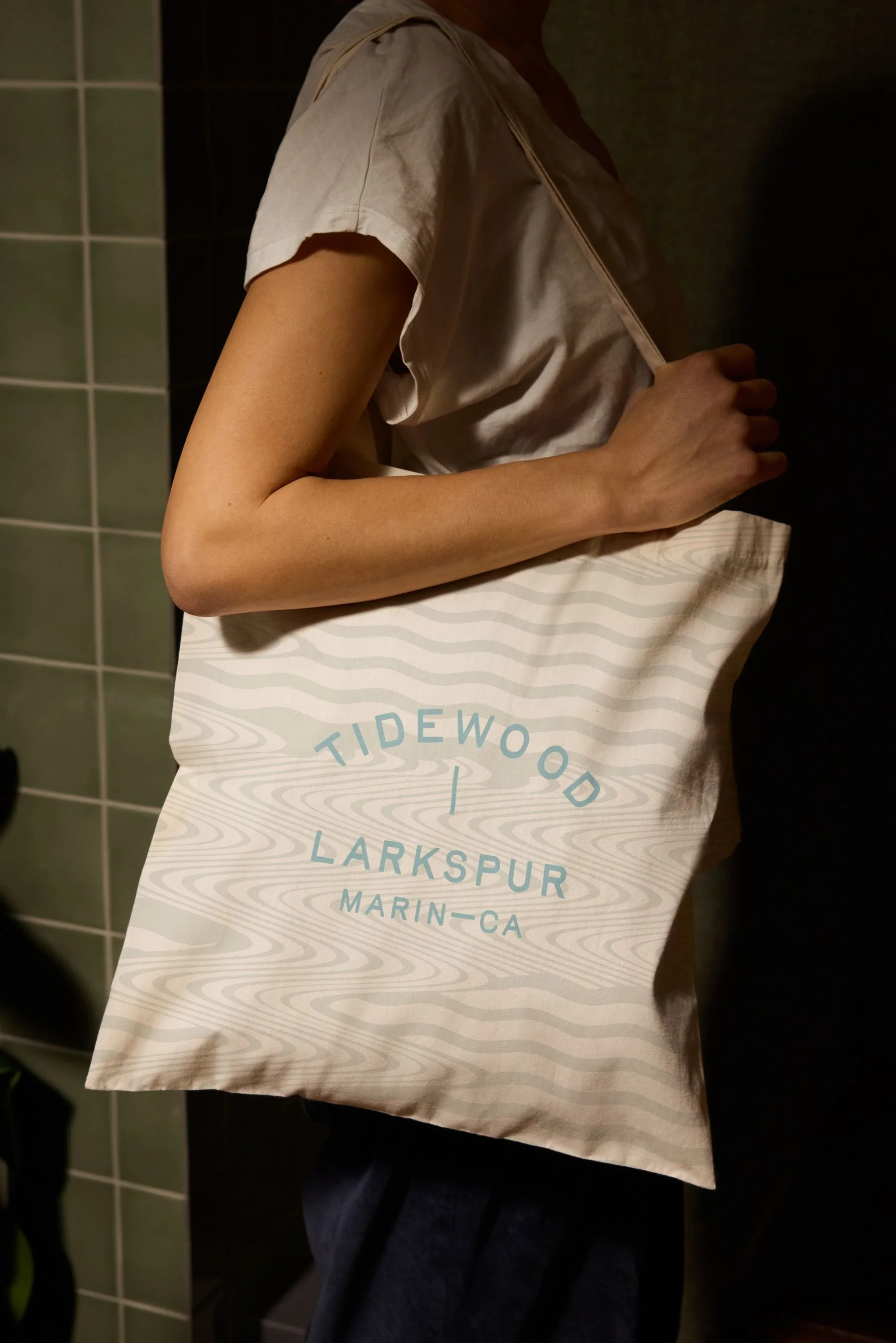
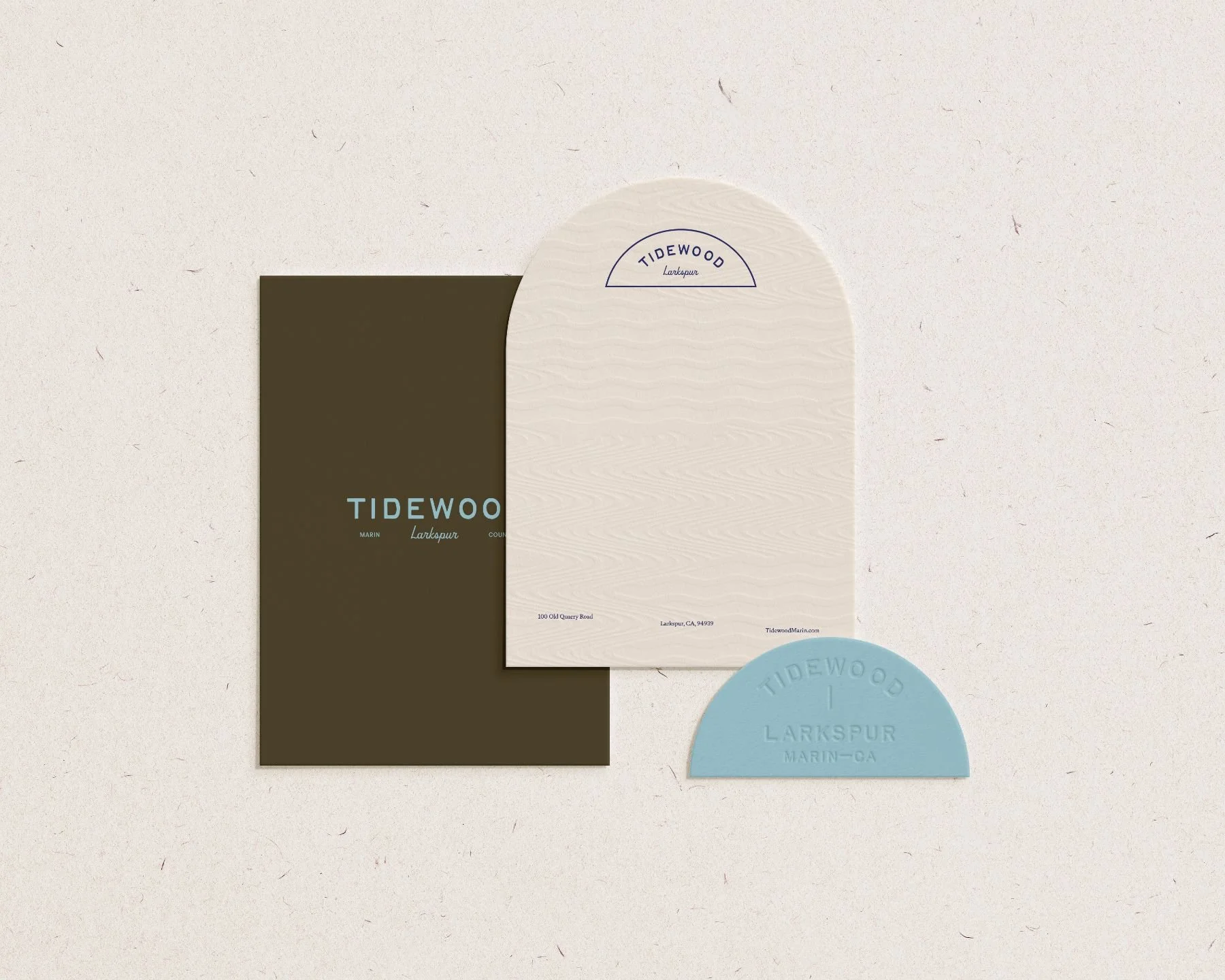
The visual language is elevated but relaxed sophistication drawn straight from the Marin landscape. A warm, earthy palette of olive and seafoam, marigold and almond, softened sky blue and deep indigo, all grounded in cream, gives the brand its sun-washed, textural, distinctly Northern California feel.
Brand Toolkit
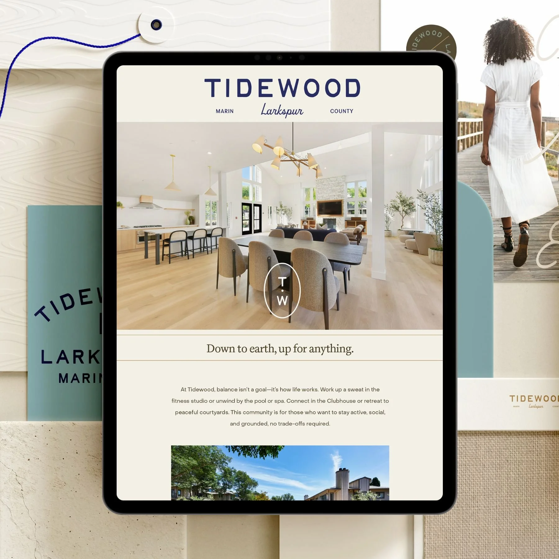
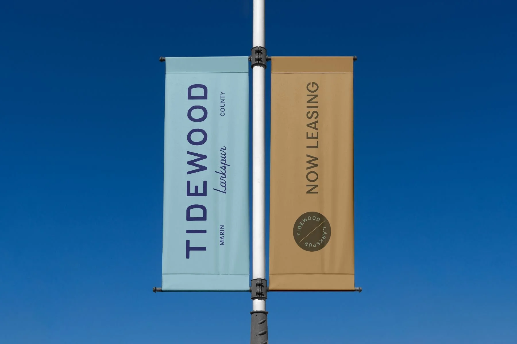
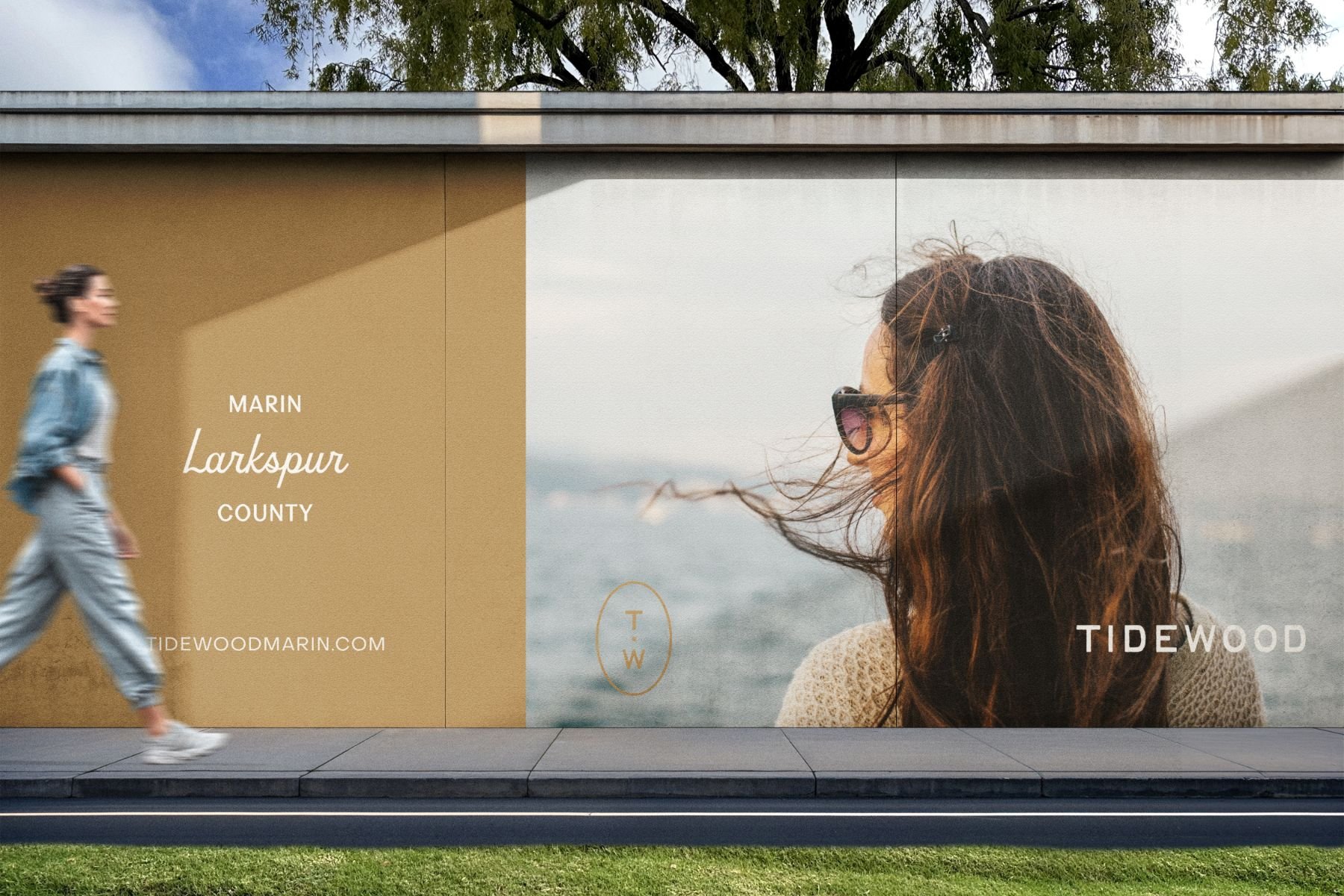
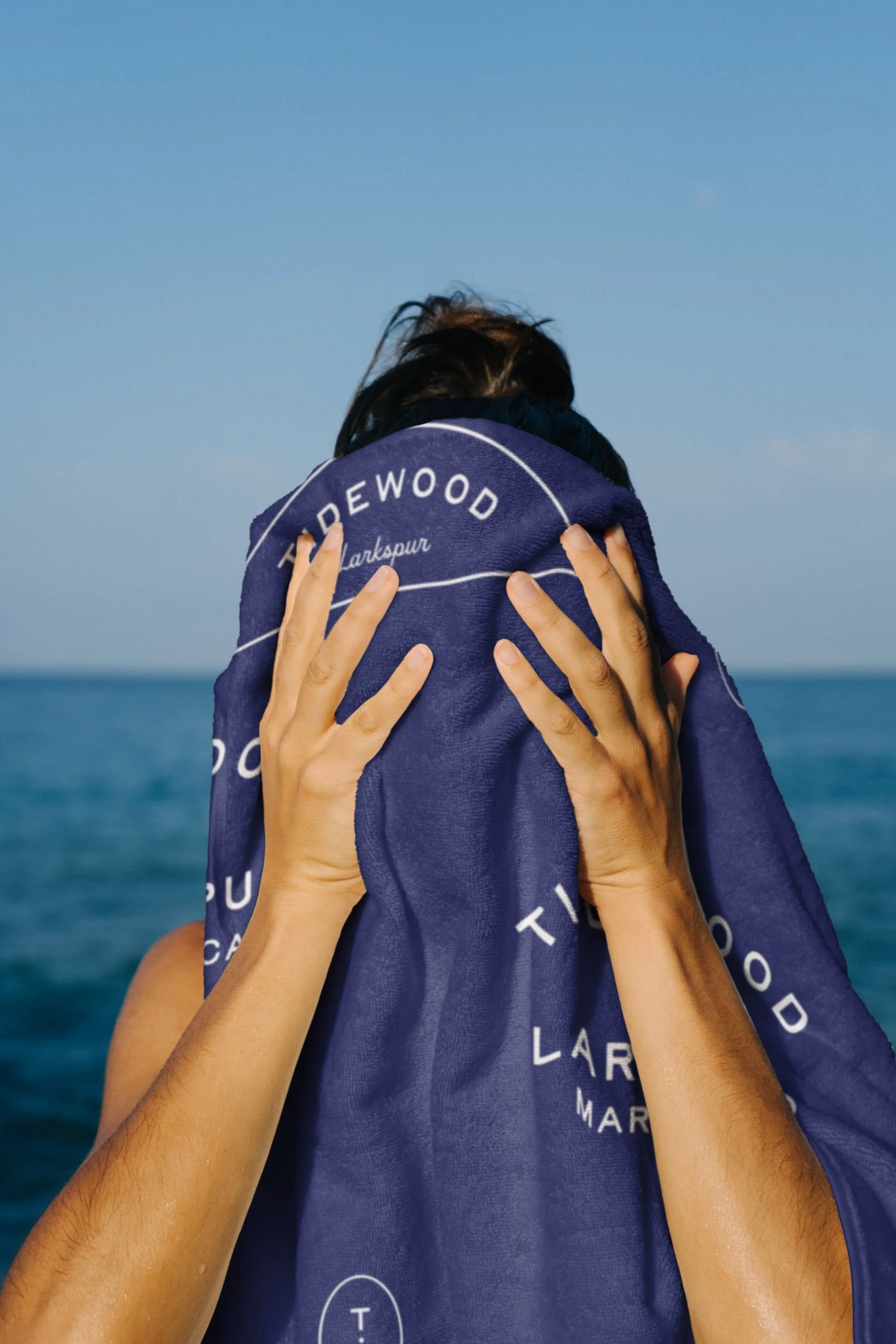
Starting from the brand story and positioning, we built out the full identity — naming, logo, color palette, typography, custom pattern library, and photography style direction. We designed the website, marketing collateral, an email marketing template campaign, and marketing and lease-up signage across the property. The result is a brand as balanced as the life it promises — coastal, natural, and elevated — and unmistakably at home in Marin.