The Cooper
Client: Boundary Development
Property Management: Luna Properties
Objective
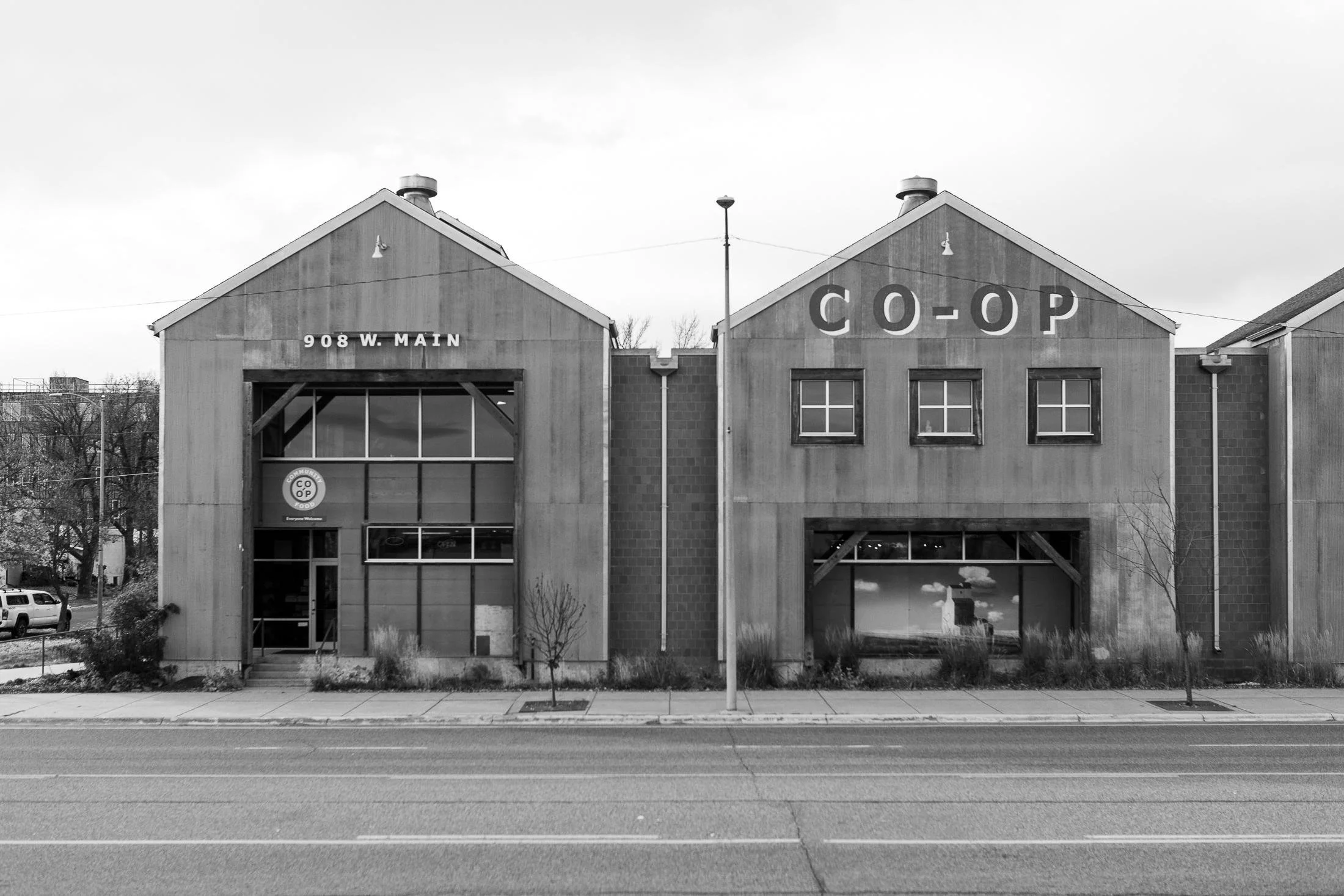
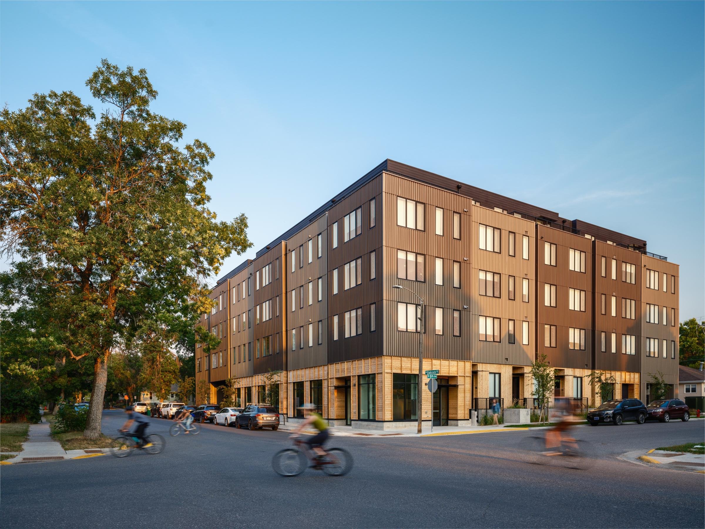
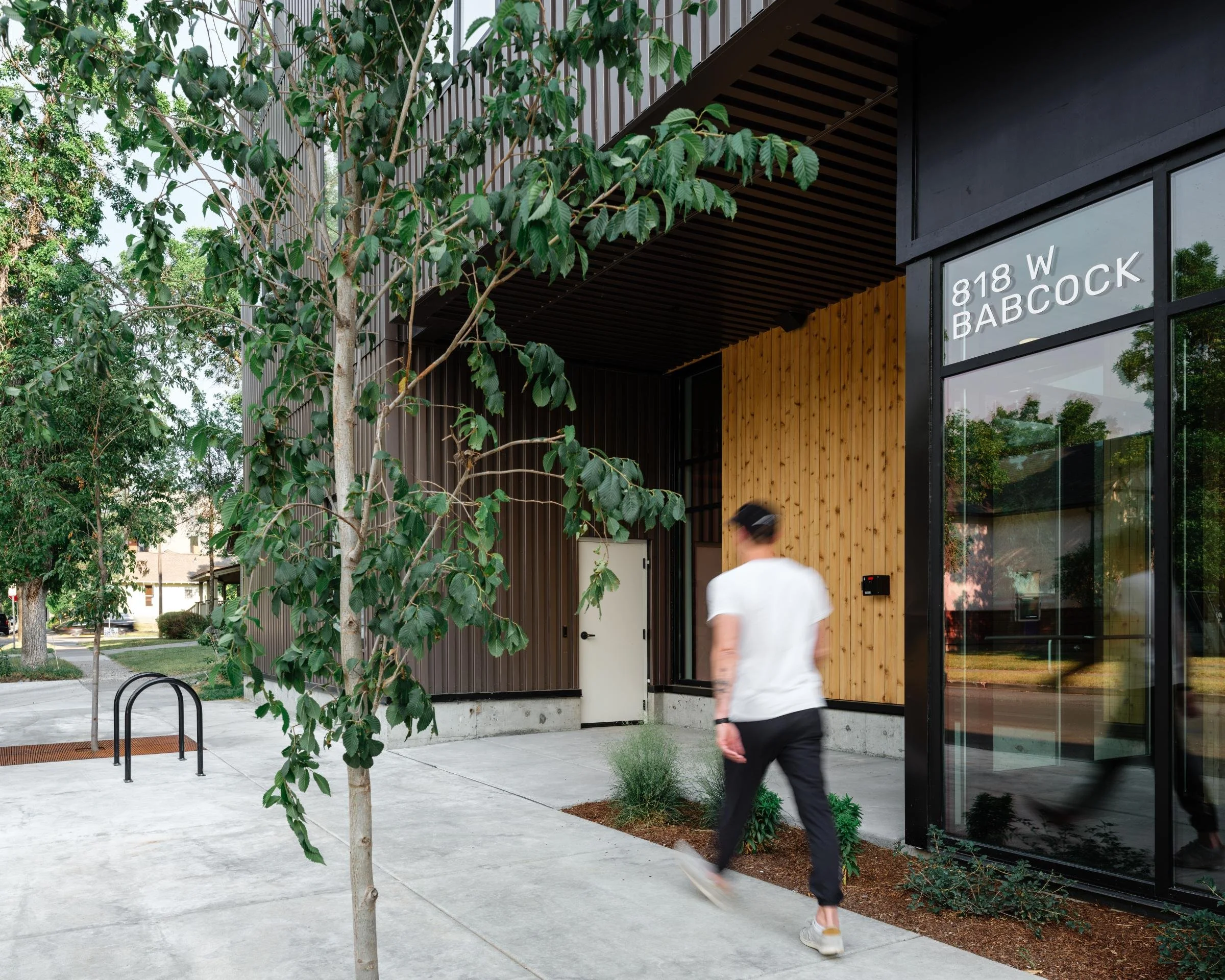
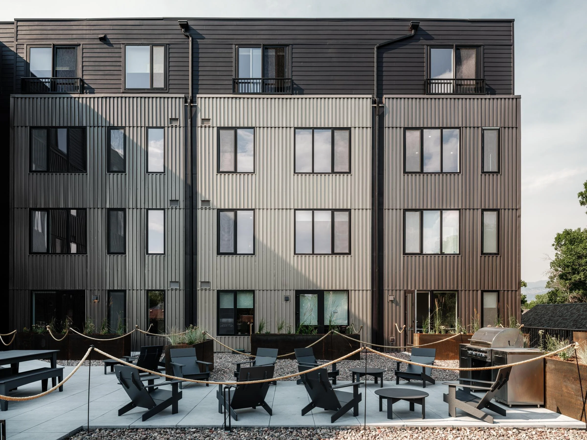
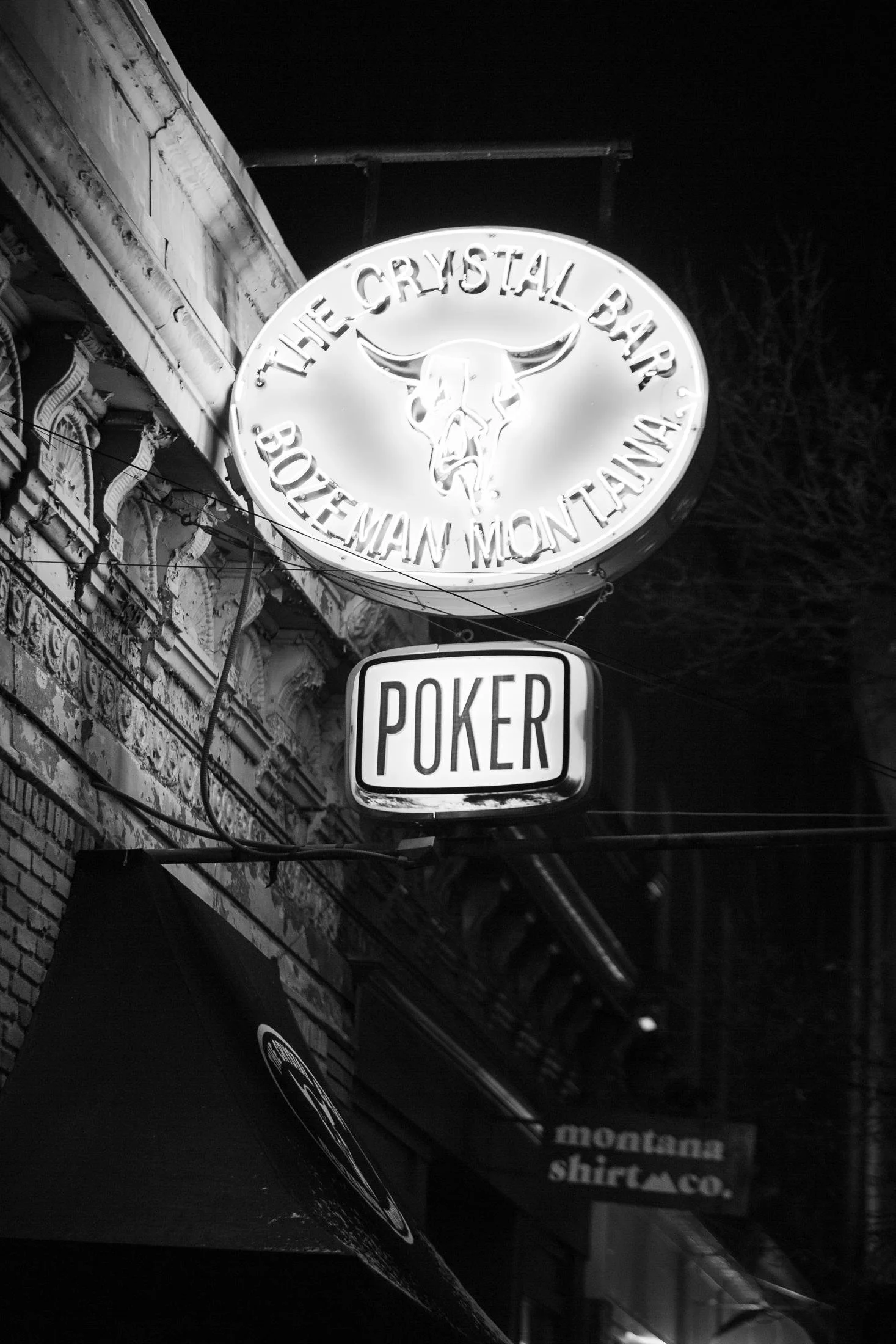
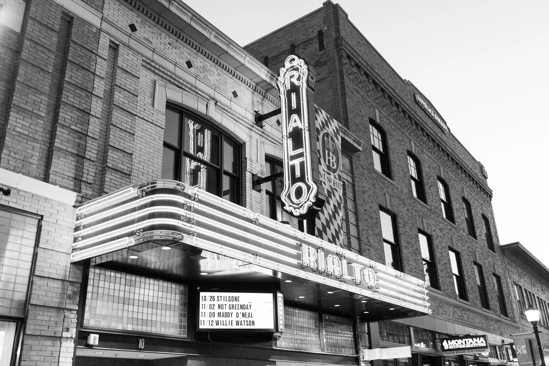
The Cooper rose up in the heart of Bozeman — right across the street from the beloved Co-op and just a block off Main Street, in the tree-lined, historic Cooper Park neighborhood with the Bridger Mountains framing the view in every direction. Designed by local studio Minarik Architecture, the building needed a brand that could hold both sides of Bozeman: rugged outdoor spirit and upscale, modern comfort. We developed the brand story and direction from the ground up and built a complete identity to match — one that feels equal parts mountain town and design-forward, and carries seamlessly from the wayfinding signage to the website.
Our Role
Brand Development
Brand Identity
Brand Guidelines
Marketing Copywriting
Print Collateral
Marketing Signage
Wayfinding Permanent Signage
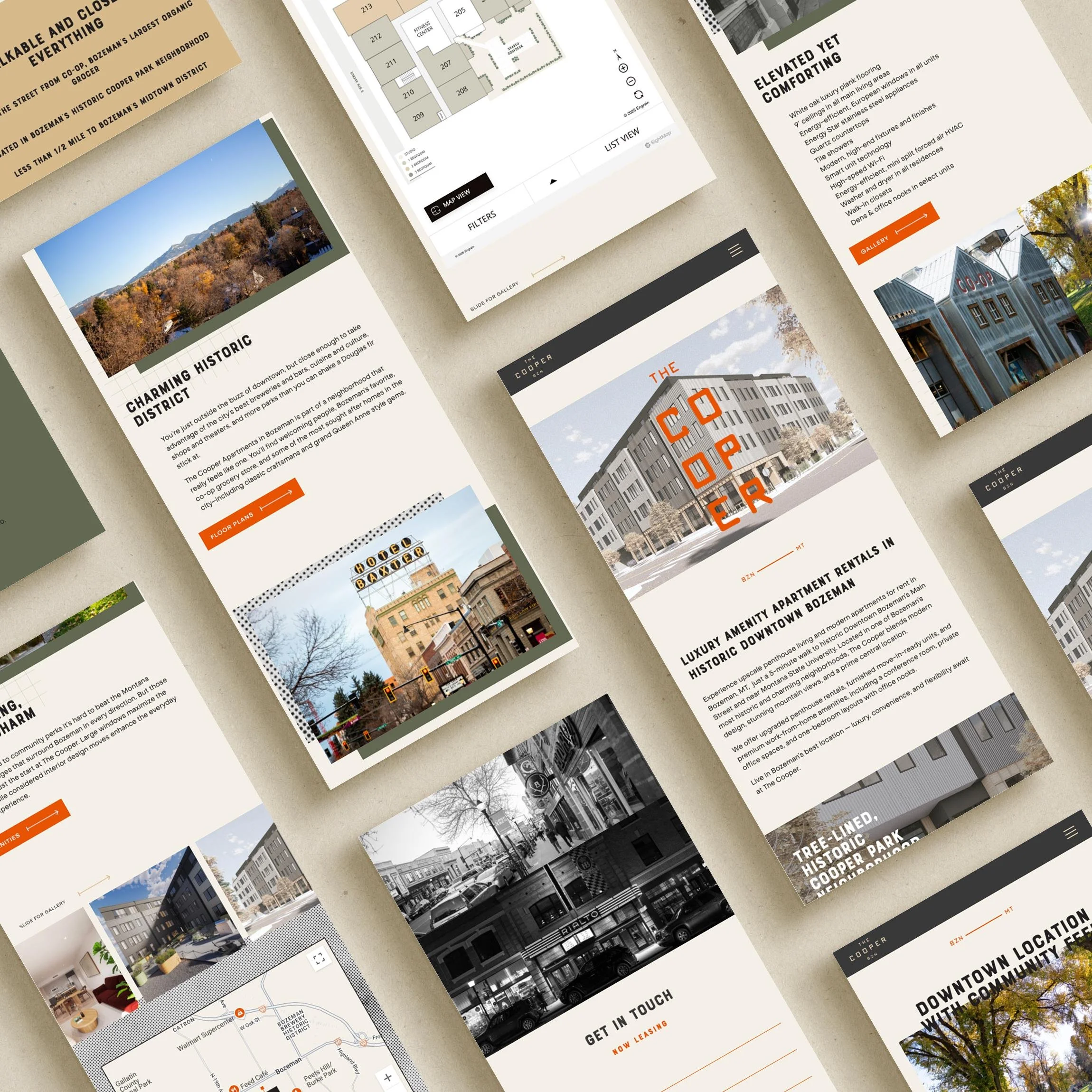
Website Design

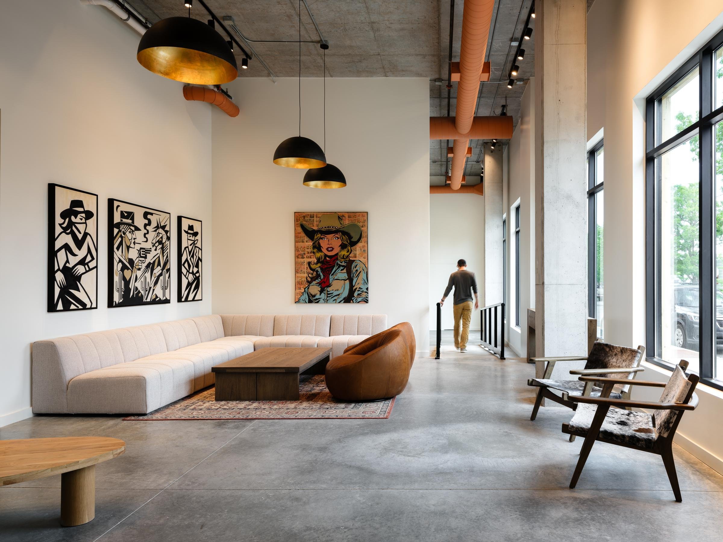
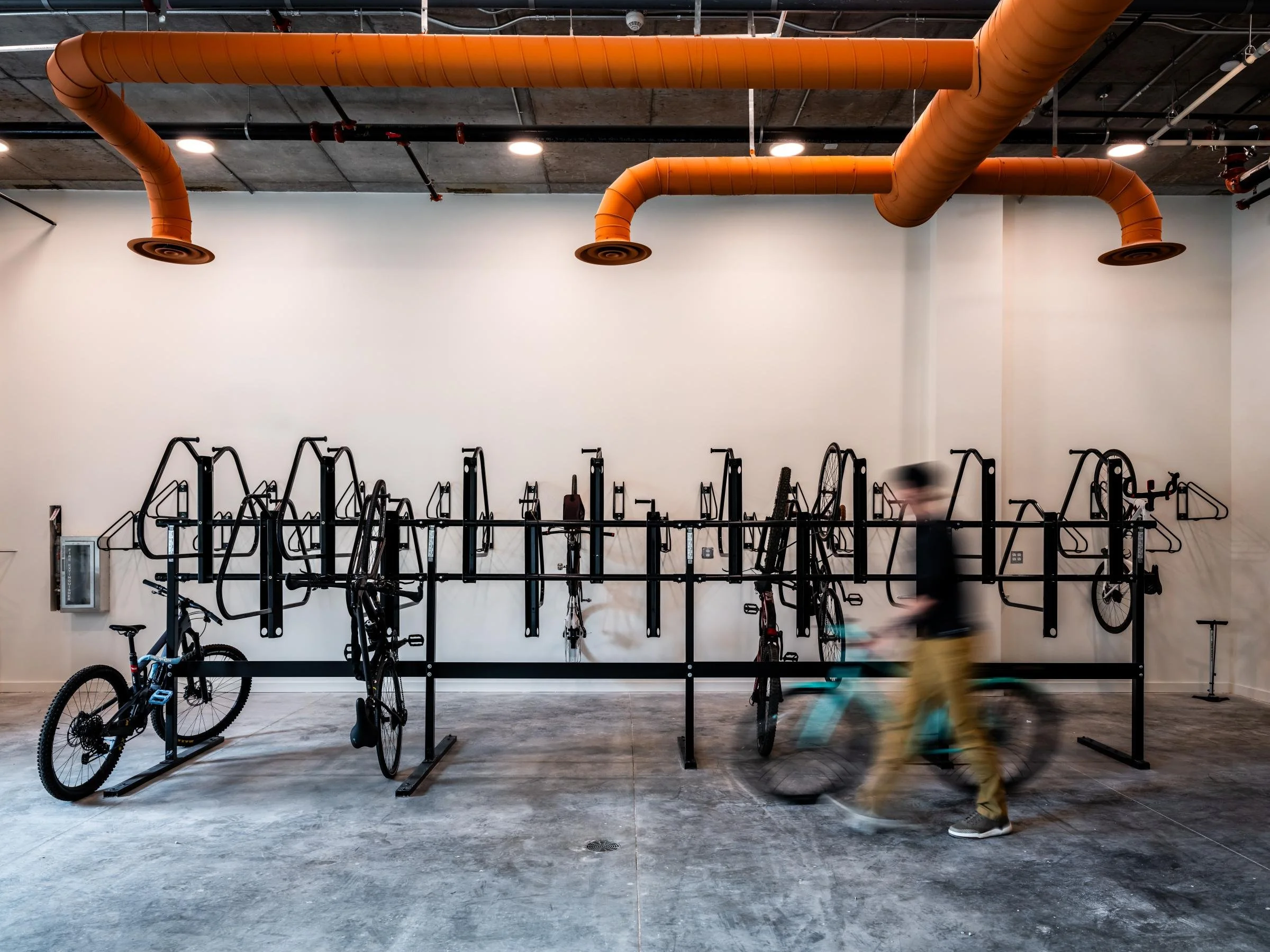
The Cooper is mountain-bound living for outdoor enthusiasts and urban explorers alike — a place to balance rugged pursuits with refined comforts. Walk to the Co-op for organic fare or coffee with a friend, catch live music on Main Street, then hit the trail, the river, or the slopes whenever they call. With incredible views of the Bridgers, the Spanish Peaks, and the Gallatin valley, and a gear lounge that keeps every adventure close at hand, it's a community built for people who want it all within reach.
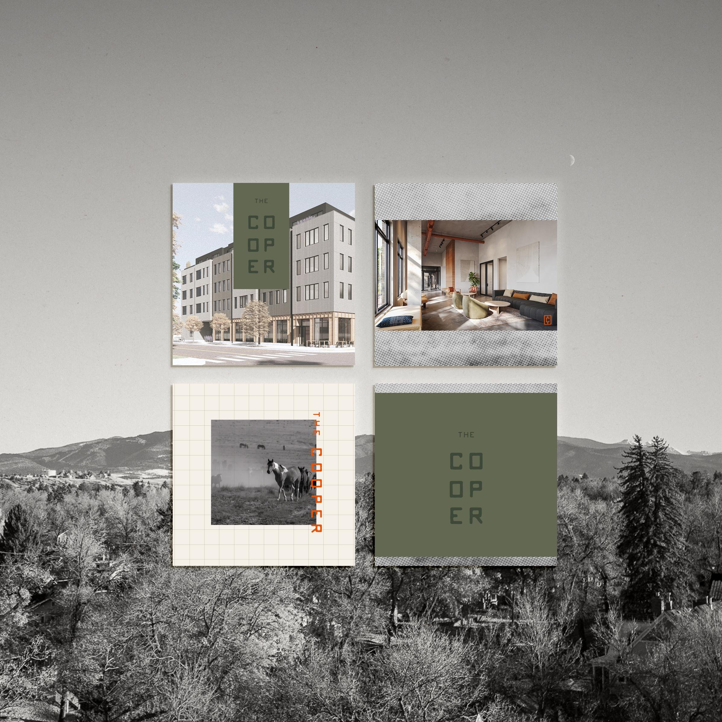
The name and identity are rooted in that Montana character. The logo draws its inspiration from an old cattle-branding tool — a nod to the region's ranching heritage, reimagined as a clean, modern mark with a touch of the industrial warmth found throughout the building's cedar-and-concrete design. It's Montana minimalist in the best way: grounded, authentic, and ready for the next adventure, whether residents settle into a furnished home or make a non-furnished one their own.

The Story

Brand Direction
The visual language is drawn straight from the Montana landscape — modern with a touch of industrial warmth. A palette of olive and deep forest green, warm wheat, and soft oat is sparked by a bold burnt orange that echoes the building's corten-and-cedar exterior and the big-sky energy of Bozeman. The cattle-brand-inspired logo anchors the system, and a photography style direction that captures both mountain grandeur and everyday neighborhood life keeps the brand feeling authentic across every surface.
Brand Toolkit
The brand was constructed to carry one cohesive idea from the trailhead to the leasing office. Starting from the brand story and direction, we designed the logo and a full set of brand style guidelines — color palette, typography, and photography style direction — then extended the brand into the moments that matter most for lease-up: a leave-behind brochure, marketing signage to gain momentum, permanent wayfinding signage, and a custom website.