Alchemy
CLIENT: Carmel Partners
PROPERTY MANAGEMENT: Greystar
Objective
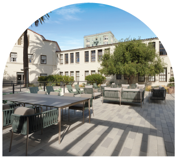
Alchemy sits at 200 Buchanan Street, where Hayes Valley’s style meets Lower Haight’s personality. It’s a large community on 4.3 landscaped acres, and no two corners look quite alike. Some buildings have arched doorways and the details of old San Francisco, while others are clean, light-filled, and modern. The owners wanted to keep the Alchemy name but give the property a whole new brand direction, one that reflected the charm and soul of the neighborhood and the character of the community itself. We wrote the brand story and created amenity inspiration and visual design concepts with mood boards that guided the interior design team through the rebrand. From there, we designed the new identity and brand guidelines, wrote the marketing copy, and carried the brand into marketing materials, an email drip campaign, a custom illustrated neighborhood map, a new website, and lease-up signage.


Our Role
• Brand Positioning and Story
• Amenities Inspiration Boards
• Visual Design Inspiration Boards
• Brand Identity
• Brand Guidelines
• Brand Elements + Patterns
• Typography System
• Photography Style Direction
• Neighborhood Map + Custom Illustrations
• Website
• Marketing Collateral
• Email Drip Campaign


The Story
Alchemy is the art of transformation, of combining different elements to create something greater. That’s what happens here. Historic and modern, arches and clean lines, city energy and quiet green space all come together in one community. The brand promise grew from that idea: Experience the magic of city life, transformed. The copy describes Alchemy as part art, part science, all San Francisco, a place where thoughtful design, creative energy, and smart amenities combine to create something greater: the freedom of everyday flow.
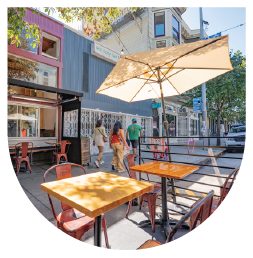
The neighborhood gave the story its soul. Hayes Valley is a beloved locale saturated in peak San Francisco culture, with the trendy spots of the Hayes Street corridor on one side and the vintage wonders of Lower Haight on the other. Eclectic cafés, bars, music venues, and boutiques are steps away, and Muni, Duboce Park, and the Wiggle bike route are just blocks from home. The amenities offer the same mix, supporting moments of focus, movement, downtime, and connection. Residents can work in the coworking lounge, recharge in the fitness center or yoga studio, raise a fireside toast in the clubhouse, play a round on the regulation bocce court, or take in the skyline and Twin Peaks from the rooftop terrace. The voice is warm and confident, with lines like Storied and soulful, Where elements align, Form, function, flow, and Made for momentum.





Brand Direction
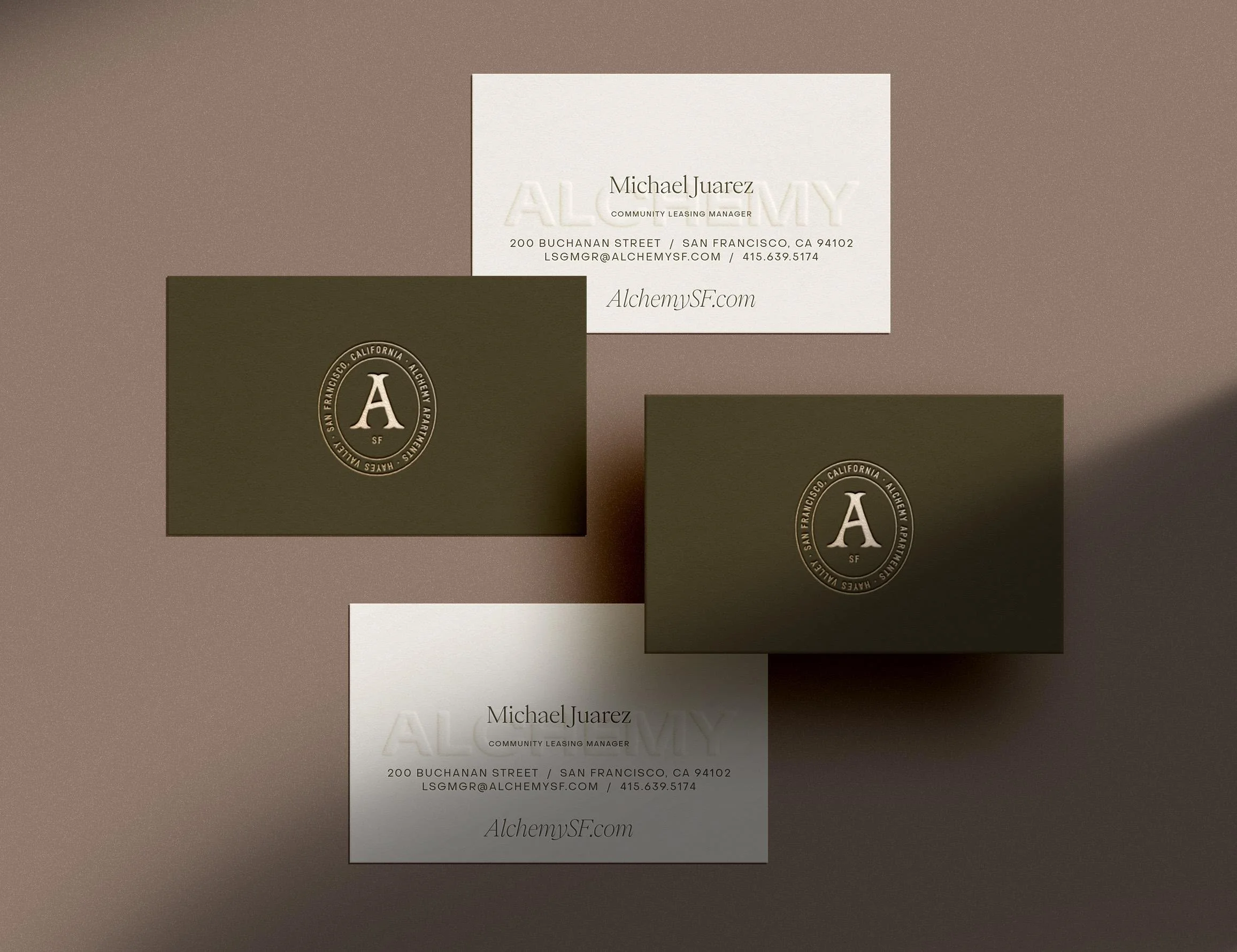
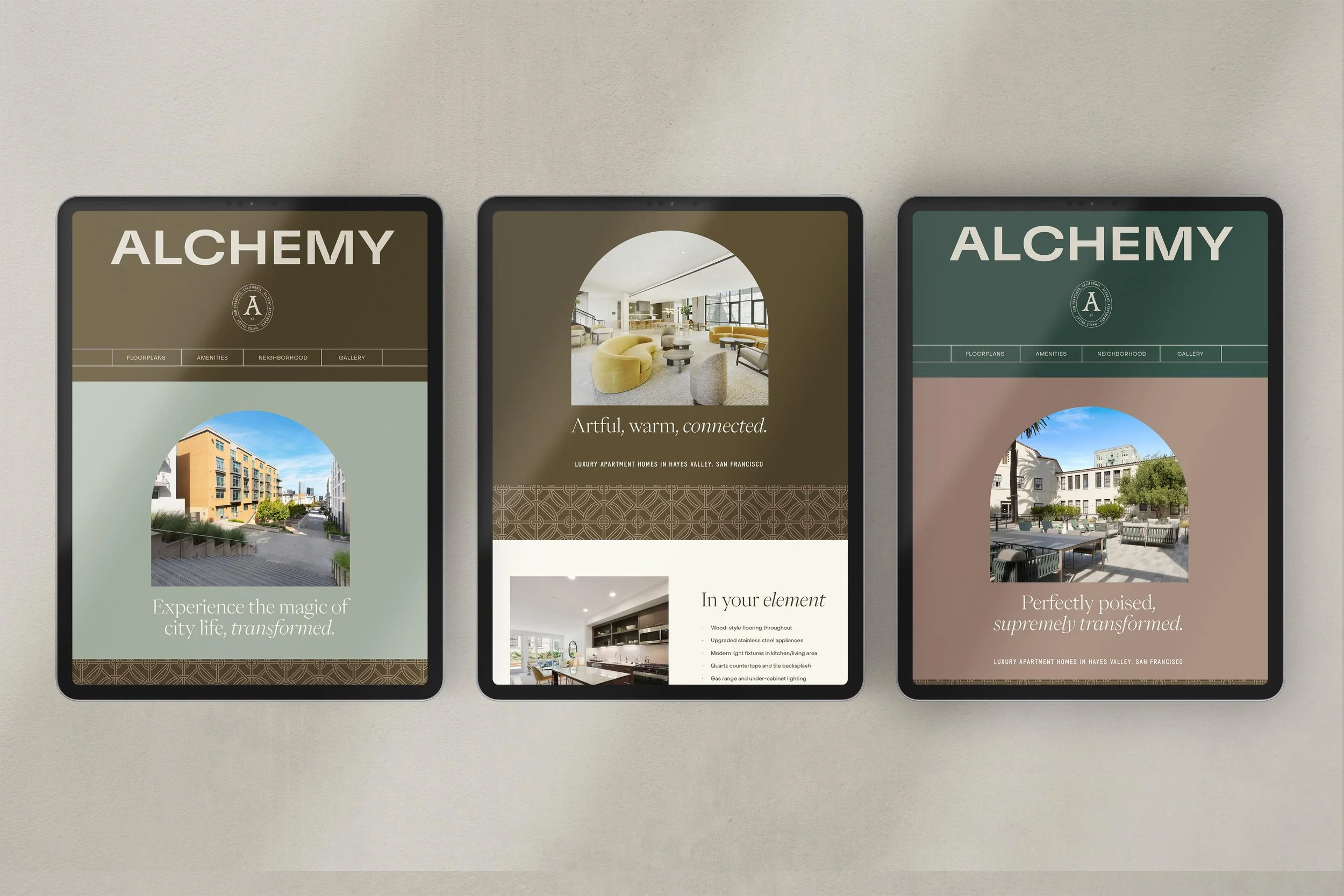
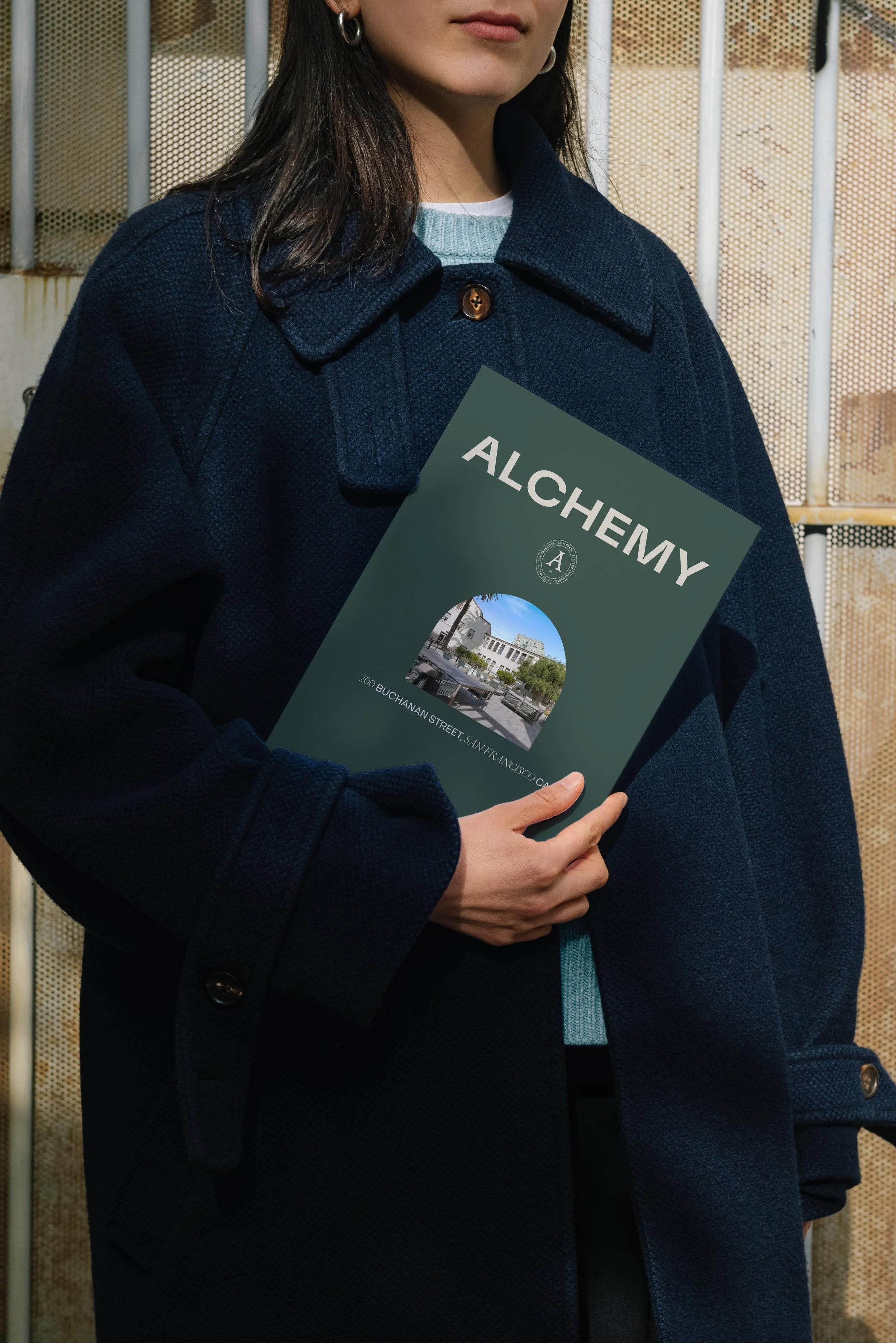
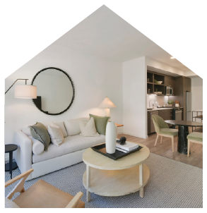
The look balances old San Francisco charm with modern ease, much like the community’s mix of buildings. The palette is warm and grounded: deep olive and forest green, soft sage, golden marigold and clay, with sand, almond, and cream for lighter moments. The identity centers on a wide, confident “ALCHEMY” wordmark with Hayes Valley and Apartments taglines and vertical lockups. It’s paired with an oval seal in which a vintage-inspired “A” sits inside a ring that reads San Francisco, California · Alchemy Apartments · Hayes Valley. Arches drawn from the property’s historic doorways appear throughout as photo frames and overlay shapes, along with hexagon, house, stair, and flip-arch forms. A geometric circle pattern and a colorful half-moon pattern add texture. A custom neighborhood map brings it all home, with hand-drawn illustrations of local landmarks like the Painted Ladies at Alamo Square, the Ferry Building, Golden Gate Park, and the Castro, all in the brand’s colors.



Brand Toolkit
We started with the brand story and inspiration boards, which gave the interior design team a clear direction for the amenity spaces and the overall look of the rebrand. The brand guidelines then defined logo usage, color, typography, design elements, patterns, and photography style as a brand toolkit for the leasing team and social media agency. The marketing copy carried the new voice across the marketing materials and the website, which we designed to show off the residences, amenities, and the Hayes Valley neighborhood. An email drip campaign kept prospects engaged, and the illustrated neighborhood map helped them picture life at the center of the city. Lease-up signage brought the brand to the street and introduced the new Alchemy to San Francisco. Online, in inboxes, and across the property, Alchemy now feels as storied, soulful, and uniquely San Francisco as its neighborhood.