
The Lookout
CLIENT: Boundary Development
PROPERTY MANAGEMENT: Luna Properties
Objective
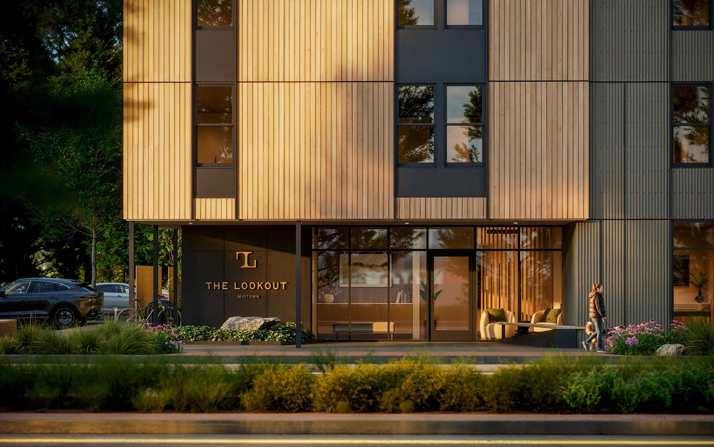
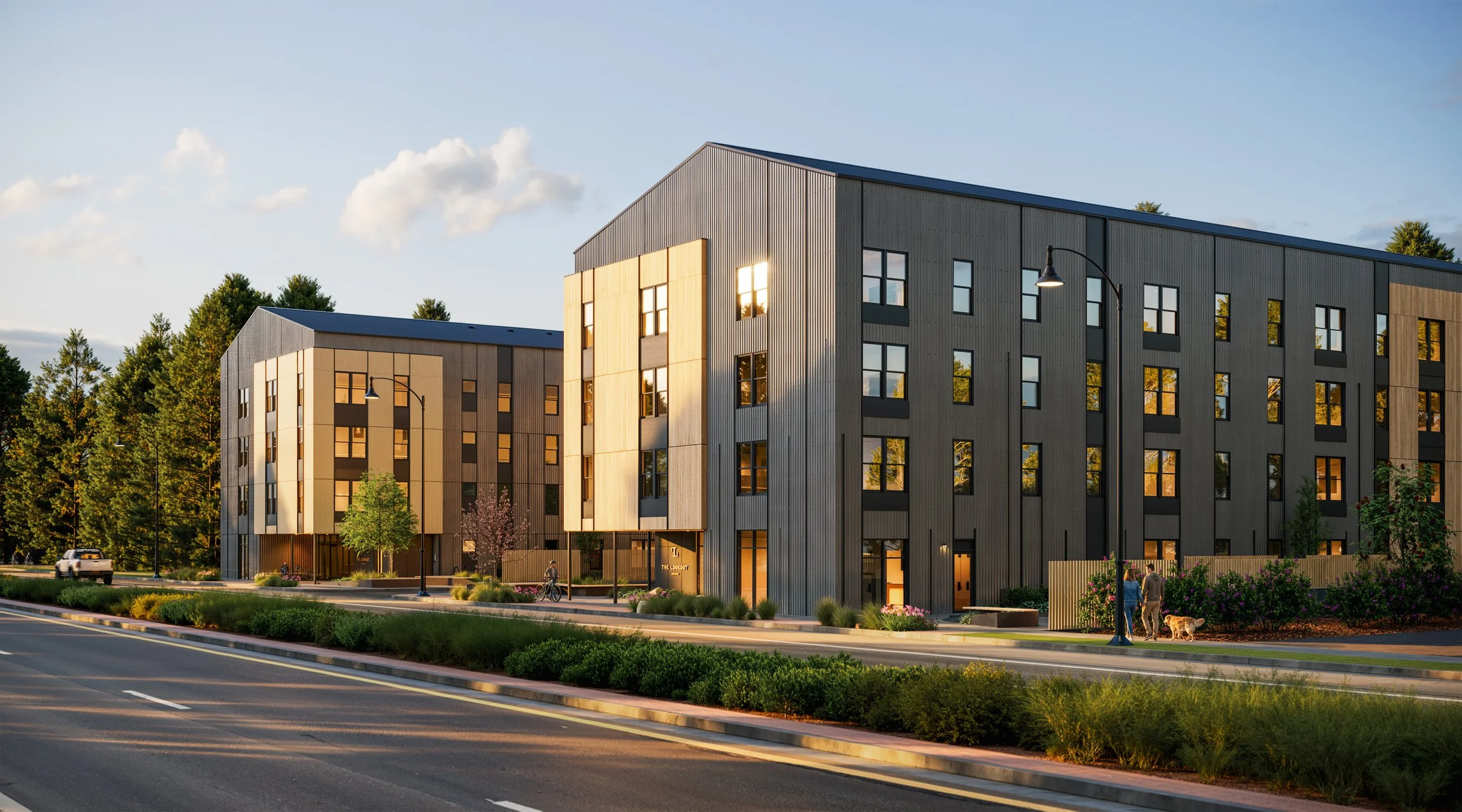
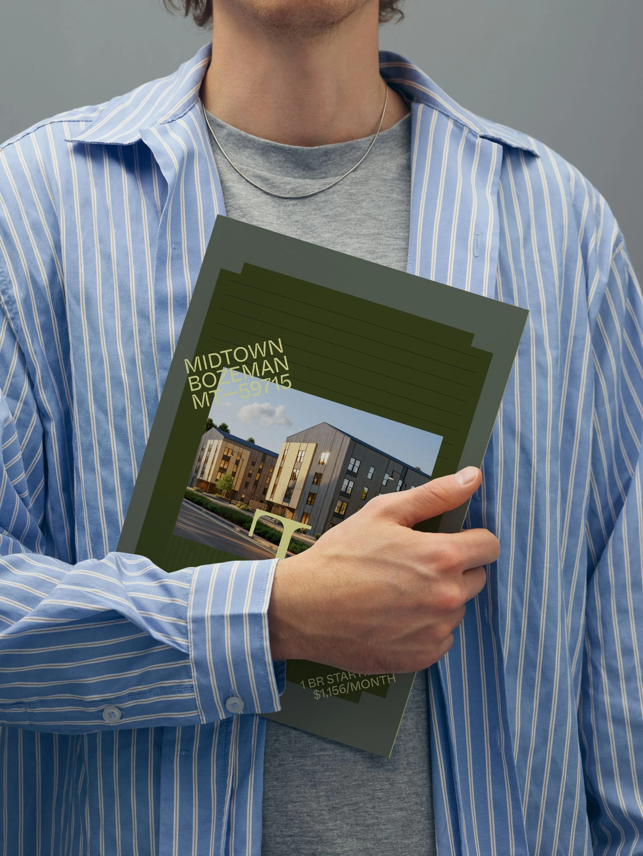
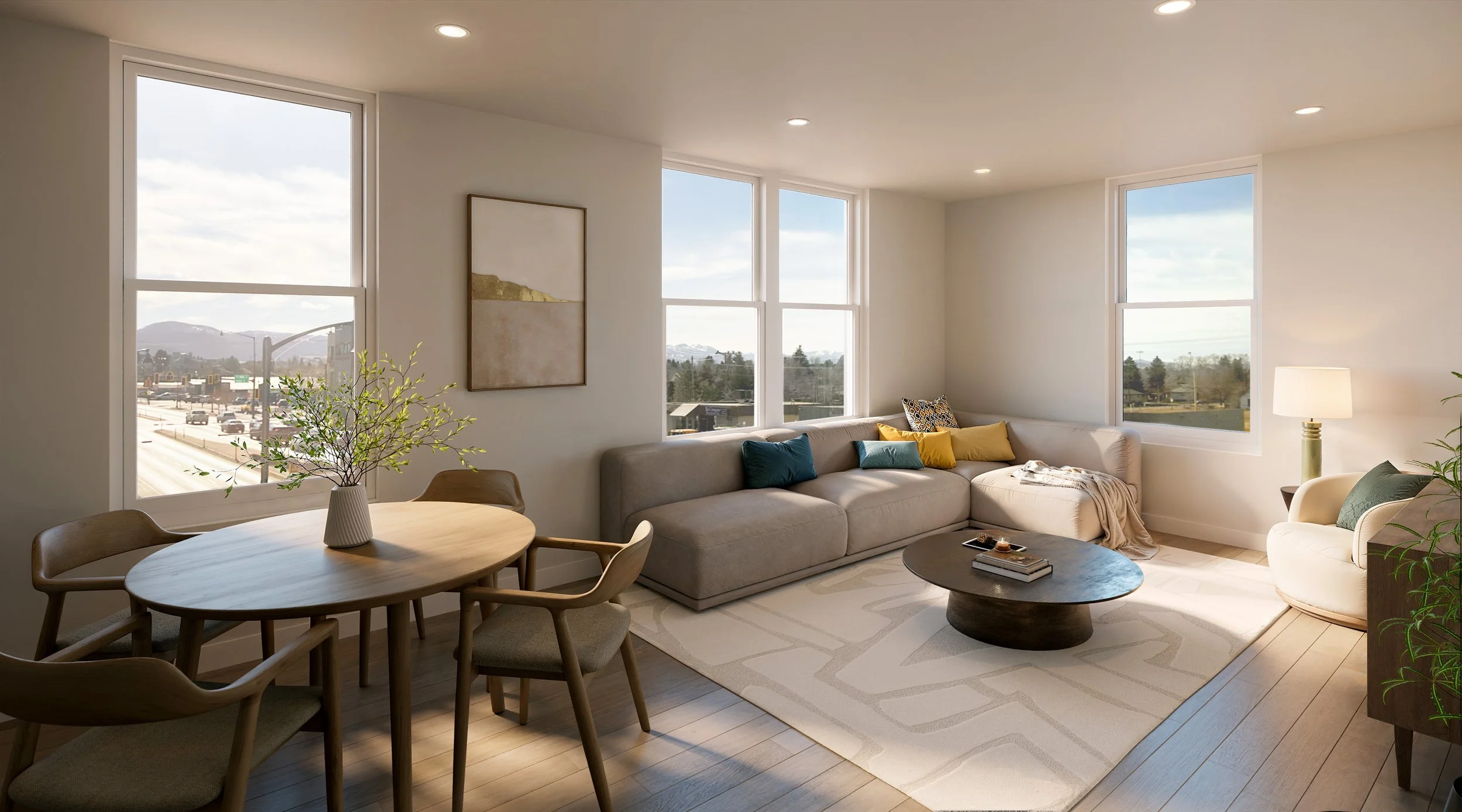
The Lookout Apartments in Bozeman are an affordable housing community of two new buildings at 7th and Main in Midtown. The challenge was making attainable housing feel like a place people would be proud to call home, with no hint of compromise. We designed the logo and identity, wrote the marketing copy, and carried the brand through the brochure, the website, and the lease-up signage. The result is a community that reads as modern, warm, and unmistakably Bozeman, and it's clearly for locals.

Our Role
Brand Development
Brand Identity
Brand Guidelines
Marketing Copywriting
Print Collateral
Marketing Signage
Website

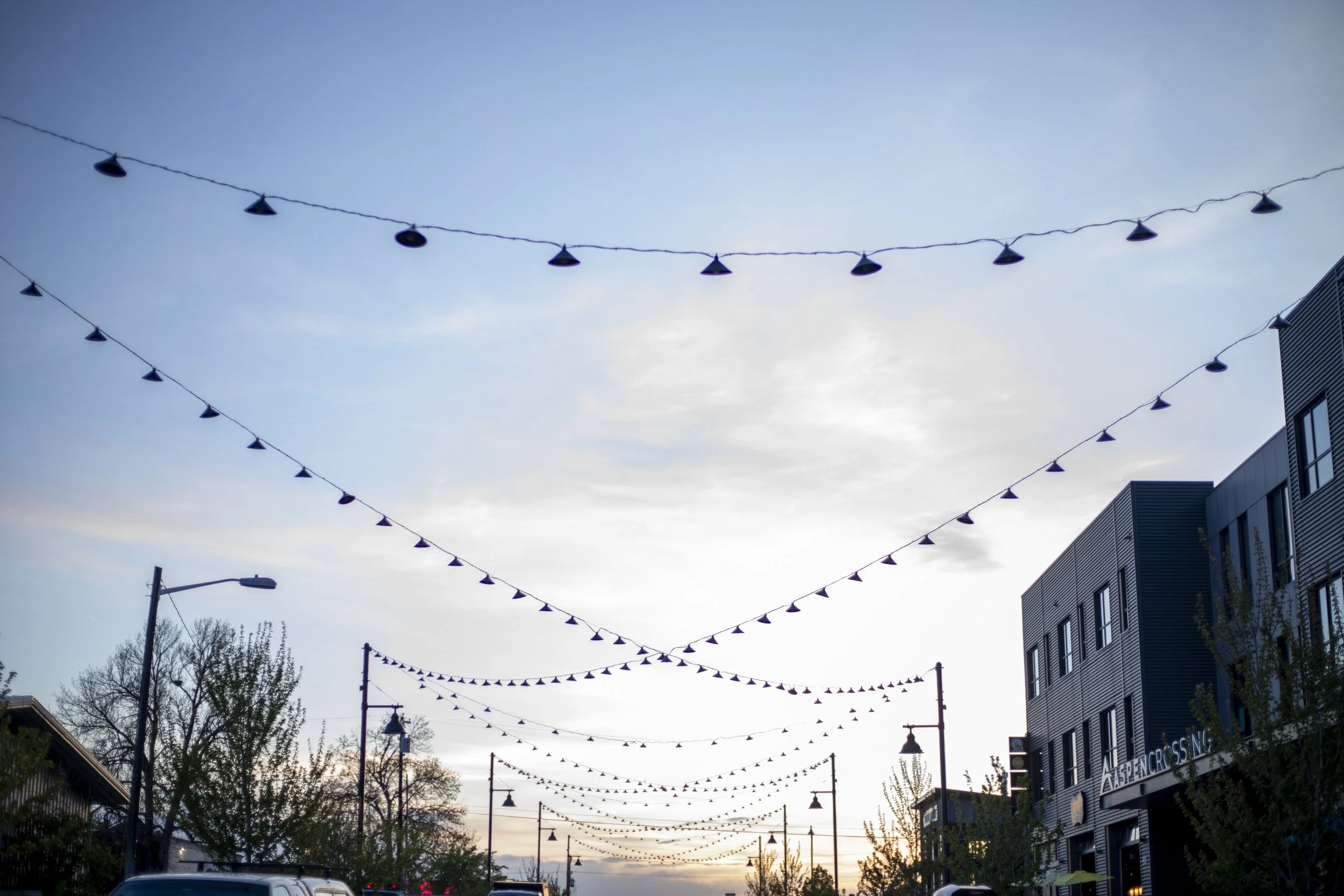
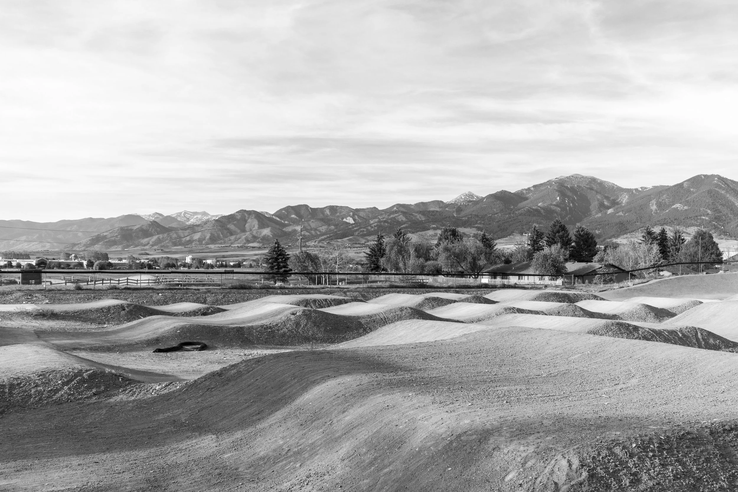
Midtown is a neighborhood with mid-century roots and a strong sense of community, and it's growing thoughtfully. New housing, new sidewalks, and new energy along Aspen Street sit right next to Bozeman icons like the Haufbrau, the Rainbow Hotel, and the Lewis and Clark Hotel. The Lookout stands at the center of that change, offering a new point of view on Bozeman living: Right on 7th, close to Main, easy to everything.
The positioning, Built for Bozeman, put the people who make the town work at the heart of the story: teachers, nurses, service workers, and young professionals who want to stay in the city they love. The copy leaned into everyday life in the neighborhood. Residents can walk to coffee, bike to work in minutes, and make a fast getaway to Bridger Bowl, Hyalite Canyon, or the Story Mill Trail when the weekend starts. The Lookout is modern, well-appointed living made attainable, and it's designed so residents can plant roots in a community that's on the rise.

The Story
Brand Direction
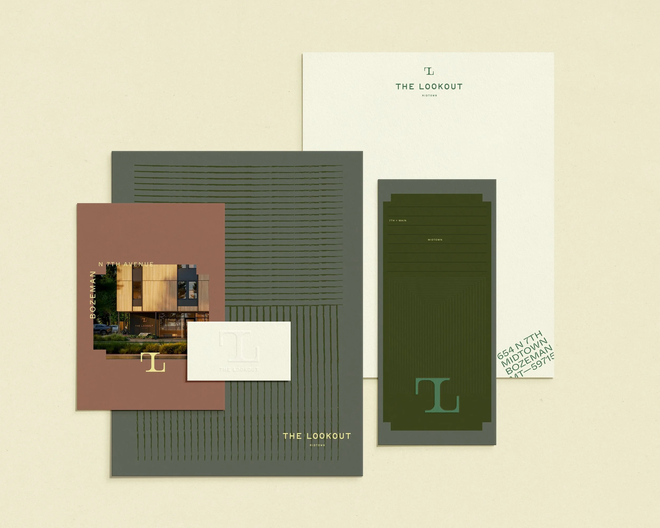
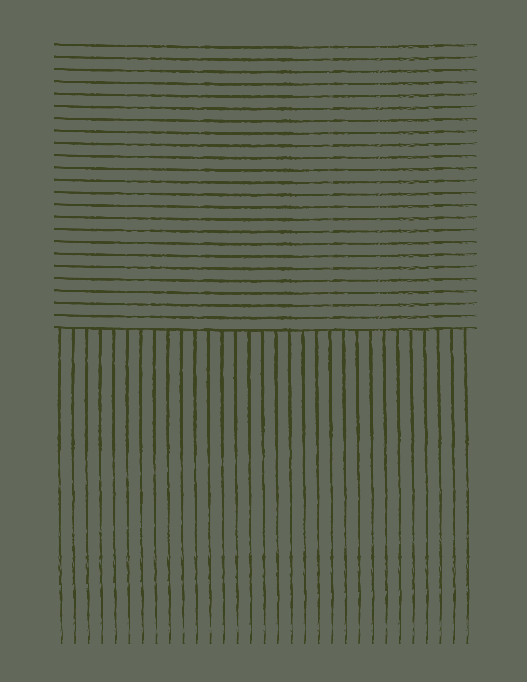
The visual language borrows from Montana's landscape and Midtown's mid-century character, and it's grounded, optimistic, and a little playful. An earthy palette of deep forest, grass green, and soft sage is warmed by golden mustard and clay, and a bright lemon keeps the brand feeling fresh and approachable.
Brand Toolkit
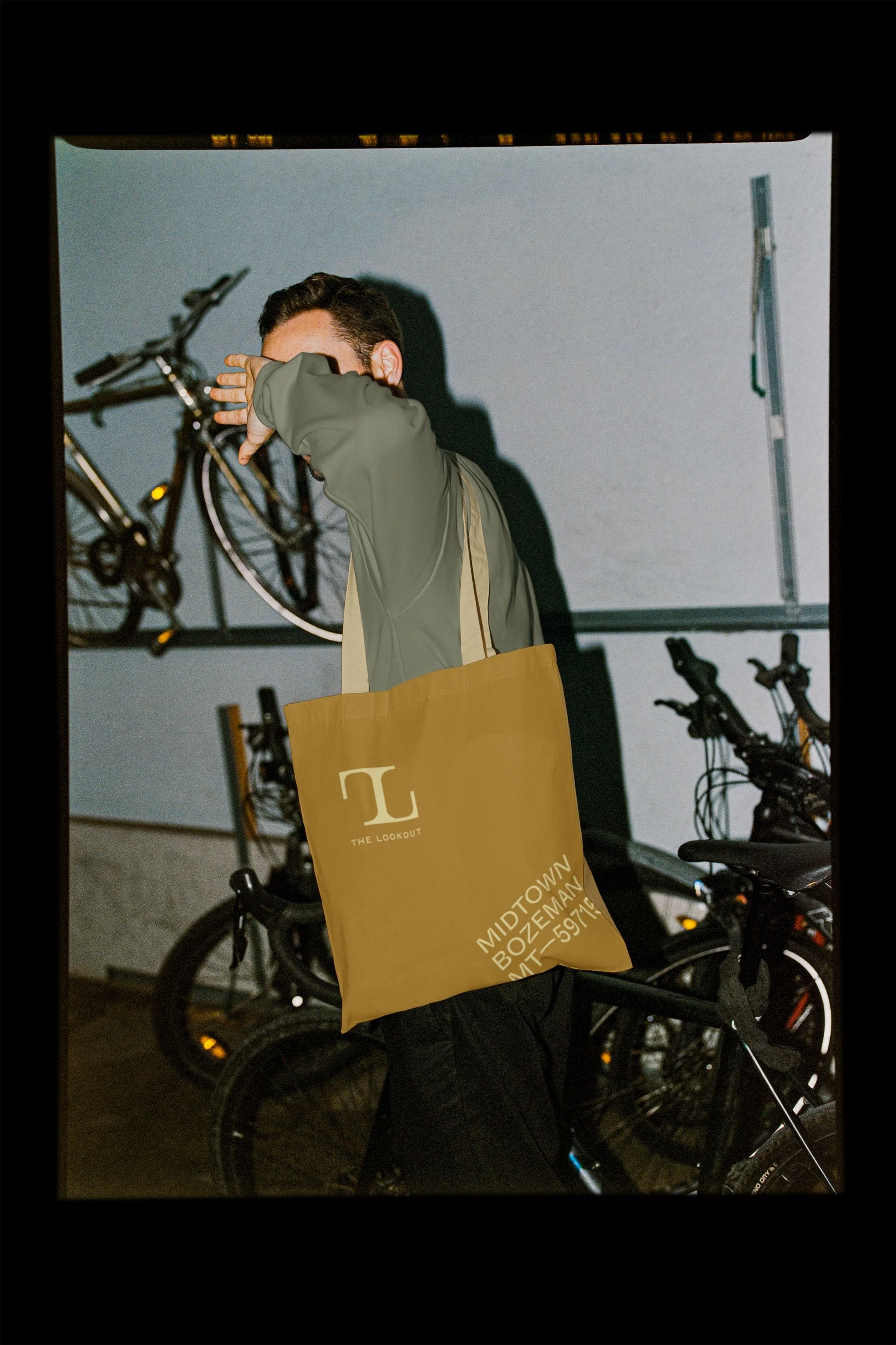
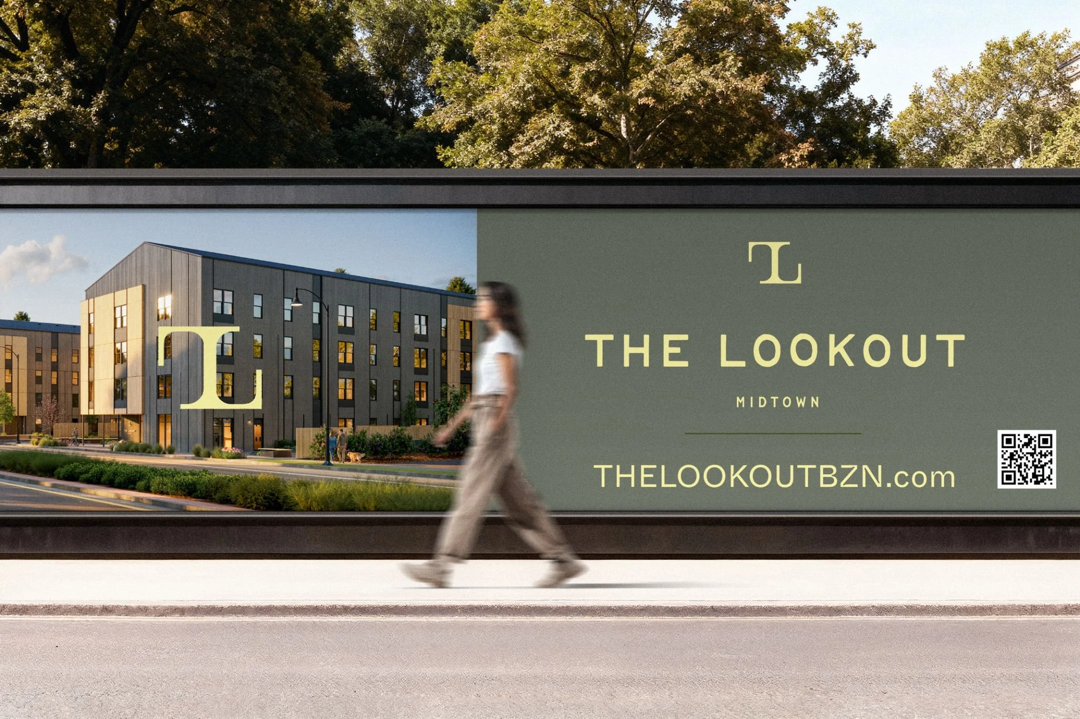
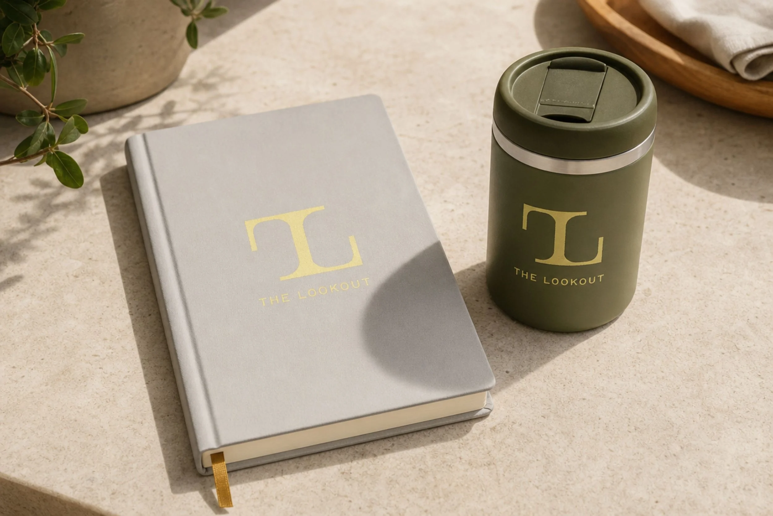
Everything was built to help a community-minded project lease up quickly and connect with the locals it was made for. Starting with the logo and brand guidelines, we developed a complete identity system and developed the copy that gives every page its voice, from the website to the brochure. We created bold 10' x 6' fence panels that announced "Built for Bozeman" to the neighborhood while construction wrapped up.