Chronicle
CLIENT: Soltrust
PROPERTY MANAGEMENT: Redside Partners
INTERIOR DESIGN: Weber Thompson
INTERIOR PHOTOGRAPHY: Cindy Apple
LIFESTYLE PHOTOGRAPHY: Jenny Jimenez

Objective

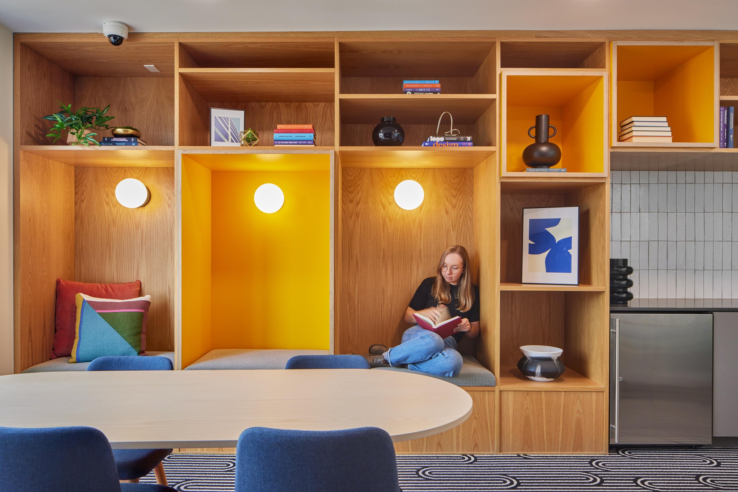
Chronicle is a boutique apartment community in Wallingford, the Seattle neighborhood that connects to Lake Union — vintage craftsman charm, eclectic storefronts, and a walkable, lived-in personality that's been accumulating for a century. The building needed a name and identity that could hold the character and still feel airy, modern, and elevated. We started with the story of the place, built a brand narrative and inspiration board that went on to shape the interior design direction, and carried a single idea — a neighborhood worth chronicling — through every piece of the brand.

Our Role
• Brand Development
• Naming
• Brand Identity
• Brand Guidelines
• Marketing Copywriting
• Lifestyle Photography
• Print Collateral
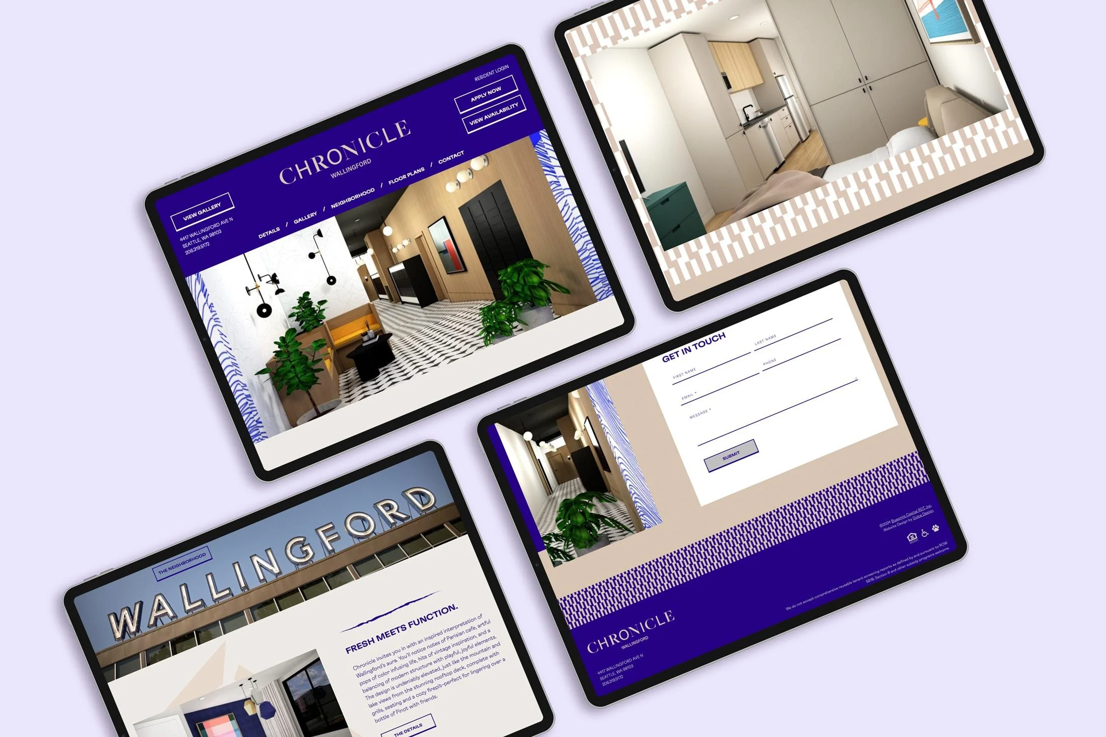
• Website Design + Development


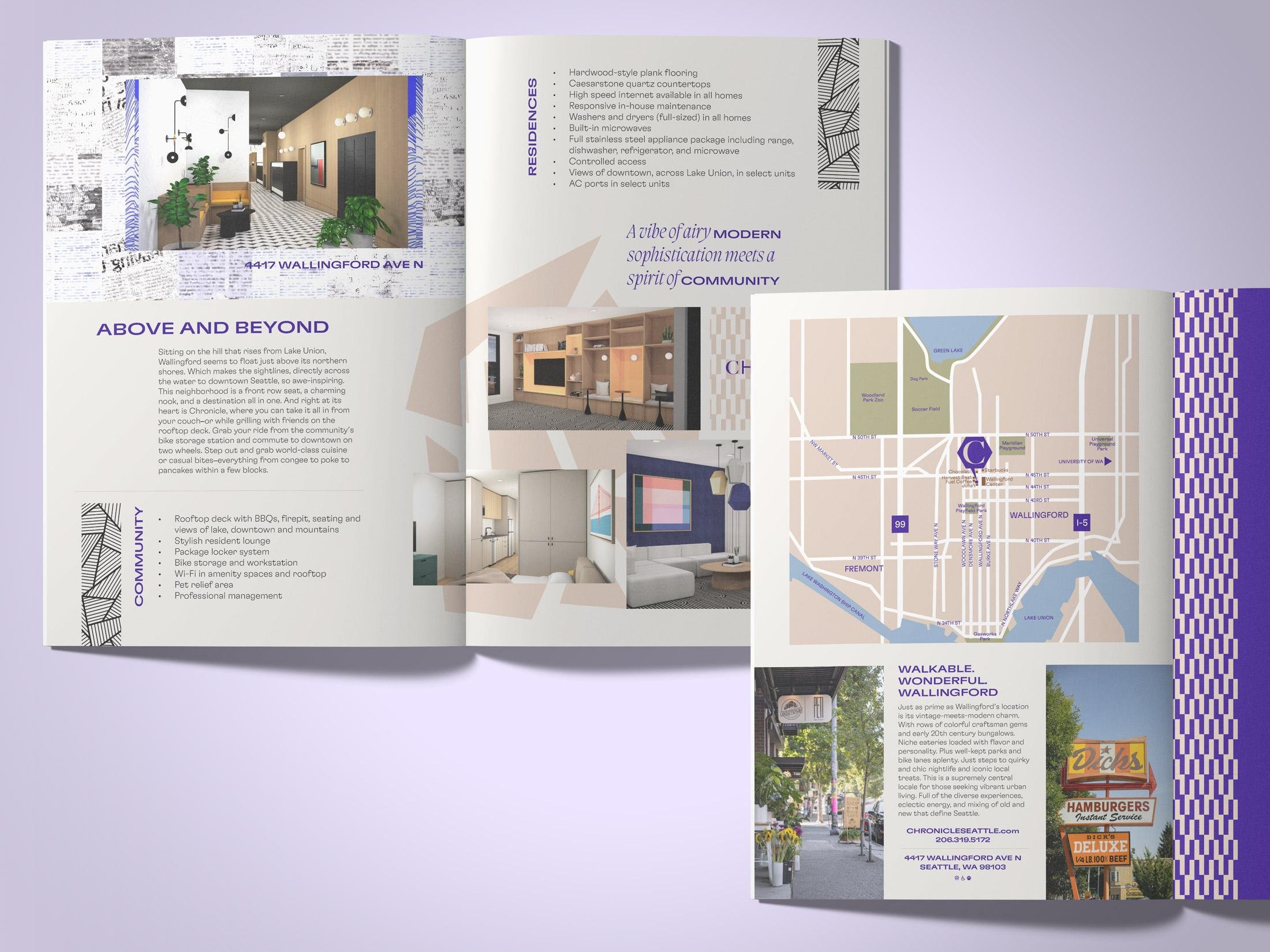
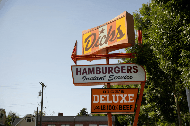
Wallingford is a front-row seat, a charming nook, and a destination all at once — Parisian-cafe energy and craftsman bungalows, record shops and rubber-chicken novelty stores, congee and poke and pancakes all within a few blocks. The name Chronicle leans into that sense of an ongoing, layered story: a neighborhood that keeps writing itself, and a place where residents add the next chapter. The positioning balanced the two sides of Wallingford — airy modern sophistication meeting a genuine spirit of fun and community.
To capture it honestly, we art-directed photography by Seattle street photographer Jenny Jimenez, whose work caught the historic, quirky, eclectic, walkable spirit of the neighborhood exactly as it lives — vintage signage, local color, and the everyday texture that makes Wallingford feel like nowhere else.
The Story


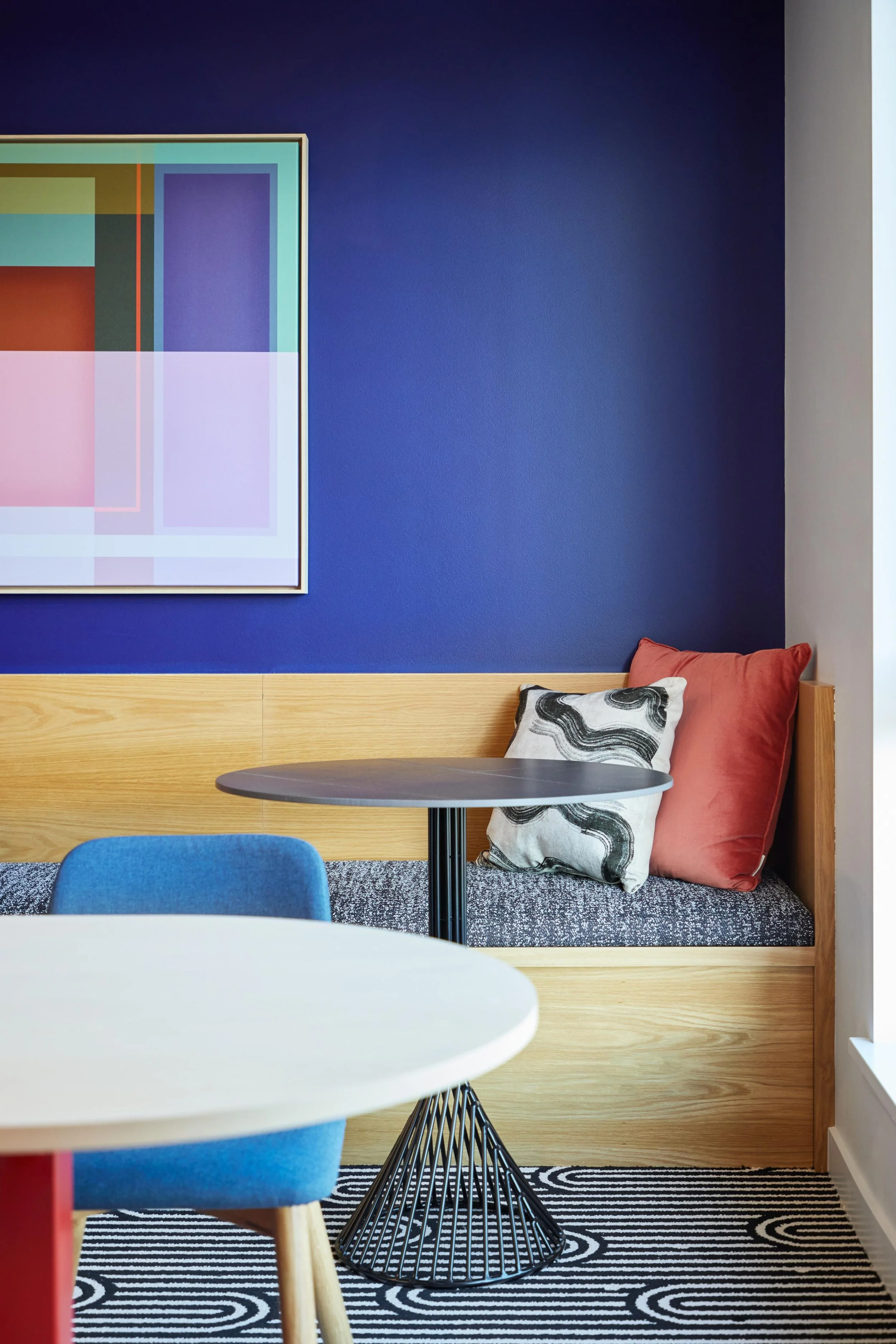
Brand Direction
The identity pairs structure with playfulness. A confident palette of deep indigo and warm chestnut, grounded by sand and warm grays, gives the brand its elevated, slightly vintage feel. Typography leads with GT Flexa across headlines and body for clean modern bones, lifted by Migra Italic as an expressive highlight, while a flexible pattern and graphic-element system — drawn from the layered, clipping-and-collage feel of a chronicle — keeps the brand lively across every surface.