Ballard Yards
CLIENT: Carmel Partners
PROPERTY MANAGEMENT: Greystar
LIFESTYLE PHOTOGRAPHY: Dave Estep Photography
EXTERIOR MURAL ARTIST: Sarah Robbins
INTERIOR MURAL ARTIST: Kyler Martz
SCULPTURE ARTIST: George Lee
Objective
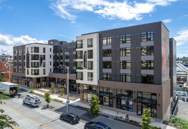
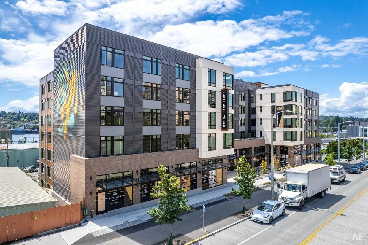
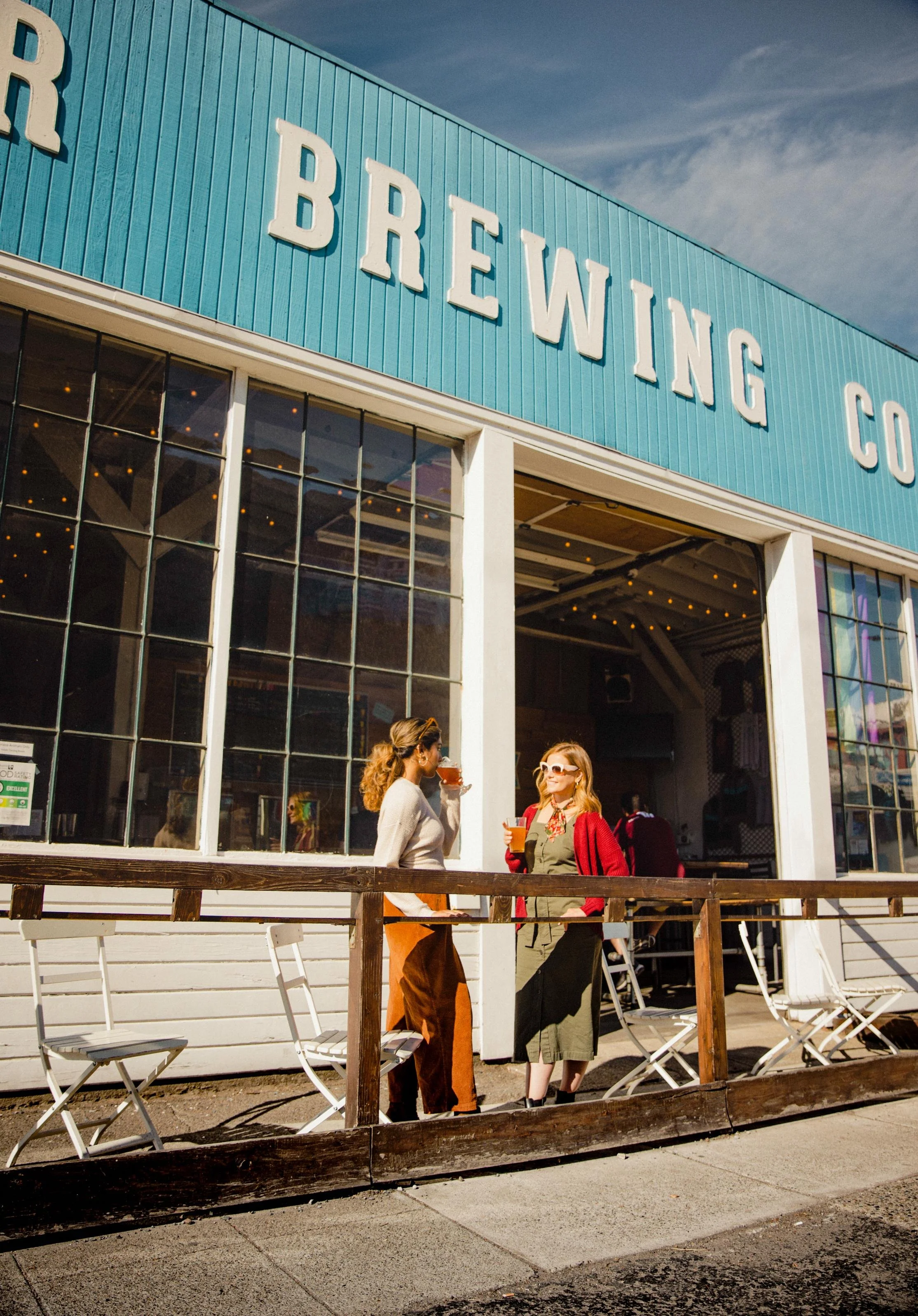
Ballard Yards is located on Market Street in the historic and charming neighborhood of Ballard. It’s a Scandinavian fishing village turned maritime working waterfront, all grit and salt and hard-won character. Our work began with research and a brand narrative that captured what makes Ballard Ballard, then carried that single idea outward into everything from the interiors to the sculpture out front. The result is a brand that settles seamlessly into place — at the intersection of where Ballard has been and where it's headed.

Our Role
Brand Development
Naming + Positioning
Brand Identity
Brand Guidelines
Marketing Copywriting
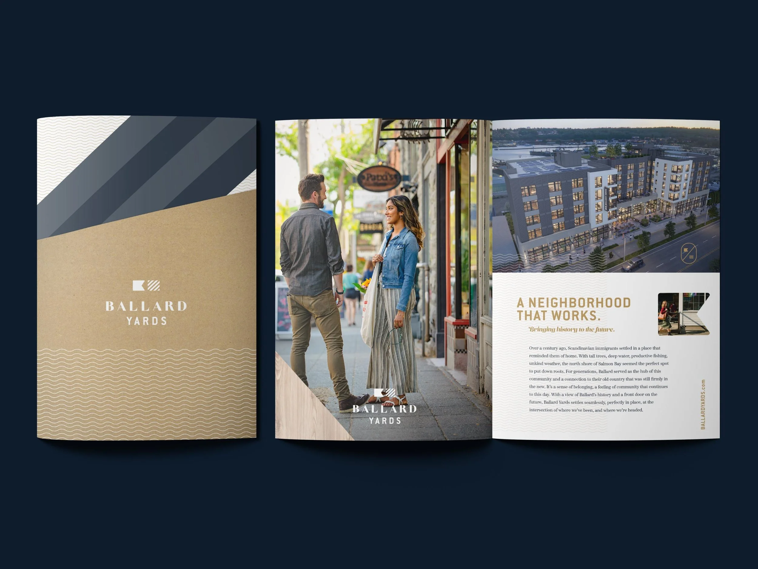
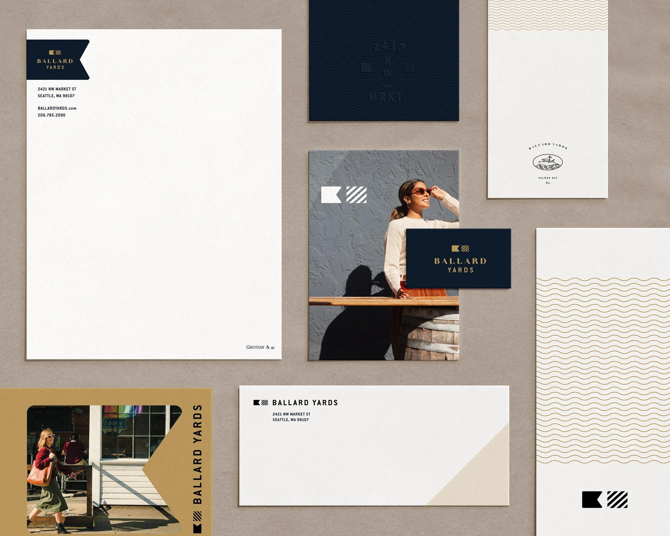
Print Collateral
Marketing Signage
Website Design
Email Drip Campaign
Lifestyle and Neighborhood Photography
Art Direction


The Story
A century ago, Scandinavian immigrants put down roots on the north shore of Salmon Bay — tall trees, deep water, productive fishing, unkind weather, and a place that reminded them of home. Generations later, Ballard still runs on that mix of tradition and forward motion: century-old buildings full of modern shops and breweries, the locks and the boats, an indomitable, get-down-to-business sense of self.
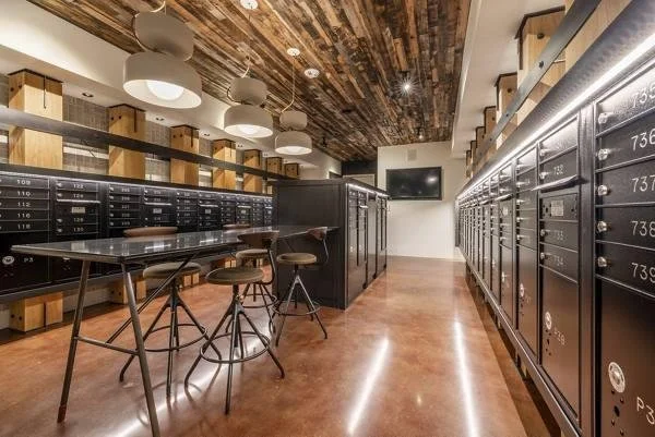
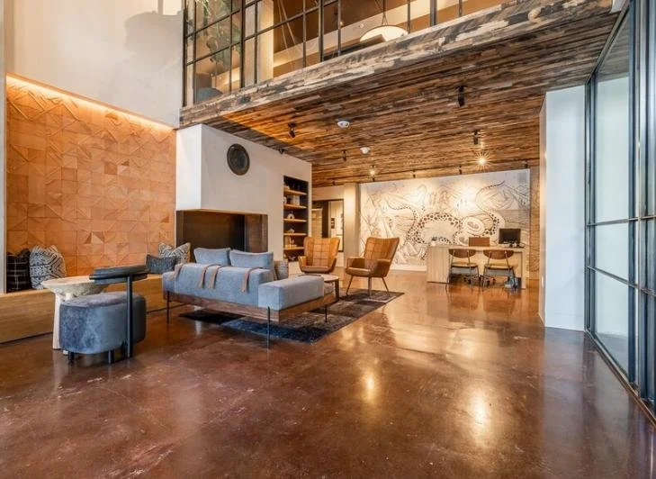
The brand story we developed put that history at the center, and it became the inspiration for everything that followed — including the interior design direction, which grew directly out of our inspiration board. The name Ballard Yards nods to the shipyards right in front of the building, anchoring the community in its working-waterfront setting. From there the idea extended into the building itself: we consulted on the murals by artist Sarah Robbins and on the maritime sculpture by George Lee that greets residents at the entrance.
Brand Direction
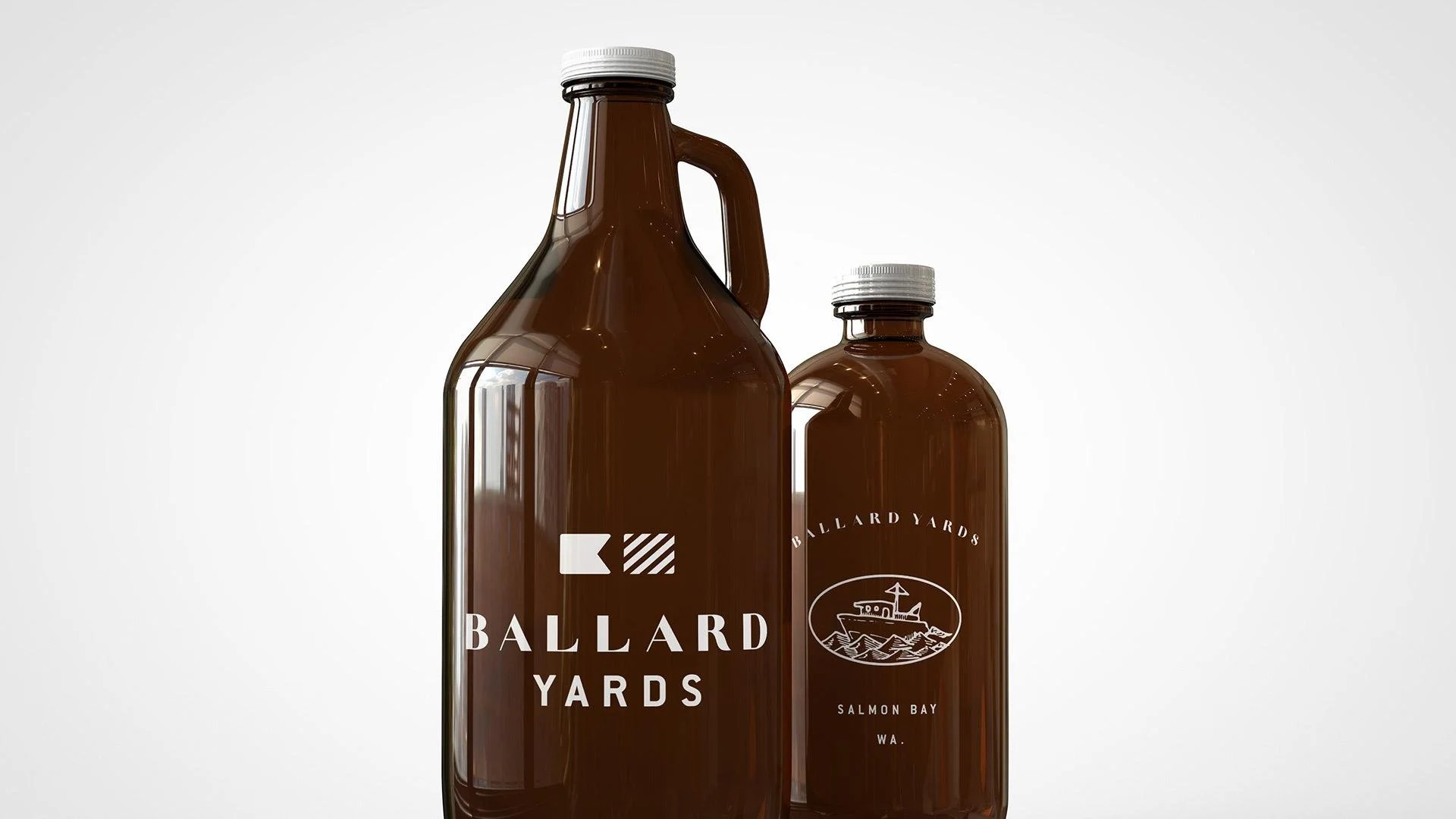
The identity bridges heritage and modernity with a confident, nautical hand. A palette of brass and deep navy, warmed by sand and a range of cool and warm grays, gives the brand its maritime weight without tipping into kitsch. A family of illustrated elements — a boat icon, anchor, nautical flag symbols for the B+Y monogram, knotwork, and a Salmon Bay address mark — gives Ballard Yards a flexible visual vocabulary rooted in the history and the water.
Brand Toolkit
The brand carried cleanly across every touchpoint of the leasing journey. We art-directed a lifestyle and neighborhood photoshoot to capture Ballard's people and pace, then designed the brochure, the website, the marketing windows and banners along Market Street, and an email drip campaign to keep prospects engaged.