Carrick
Client: SolTrust
Property Management: Redside Partners
Interior Photography: Cindy Apple
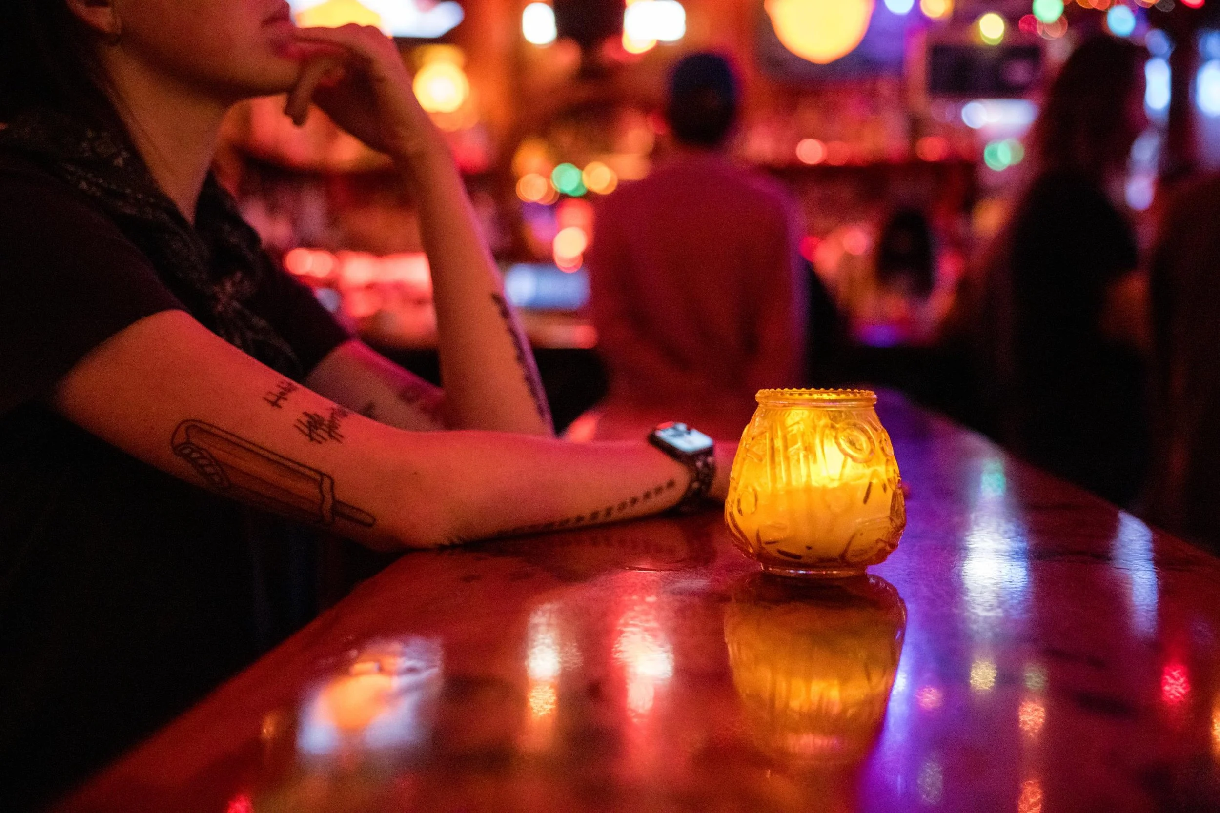
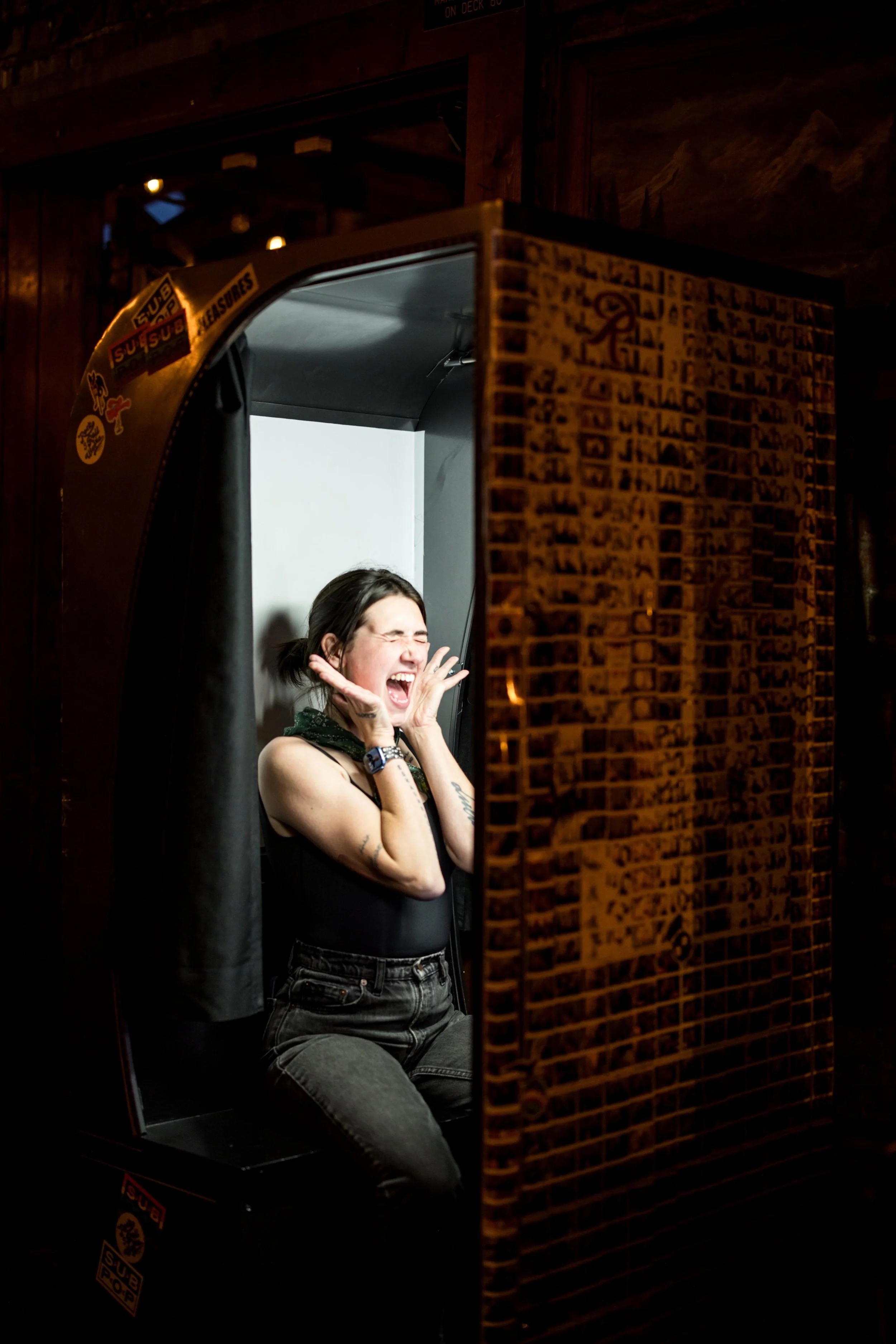
Lifestyle Photography: Jenny Jimenez
Objective
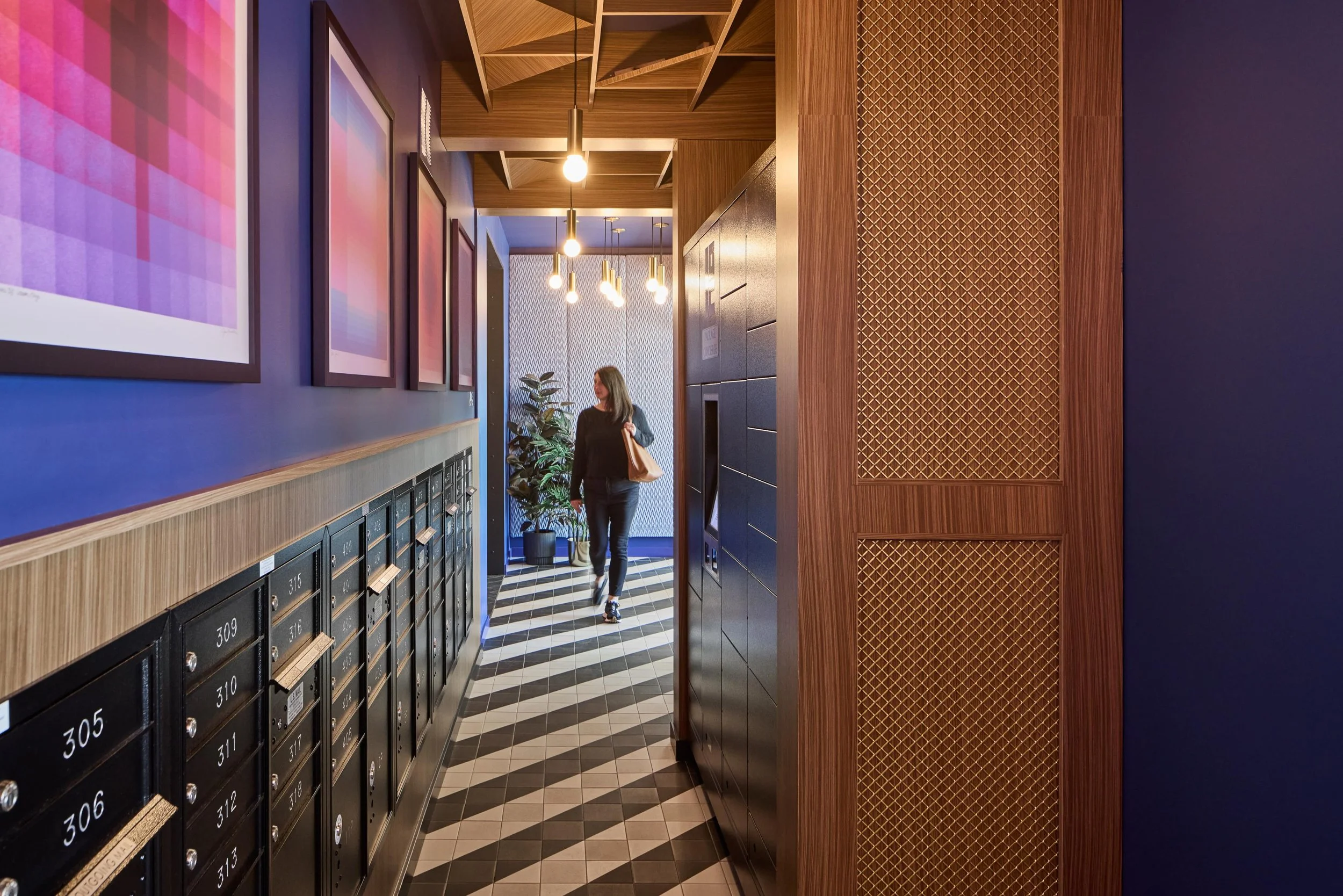
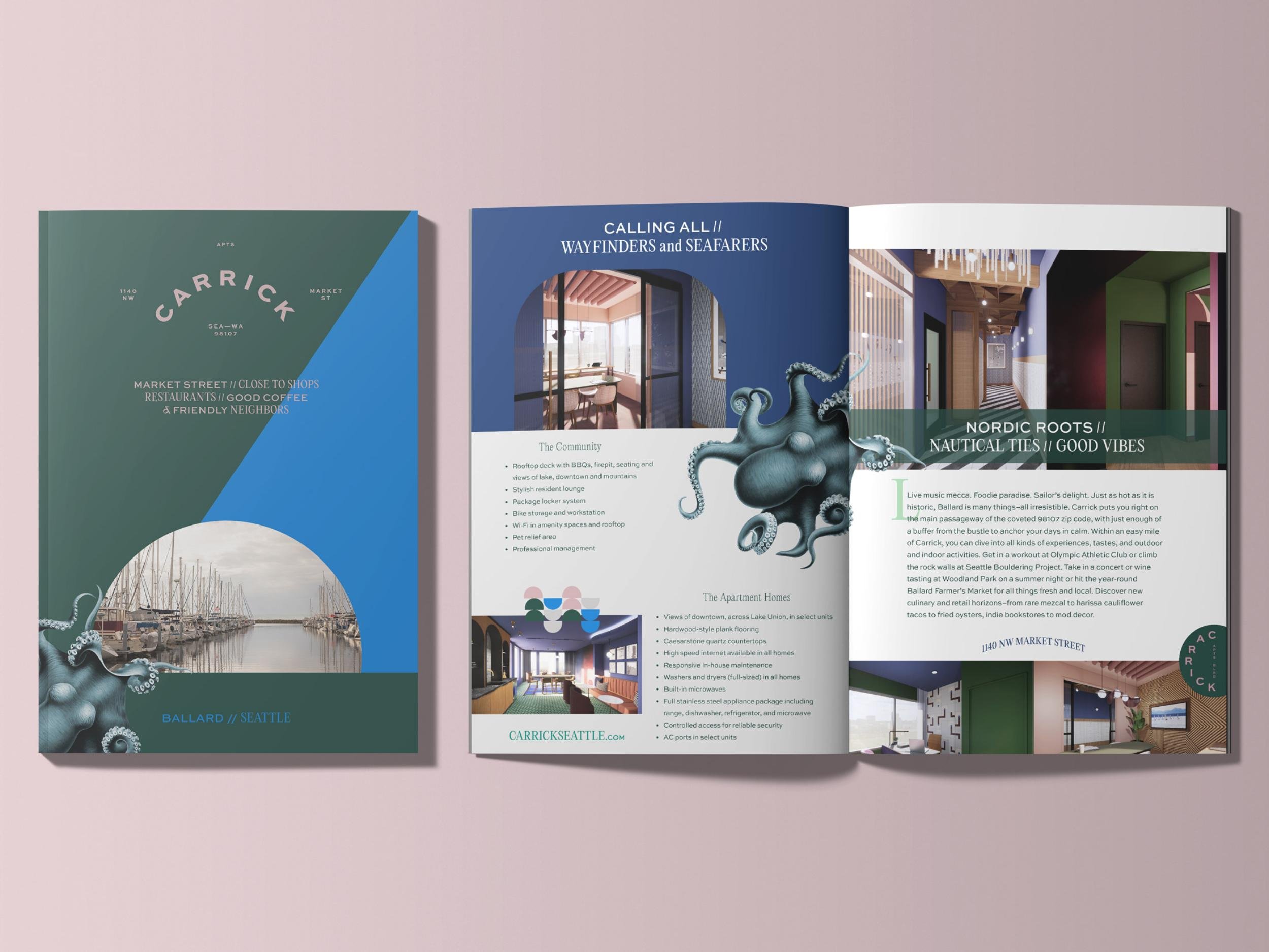
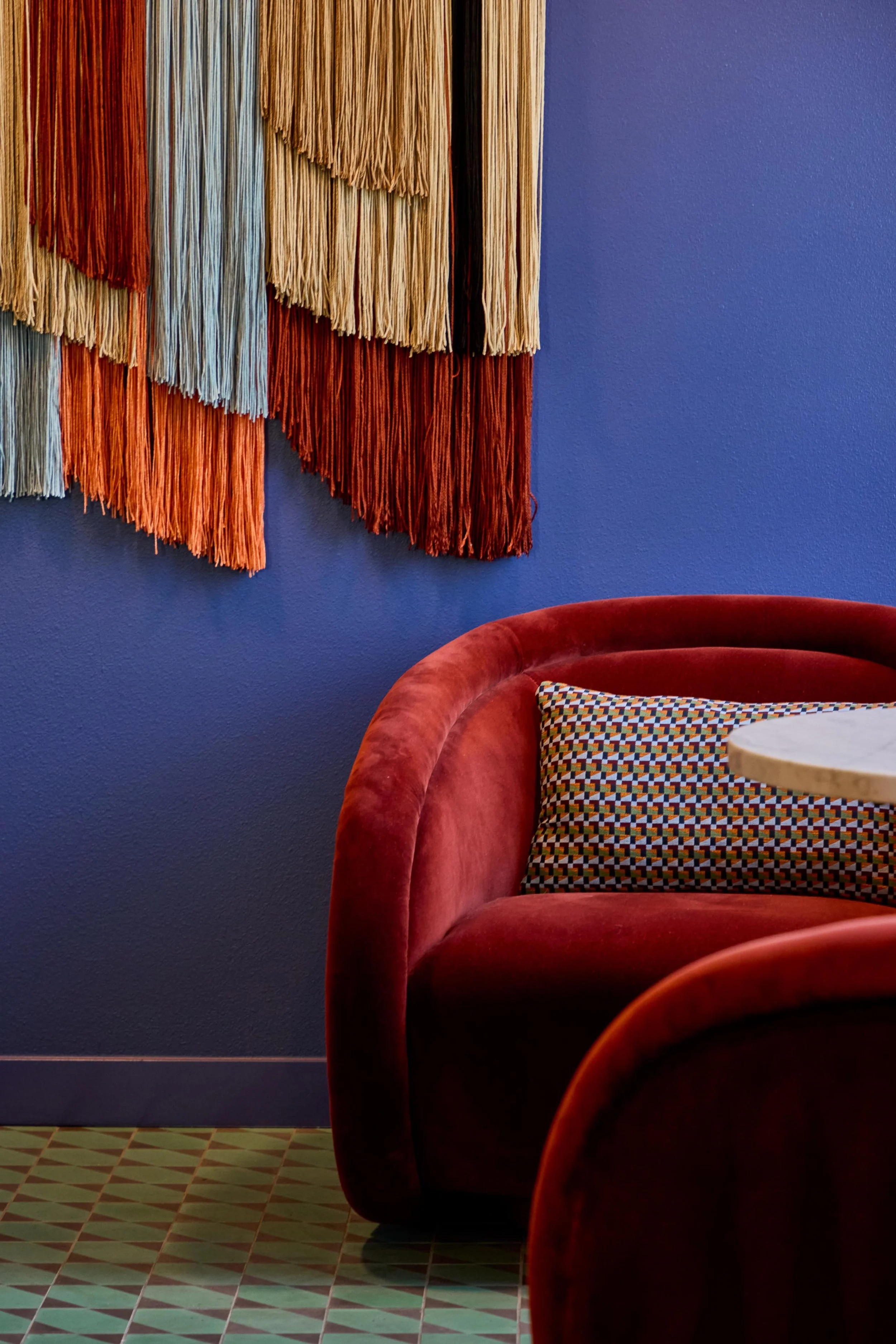
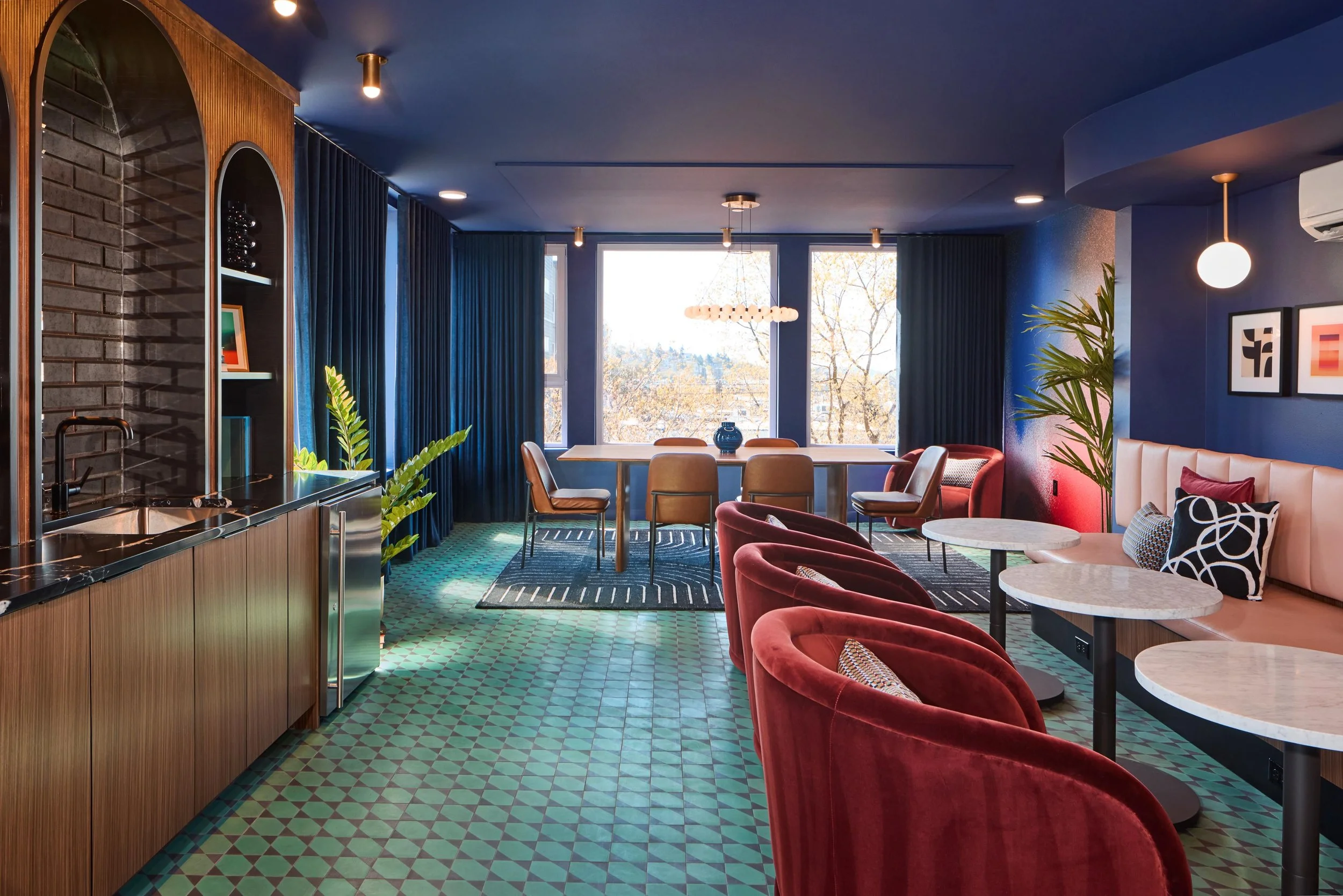
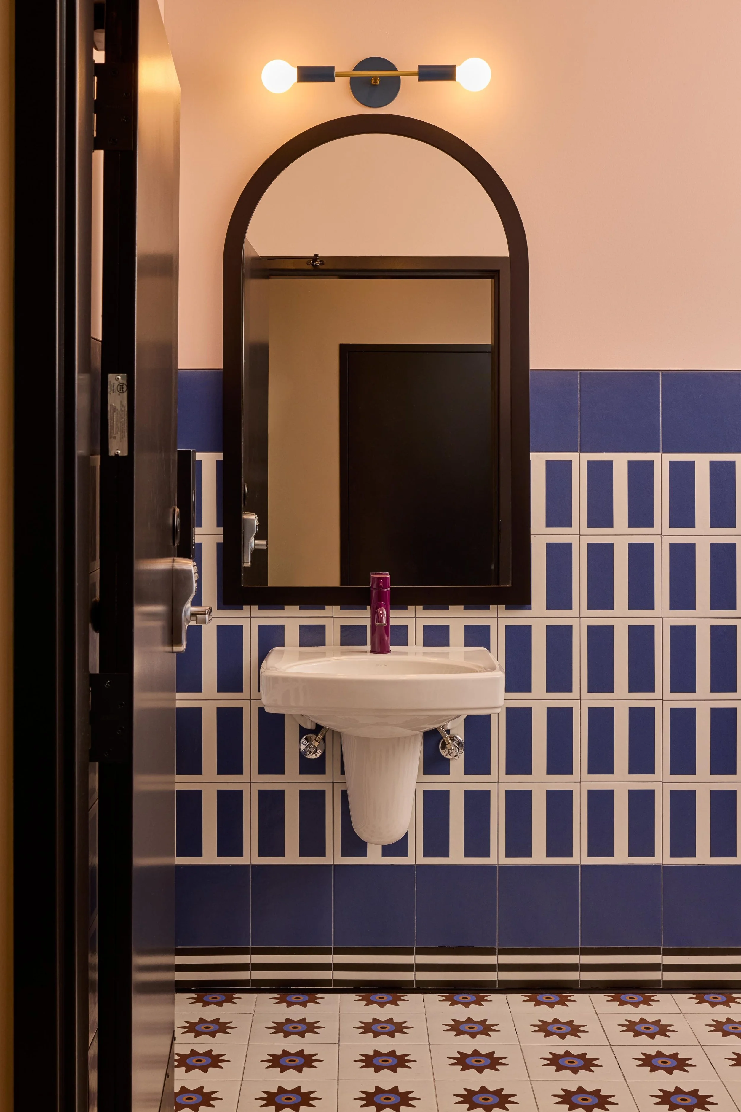
Carrick arrived as a new boutique community right on NW Market Street, the central thoroughfare of Ballard — a historic, proudly diverse neighborhood with deep Scandinavian and maritime roots, where eclectic shops, hip bars, and trendy restaurants line the streets. The brand needed to fit naturally into that storied, creative neighborhood while still making a statement of its own. We started at the beginning, developing the brand story, the name, and a brand identity built to belong on Market Street but stand out from the competitors. Early on, we created an inspiration board that the interiors team at Weber Thompson used to shape bright, welcoming, and distinctly original interiors — so the building, the spaces inside, and the brand all came from the same place.
Our Role
• Brand Identity
• Brand Guidelines
• Logo Variations
• Brand Elements + Patterns
• Typography System
• Photography Style Direction
• Brand Toolkit for In-House Use
The Story
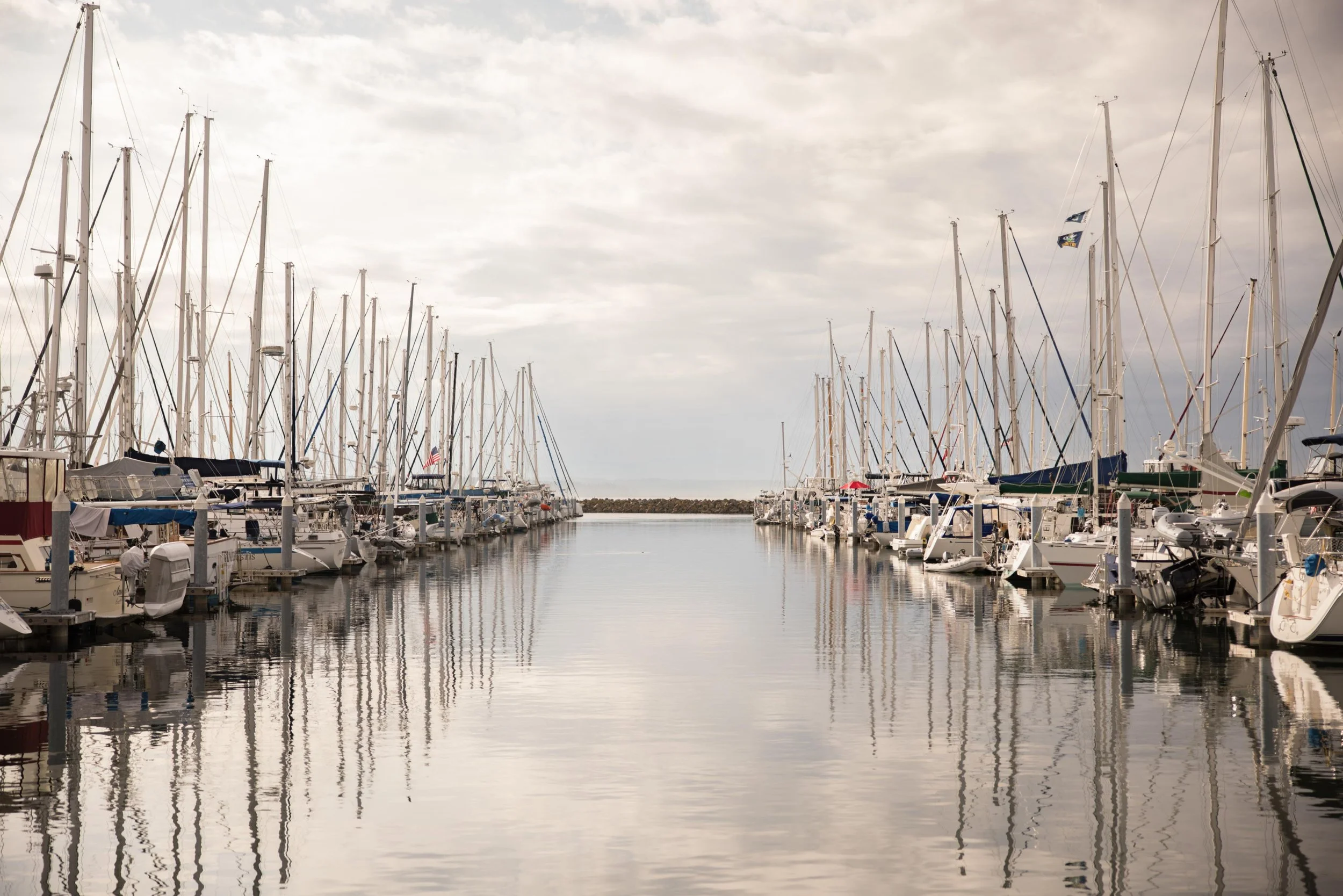
Just five miles from downtown as the crow flies, Ballard is its own waterfront destination — Nordic roots, nautical ties, and good vibes all woven together. Early Scandinavian settlers and a working maritime past left an indelible mark, and today indie shops, open-air markets, and world-class cuisine sit side by side, wholeheartedly appreciated by supportive locals. The brand had to capture that mix of history and energy.
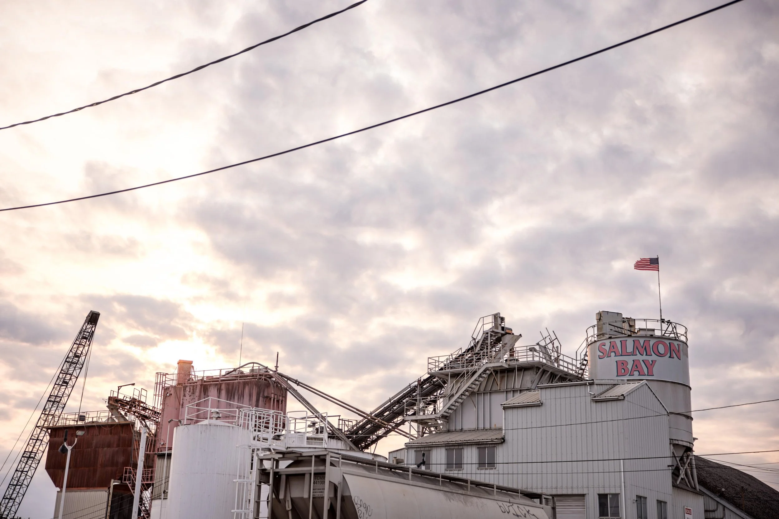
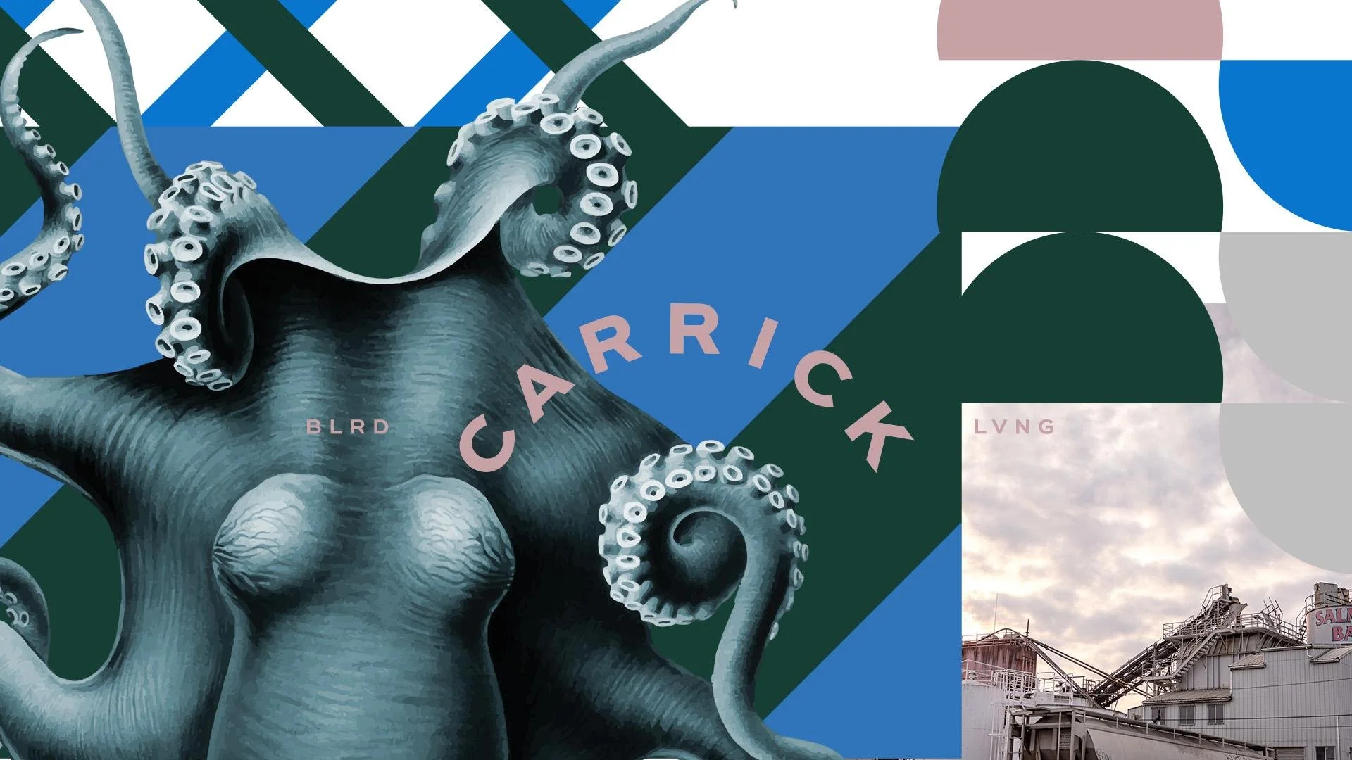
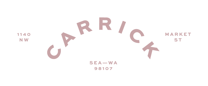
The name Carrick comes straight from the water: the Carrick bend, also called the Sailor's Breastplate, is a knot used to join two heavy ropes — known for handling significant weight and holding fast even when submerged. It's a quiet, perfect metaphor for a community built to bring people together, anchoring residents in a close-knit place while keeping them open to adventure. The positioning leaned into that wayfinding spirit — find your mooring, smooth sailing, a close-knit community open to adventure — speaking to people who want to be in the thick of Ballard's energy, with just enough of a buffer from the bustle to feel like home.
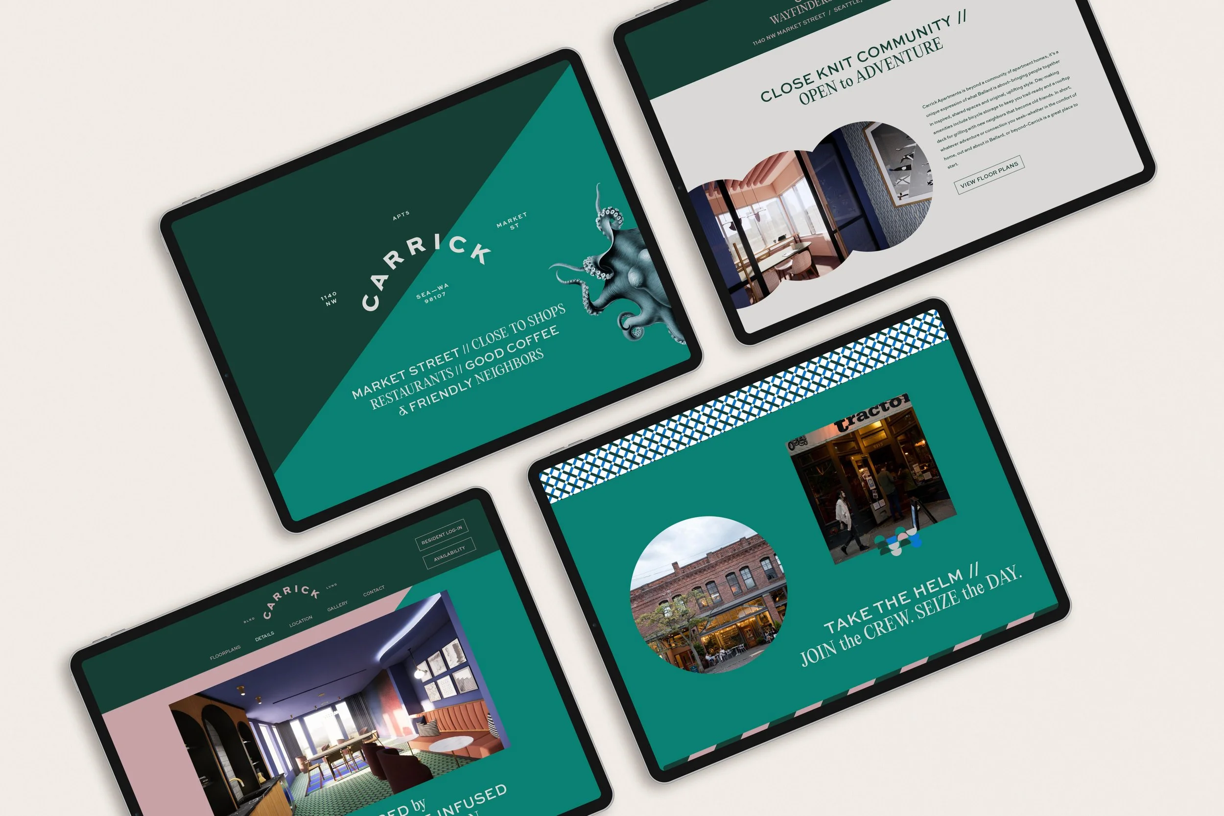
Brand Direction
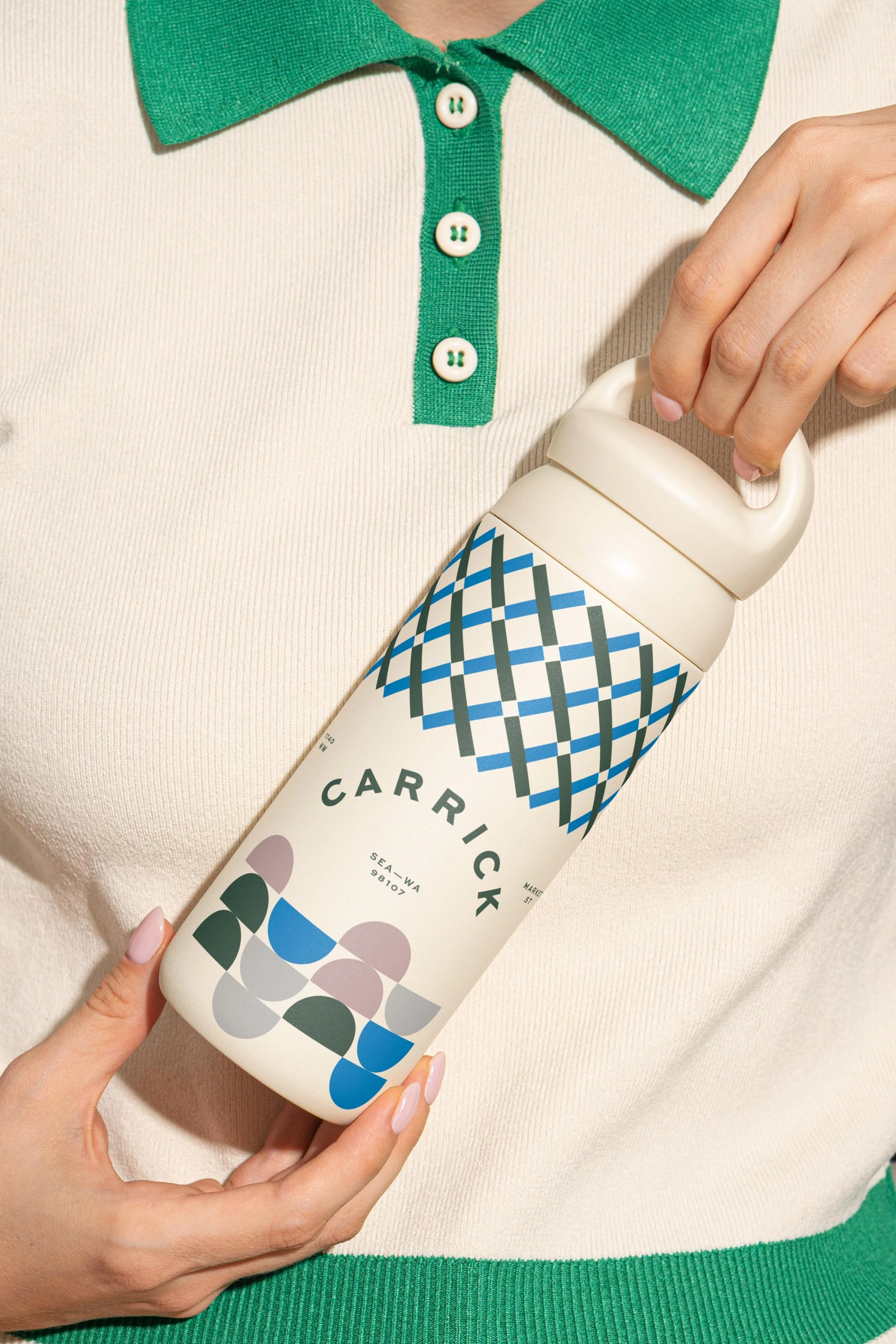
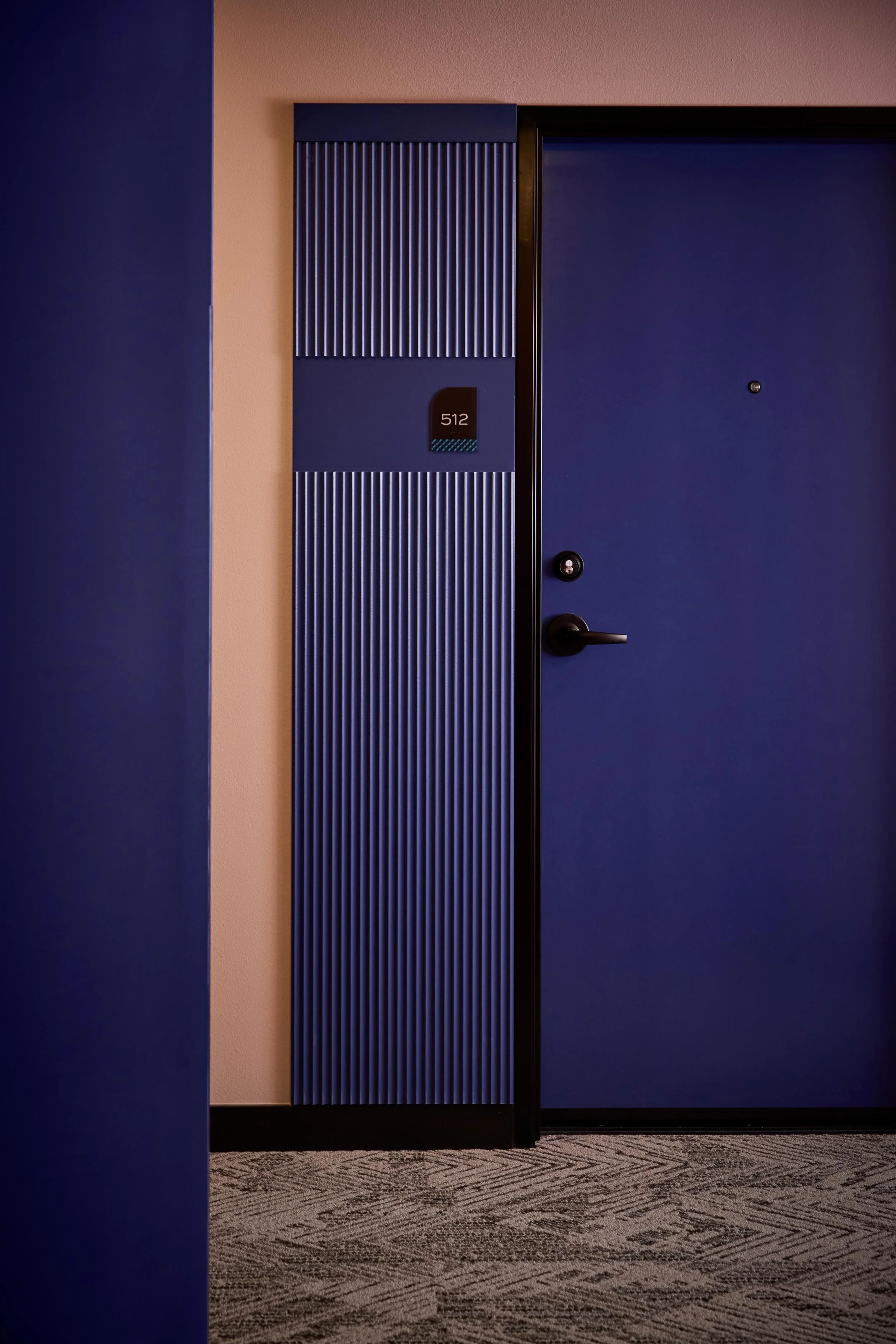
The visual language draws on Ballard's maritime character with a fresh, modern twist. A palette of deep nautical green and navy, brightened by teal, a clear bright blue, and a soft rose accent, gives Carrick a sense of place that feels both grounded and elevated — chic waterfront café meets boutique hotel. A flexible logo and tagline system, knot-inspired secondary elements, and the "BLRD / APTS" mark plant the brand firmly in its neighborhood while letting it shift gracefully across the palette.

Brand Toolkit
Everything was built so the leasing team could carry one cohesive brand from the street to the screen. From the name and inspiration boards that guided both the identity and Weber Thompson's bright, welcoming interiors, we developed the full brand identity, brand style guidelines, and marketing copywriting that gives every page its voice. From there the brand extended into print collateral and brochures, a neighborhood lifestyle shoot by Jenny Jimenez that captured the energy and creativity of Ballard, and a custom-designed and developed website — all under a single art direction so Carrick reads as one clear idea from the sidewalk to the screen.