Artline Fremont
Client: B + E Consulting Partners
Property Management: Indigo Real Estate


Objective
Artline arrived as a new boutique building in Fremont with no name, no identity, and a lot of personality to live up to. Set along the ship canal and the Burke-Gilman Trail, at the meeting point of Fremont, Ballard, and Queen Anne, it needed a brand that felt as creative and connected as its neighborhood — elevated, design-forward, and unmistakably its own. We started at the very beginning, with the name, and built outward into a complete identity and toolkit the leasing team could carry into social media campaigns, marketing outreach, and the full website design without losing a thread of the original vision.


The Story
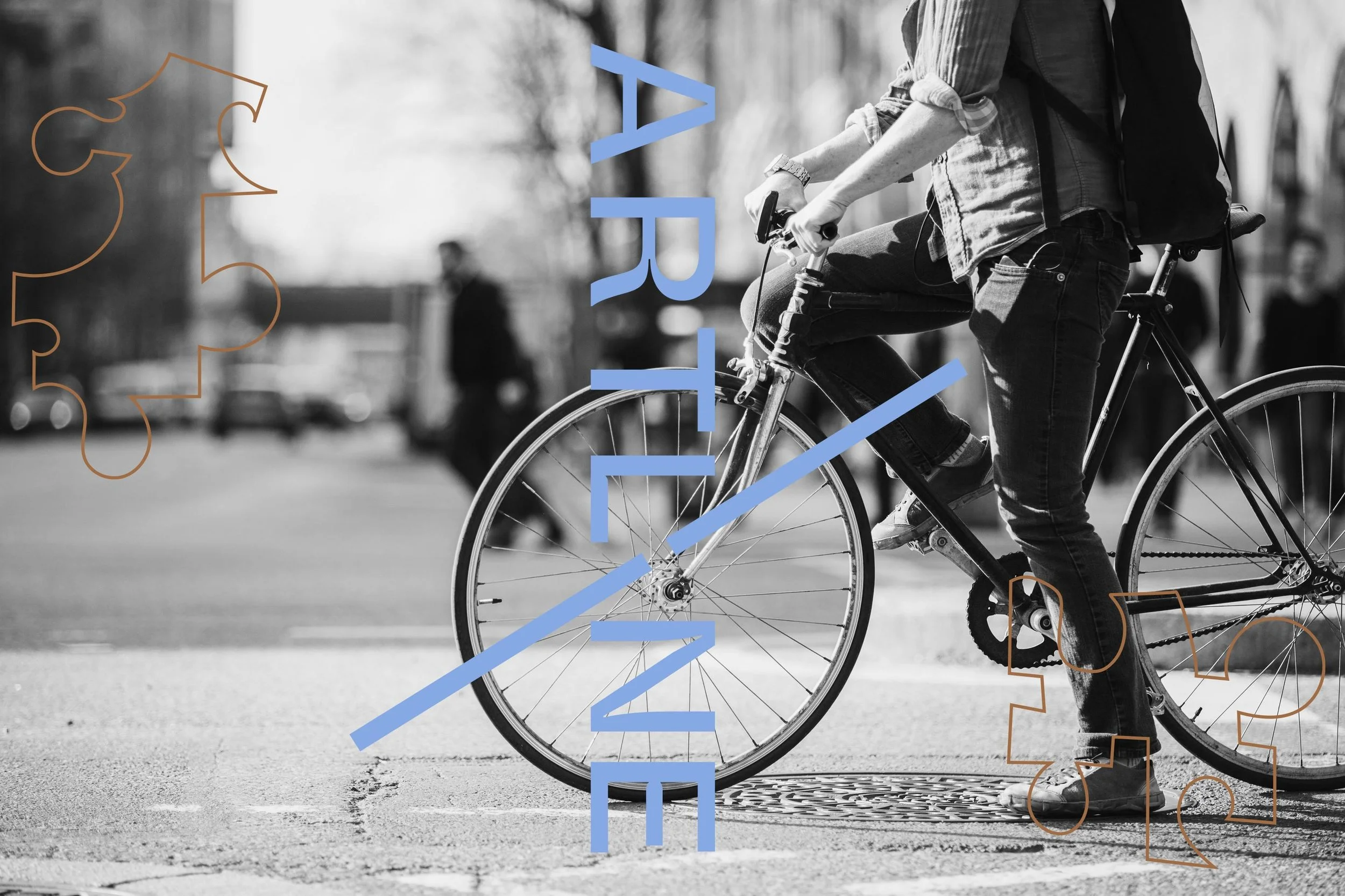
Fremont has always done things its own way — public art on the corners, character in every block, a creative streak that refuses to be ordinary. The name Artline holds both sides of that: the art of the neighborhood and the clean architectural lines of the building itself, with a nod to the canal and trail that draw a straight, easy line into the rest of the city. Part home, part canvas, the brand was built for independent spirits who want craft without the clutter — expressive, connected, and modern.
The positioning leaned into contrast: boutique building, creative community; minimum stress, maximum craft. Sophisticated interiors and curated indoor-outdoor spaces meet a rooftop made for golden hour, and the brand had to feel just as considered — inspired living that never tips into precious.


Our Role
• Naming
• Brand Identity
• Brand Guidelines
• Logo Variations
• Brand Elements + Patterns
• Typography System
• Photography Style Direction
• Brand Toolkit for In-House Use
• Marketing Copy
• Splash Page Design
• Permanent Wayfinding Signage
• Marketing Signage

Brand Direction
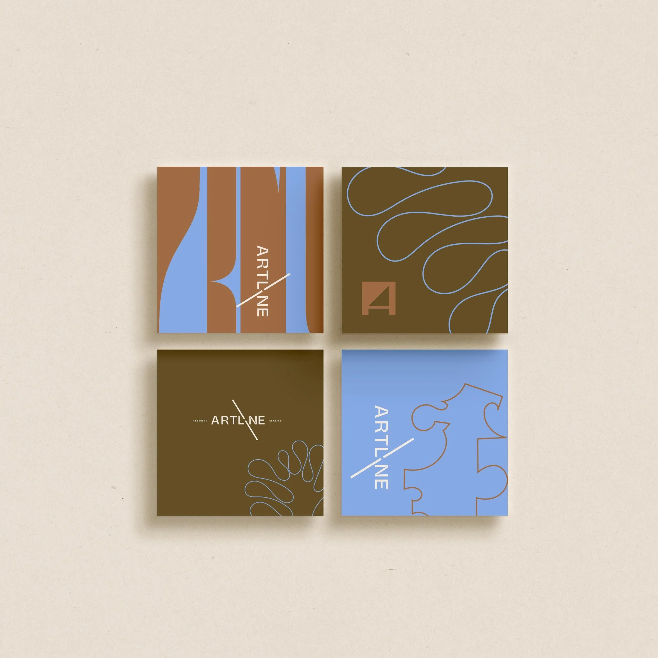
The visual language is warm and grounded, then lifted with a few well-placed surprises. A palette of clay, olive, and midnight anchors the brand, balanced by sand, sky, cornflower, and cream for room to breathe. Pangram Pangram Mori carries the typography system with quiet confidence across headlines and body, while a family of signature design elements — sketched doodles, abstract line work, and squiggled loops — gives Artline its playful, artful signature. Patterns built from those same elements keep the brand expressive across every surface.
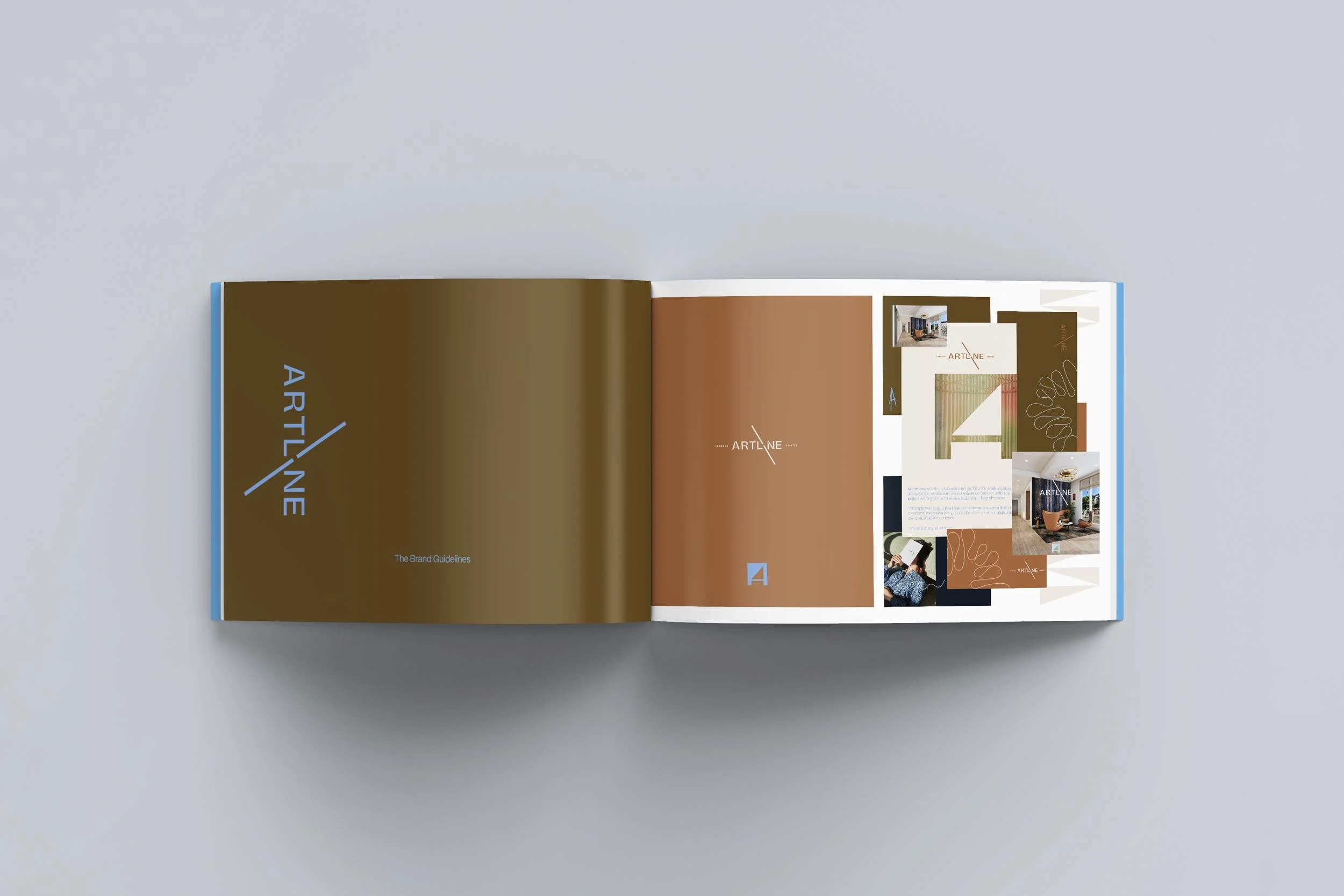
Brand Toolkit
Everything was documented so the team could run with it: a full set of logo variations (horizontal, short-line, vertical, and icon), color and tint specifications, the typography system, the pattern and design-element library, and photography style direction. From there we extended the brand into the moments that matter most for leasing — splash page design, permanent wayfinding signage, marketing signage, and the marketing copy that gives every page its voice — so Artline reads as one cohesive idea from the sidewalk to the screen.