Adaire
Property Management: Greystar

Objective
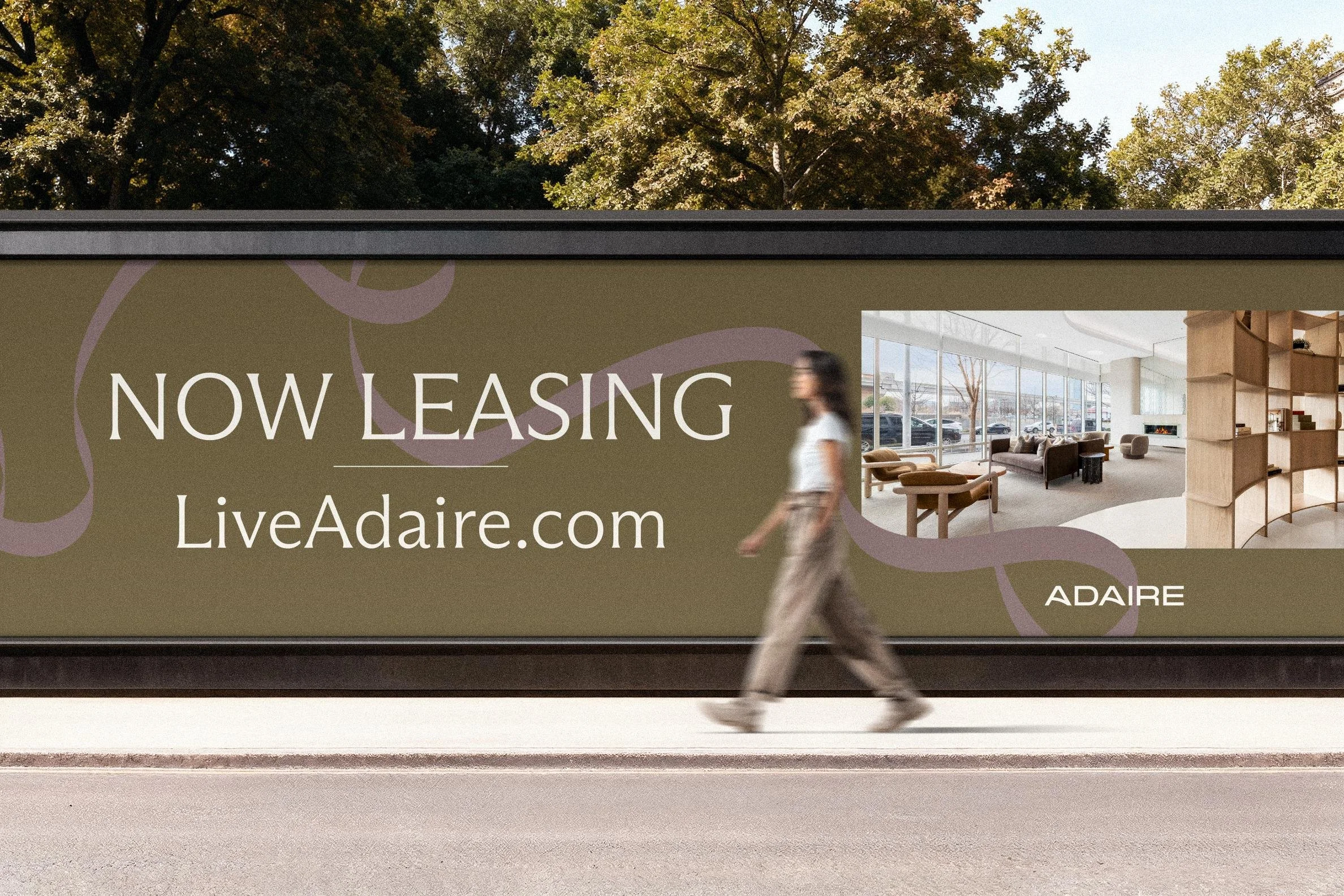
Adaire is one of the tallest residential towers in the greater D.C. area, rising 35 stories above Tysons Corner — and the client came to us for a brand refresh to match a new interior design direction. The logo already lived on the building's signage, so rather than start from scratch, we kept what was working and updated it, then built an entirely new visual brand around it: a new color palette, hand-drawn patterns, and new typography designed to align with the refreshed interiors. The goal was a brand as elevated, modern, and cosmopolitan as the tower itself — one cohesive identity that carries from the street-level signage all the way up to the 35th-floor sky lounge.

The Story
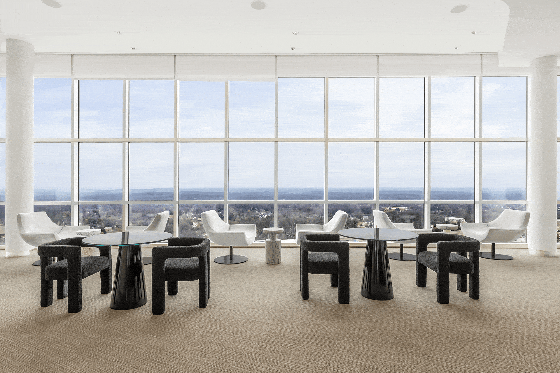
Adaire is all about perspective. From the 35th-floor sky lounge, views stretch across all of Tysons, over the D.C. Metro, and out to the Blue Ridge Mountains on a clear day; down on the eighth-floor terrace, the urban hum fades into the crackle of a firepit and the flow of conversation. The brand had to capture that feeling of living above it all — open to possibility.
The name itself carries a sense of air and ascent, and the positioning leaned all the way in: every day holds more when your perspective is wide open. Adaire speaks to modern, ambitious residents who want a home that kindles connection, balance, and opportunity. It's a place to rise every day, surrounded by the best of Tysons, with sweeping horizons that suggest there's always more within reach. Modern, cosmopolitan, and always ascending.
Our Role
• Brand Refresh
• Brand Story + Positioning
• Logo Update
• Brand Toolkit
• Design Elements + Patterns
• Typography System
• Photography Style Direction
• Marketing Copy
• Website Design
• Marketing Signage
• Email Drip Campaign
Brand Direction
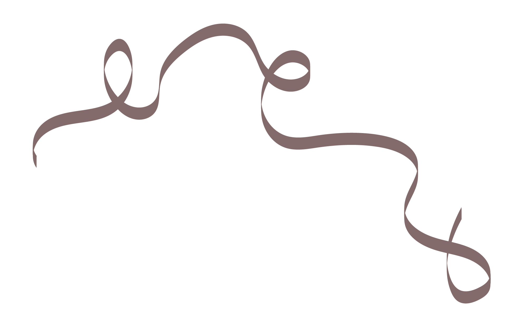
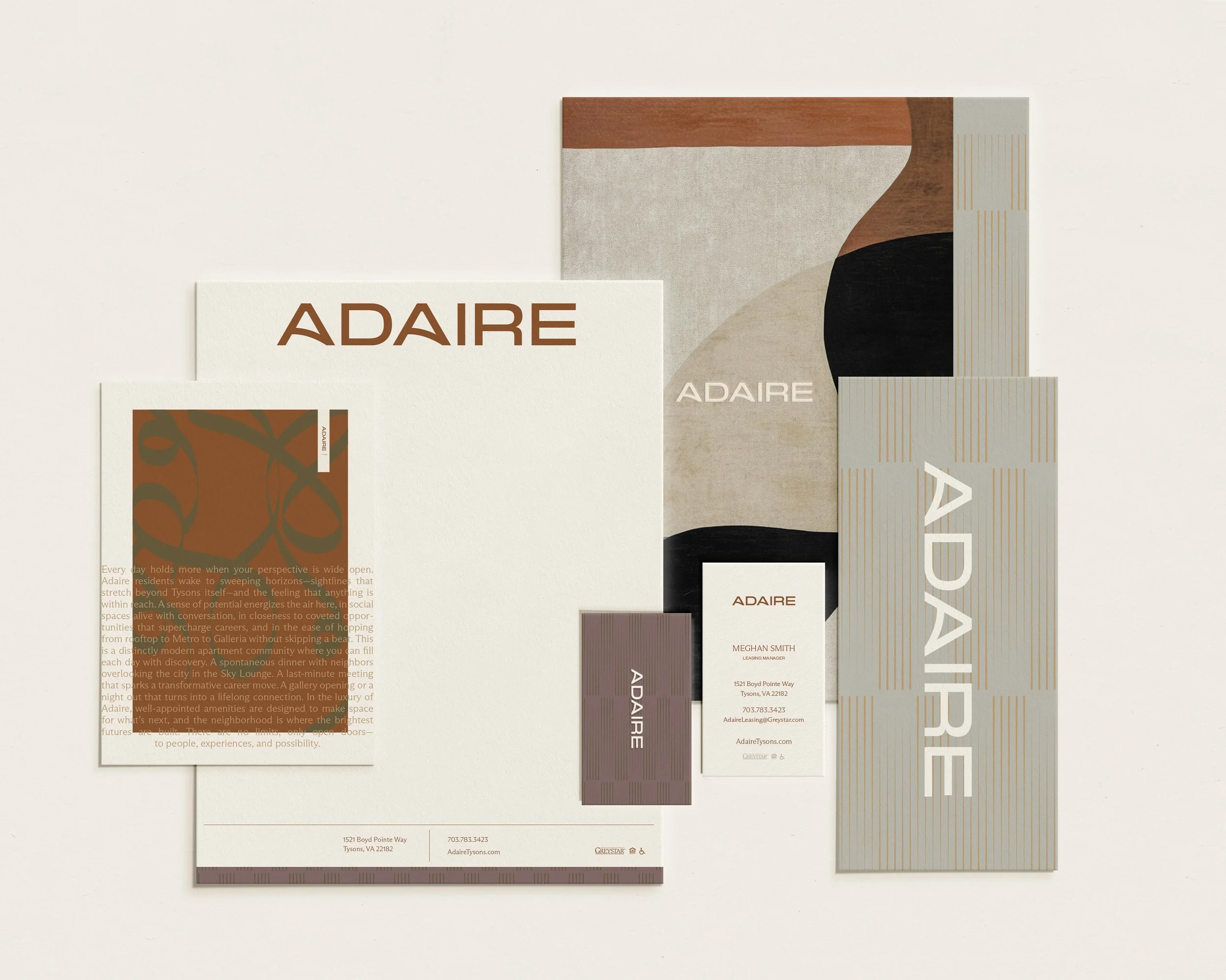
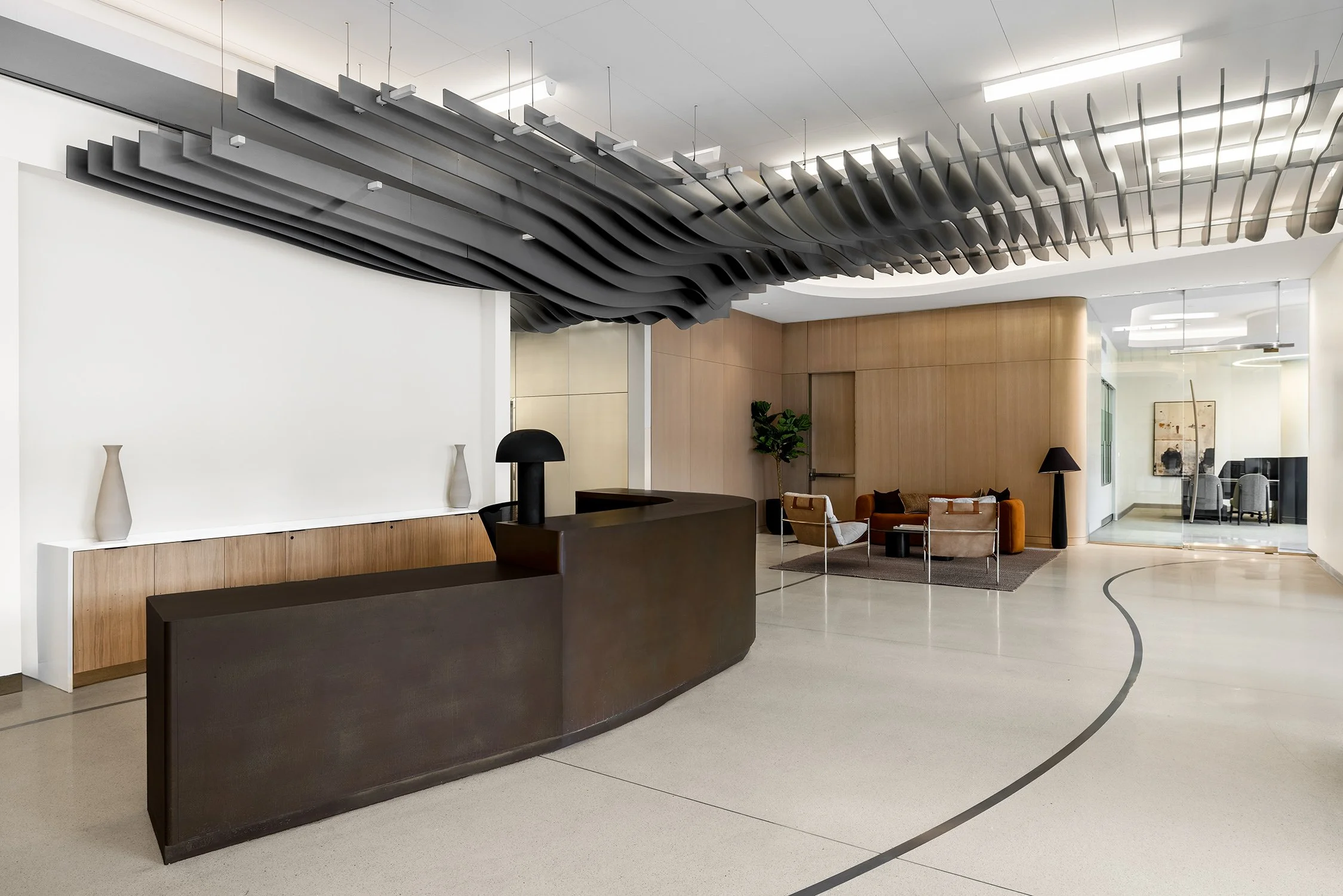
The visual language is warm, elevated, and quietly luxurious. A sophisticated palette of bronze and cognac, soft camel and gold, mauve taupe and warm greige, grounded by deep charcoal, gives Adaire a modern, cosmopolitan polish with real warmth. A signature set of hand-drawn flowing-line patterns adds movement and a human touch across every surface, while the refreshed logo keeps continuity with the building's existing signage — so the new brand feels both fresh and unmistakably Adaire.
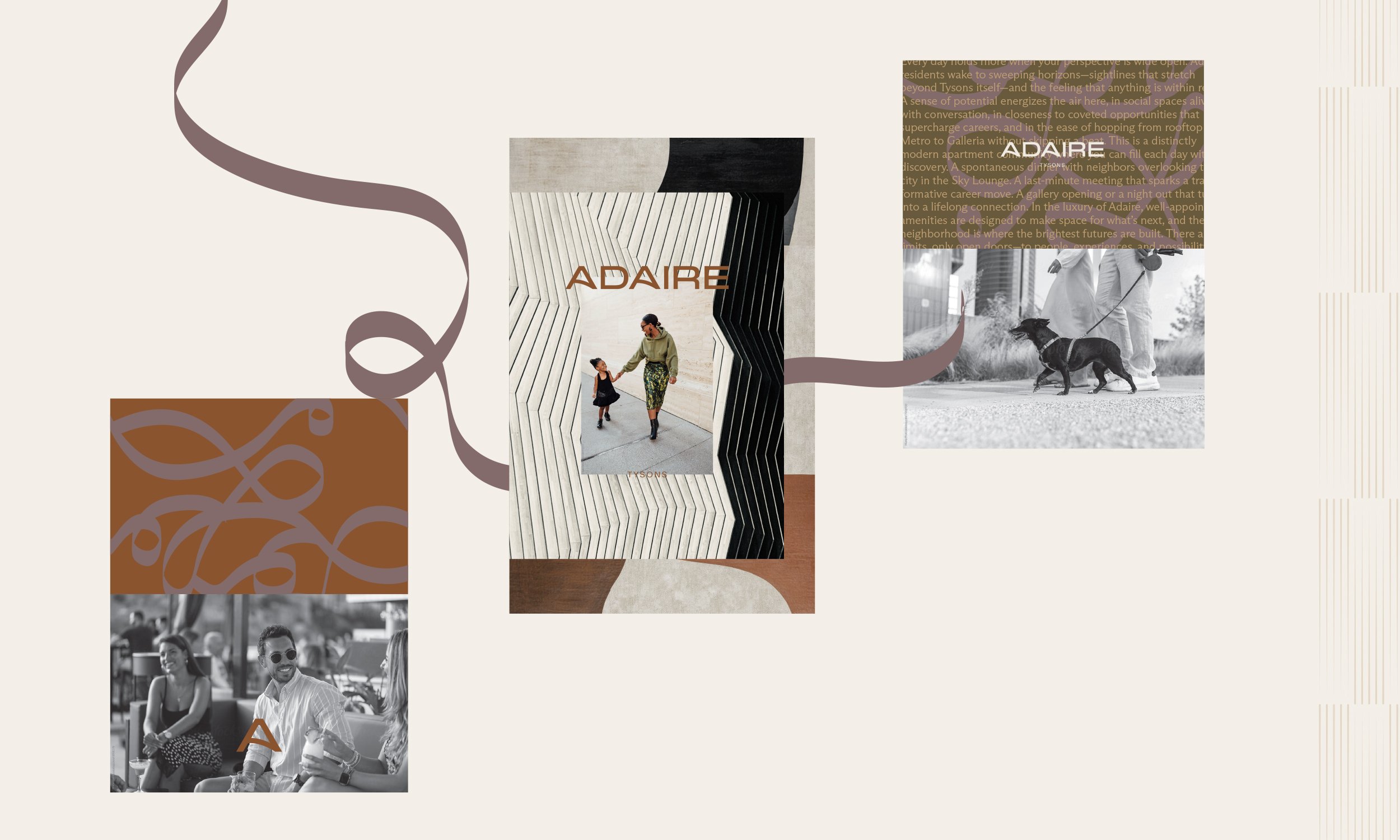
Brand Toolkit
Starting from the brand story and positioning, we refreshed the logo and built out a complete new identity — color palette, hand-drawn pattern library, typography system, and a full brand toolkit — then sourced new photography to bring the lifestyle to life. From there the brand extended into the lease-up tools: marketing copywriting that gives every page its voice, marketing signage including wind masters, large building banners, and window graphics, an email drip campaign to nurture prospects, and a custom website built on the client's platform — all under a single art direction so Adaire reads as one elevated idea.