
The Waverly
CLIENT: Greystar Development
PROJECT TYPE
Multifamily Tower New Construction
Seattle, WA
Objective
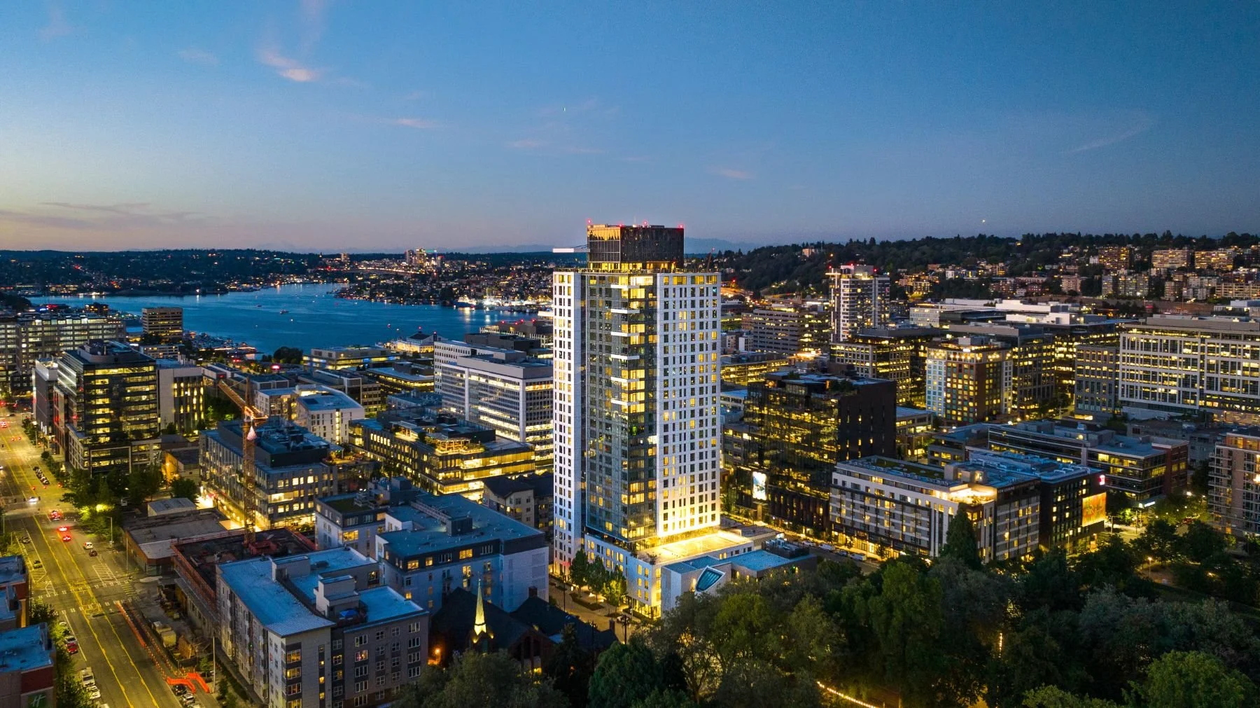
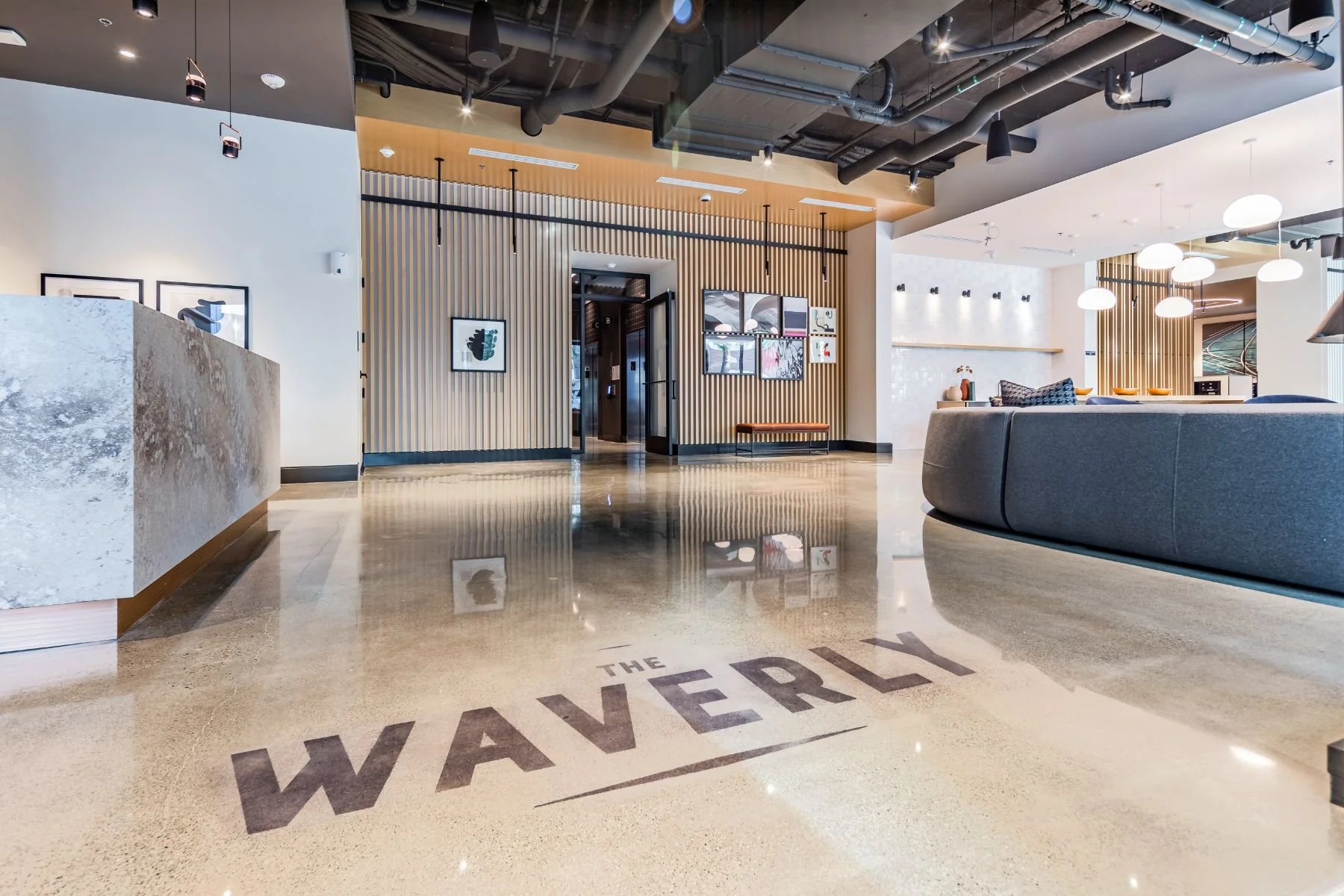
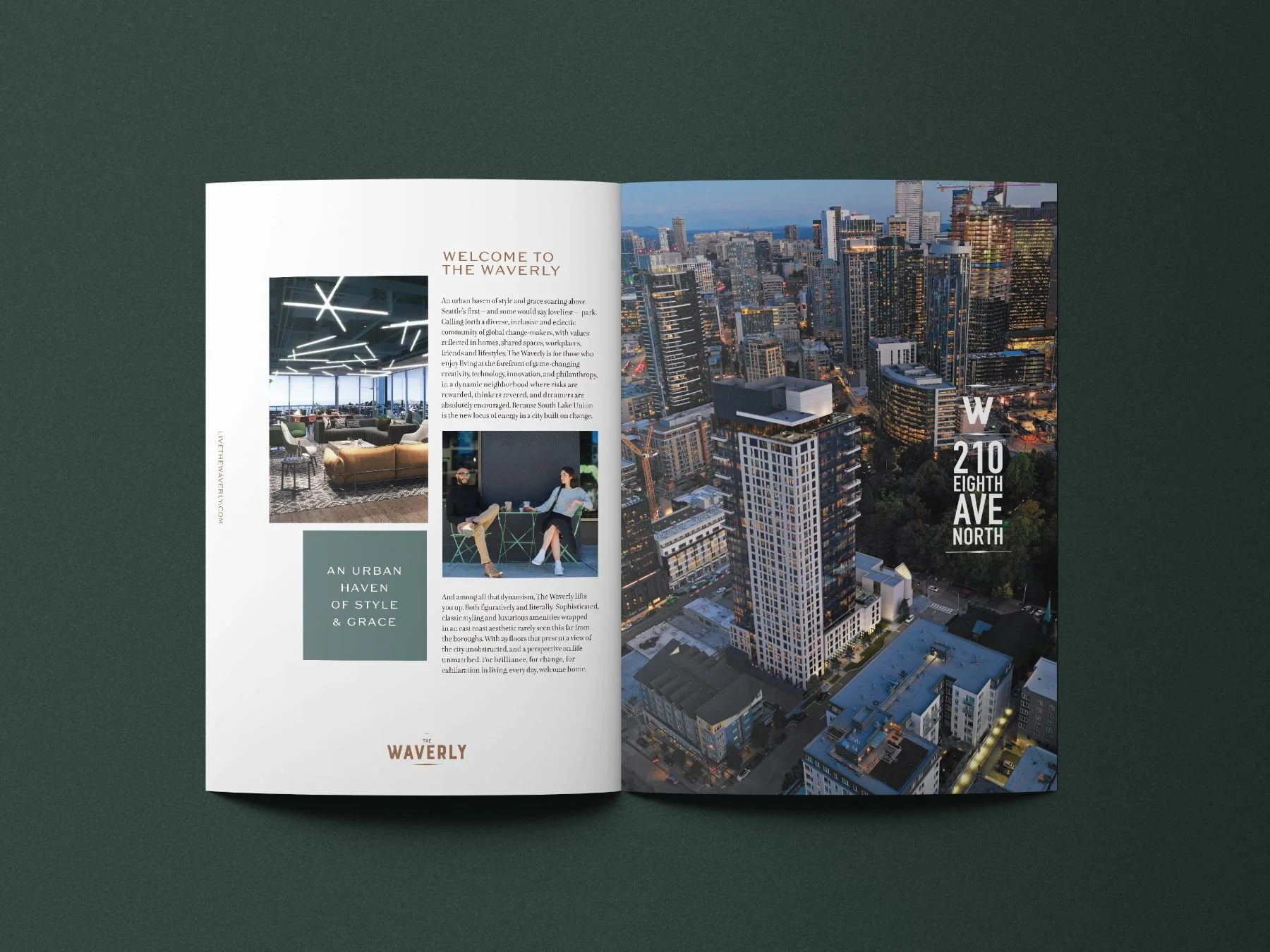
The Waverly is a high-rise at 210 Eighth Avenue North, overlooking Denny Park, Seattle's first park, at the edge of South Lake Union. The neighborhood draws innovators, founders, and philanthropists from around the world, and plenty of new towers were competing for their attention. The Waverly needed to feel more polished than the glass-and-steel buildings around it while still welcoming everyone who walked through the door. We developed the brand identity and style guidelines, then carried them through the brochure, website, marketing collateral, and leasing signage. We also produced a lifestyle shoot around the neighborhood to show residents what everyday life nearby looks like.
Our Role
Brand Development
Brand Identity
Brand Style Guidelines
Marketing Copywriting
Print Collateral
Marketing Signage
Website Design
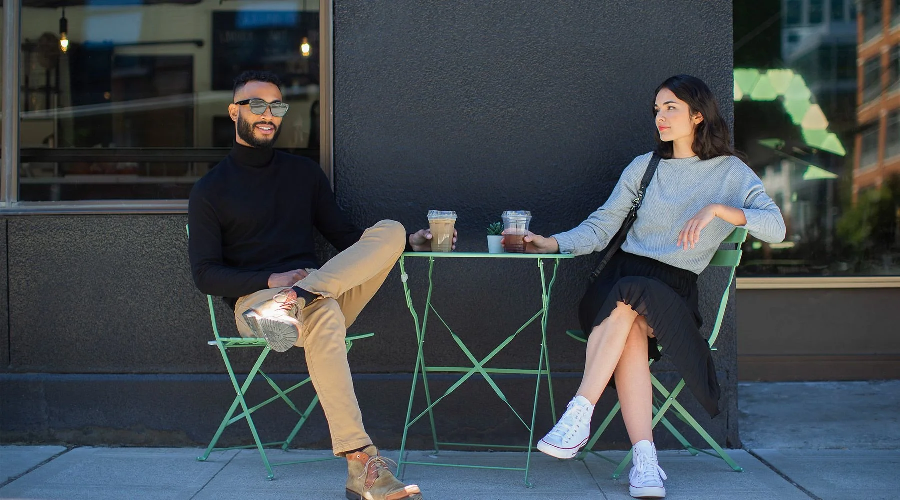
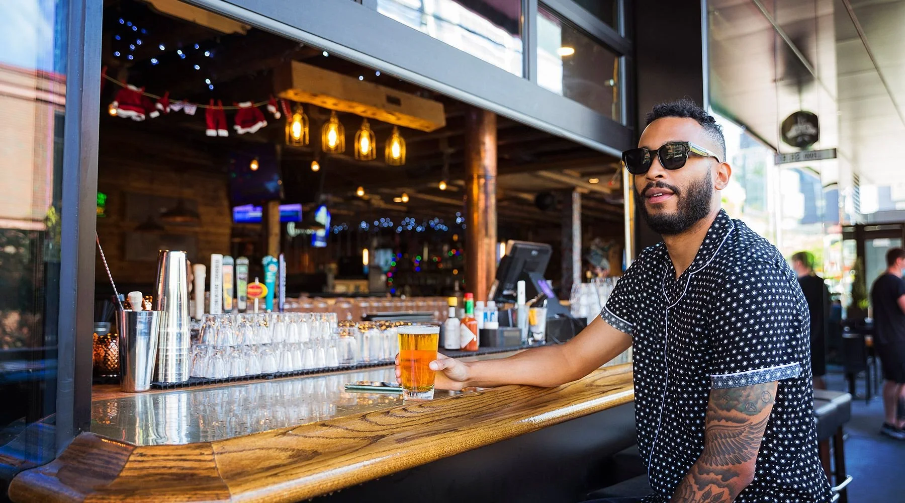
Neighborhood Lifestyle Photoshoot
The Story
The brand began with the site itself. The tower shares its landscaping and parking with a newly built church that's open to everyone and hosts community programs. That connection pointed us to values Seattle pioneer David Denny championed, such as inclusion, acceptance, and diversity, and to how naturally they fit the cosmopolitan character of South Lake Union. The positioning describes The Waverly as a home for a diverse, eclectic community of global change-makers, in a neighborhood where risks are rewarded and dreamers are encouraged. It closes with a simple invitation: Come on in.
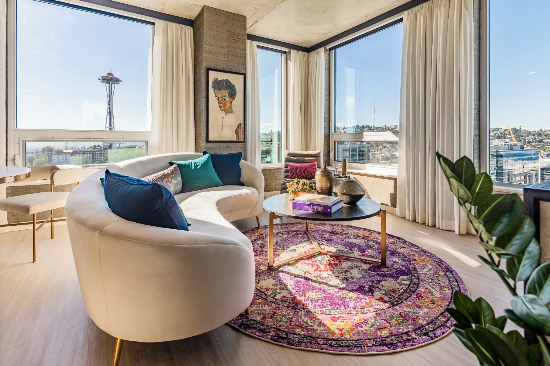
The headline A home on a different level works two ways. It speaks to the sweeping views of the Space Needle, Lake Union, and downtown from the rooftop lounge, and to a style of living that stands apart in Seattle. The copy leans into an East Coast sensibility that's rare this far from the boroughs, with classic, tailored interiors and service to match. Chihuly Garden and Glass, Climate Pledge Arena, and the Amazon Spheres are a short walk away, and the mountains are an easy drive. The Waverly gives residents the energy of a city built on reinvention and a calm, grounded place to come home to.

Brand Direction
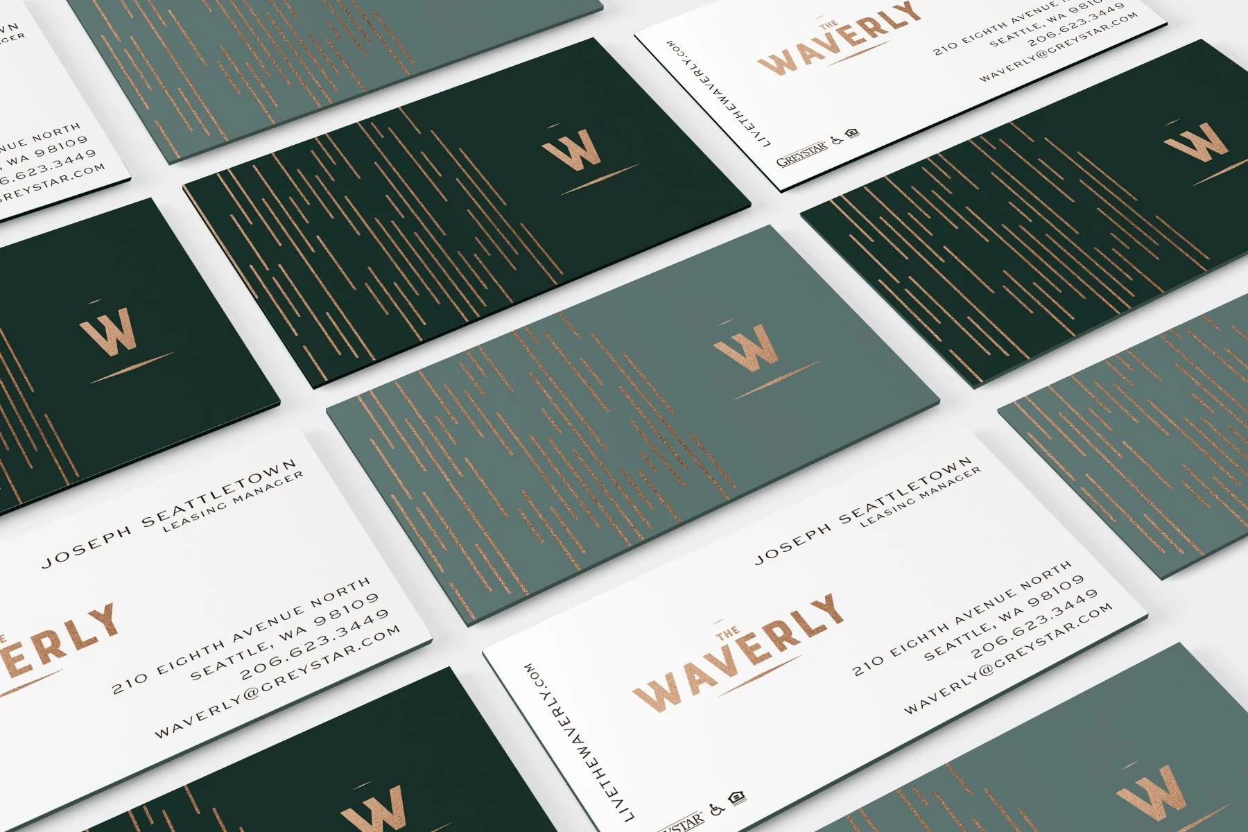
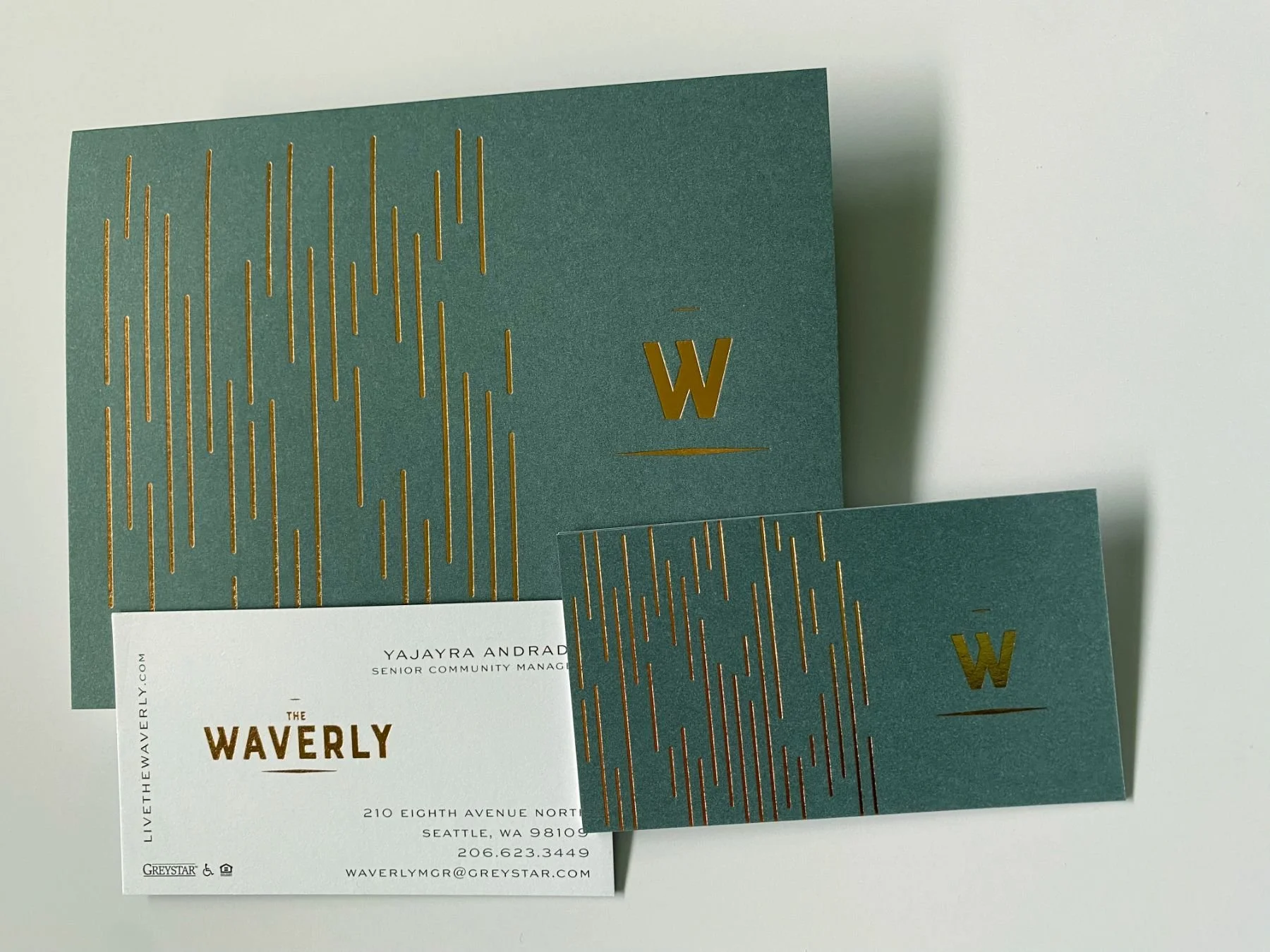
The identity takes its cues from classic East Coast residential buildings. It's tailored, confident, and understated. The core palette pairs a rich, near-black brown with a soft warm gray and a burnished copper, which appears as metallic foil on printed pieces. A secondary set of deep navy, forest, teal, and muted gray-green adds depth when needed. Sweet Gothic sets the headlines in crisp, architectural capitals. Lavigne Display Light brings a graceful serif to subheads and body text, and TT Norms serves as a clean alternate sans. The wordmark comes with and without an "Apartments" tagline, and a "W" icon (on its own or paired with the address) works as a signature seal. A small set of geometric patterns adds texture, and the guidelines call for using them sparingly.
Brand Toolkit
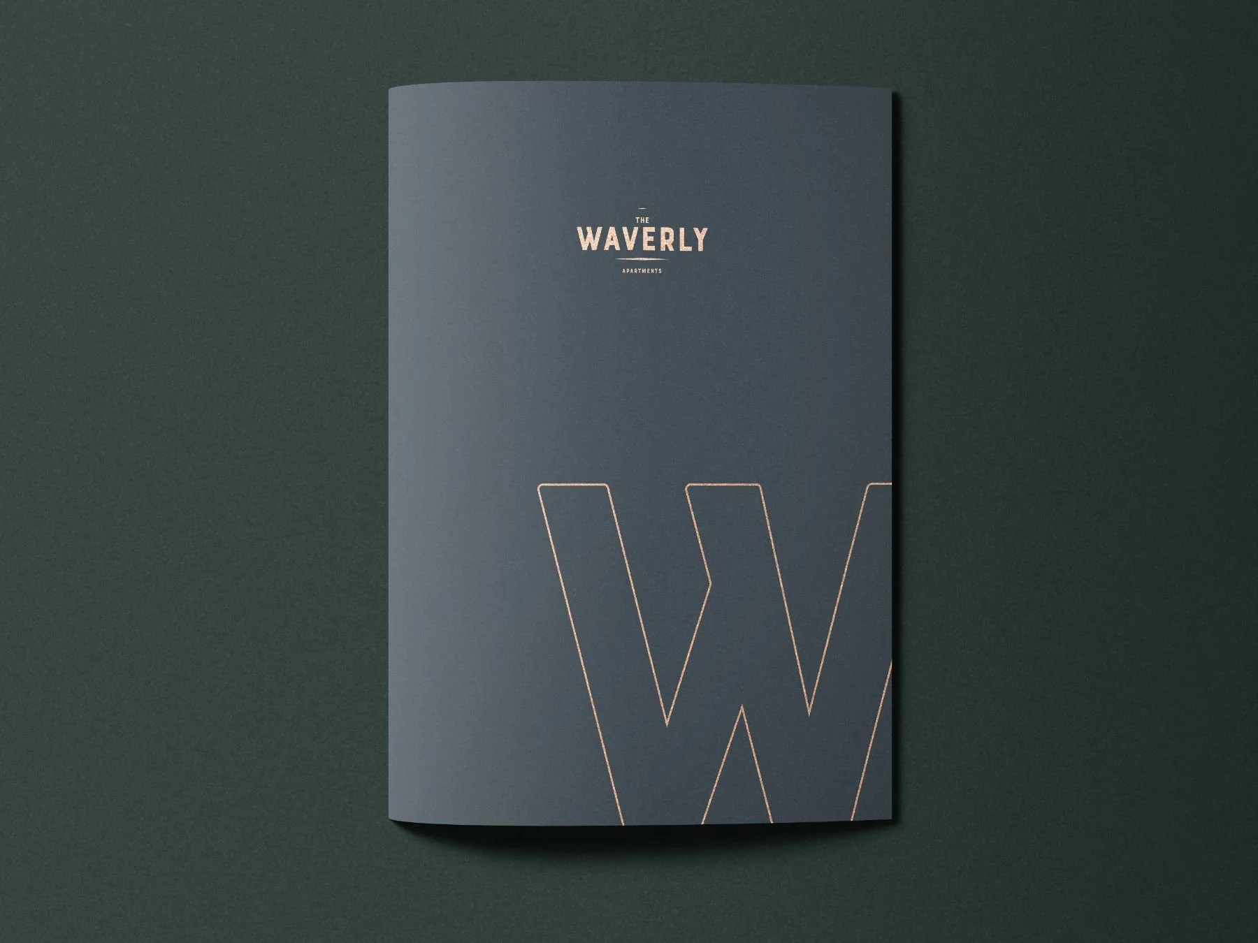
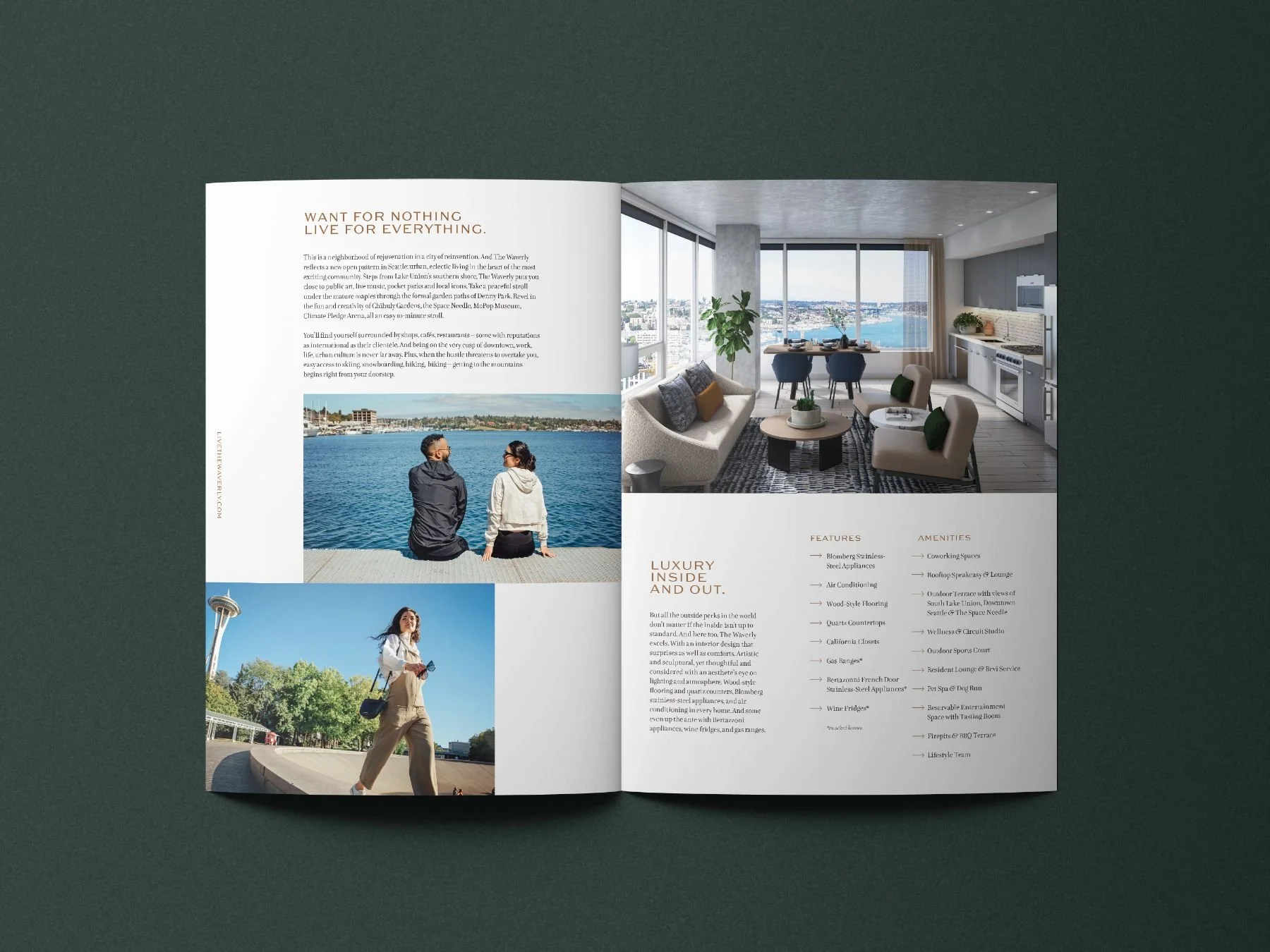
The style guidelines documented the brand's insight, positioning, personality, logo usage, palette, typography, and photography style, so every partner on the project could work from the same playbook. From there the identity moved into print and digital. The brochure pairs copper accents with a custom map of South Lake Union, from Denny Park to Pike Place Market. We also designed the website, the marketing collateral, and the leasing signage that marked the tower during lease-up. Our neighborhood lifestyle shoot captured the cafés, parks, and waterfront around the building, giving the brand real images of South Lake Union to work with. Together, the pieces give The Waverly a refined, welcoming presence that fits its reputation as a beacon of Seattle.