The Leo
PROJECT TYPE
Multifamily New Construction
Tacoma, WA
Objective
The Leo was designed for one of Tacoma's most walkable and eclectic addresses — 725 Broadway, right in the heart of the Theater District, just north of downtown and steps from historic playhouses, art galleries, thrift stores, and restaurant scene. The brand had to feel exactly like its neighborhood: a little under the radar, refreshingly free of pretense, and endlessly discoverable — where classic and current influences meld into something completely original. We built the brand by developing the brand story, positioning, and inspiration direction that shaped the identity and set the tone for the interior design. The project ultimately didn't go to market, but the brand direction remains one of our favorites — and a clear expression of what The Leo could have been.
Our Role
Brand Development
Naming + Positioning
Brand Identity
Brand Style Guidelines
The Story
The Leo hits all the right notes. You know that eclectic indie band you fell in love with before everyone else got wind of it? That's a lot like Tacoma's Theater District — a bit under the radar, but with so much to discover. In this neighborhood, at center stage, the apartment homes of The Leo achieve an organic harmony with their surroundings: art galleries, historic theaters, well-loved thrift stores, new restaurants, dive bars, and hot spots. Here, home is a destination for culture, and every day is a starting point for adventure.
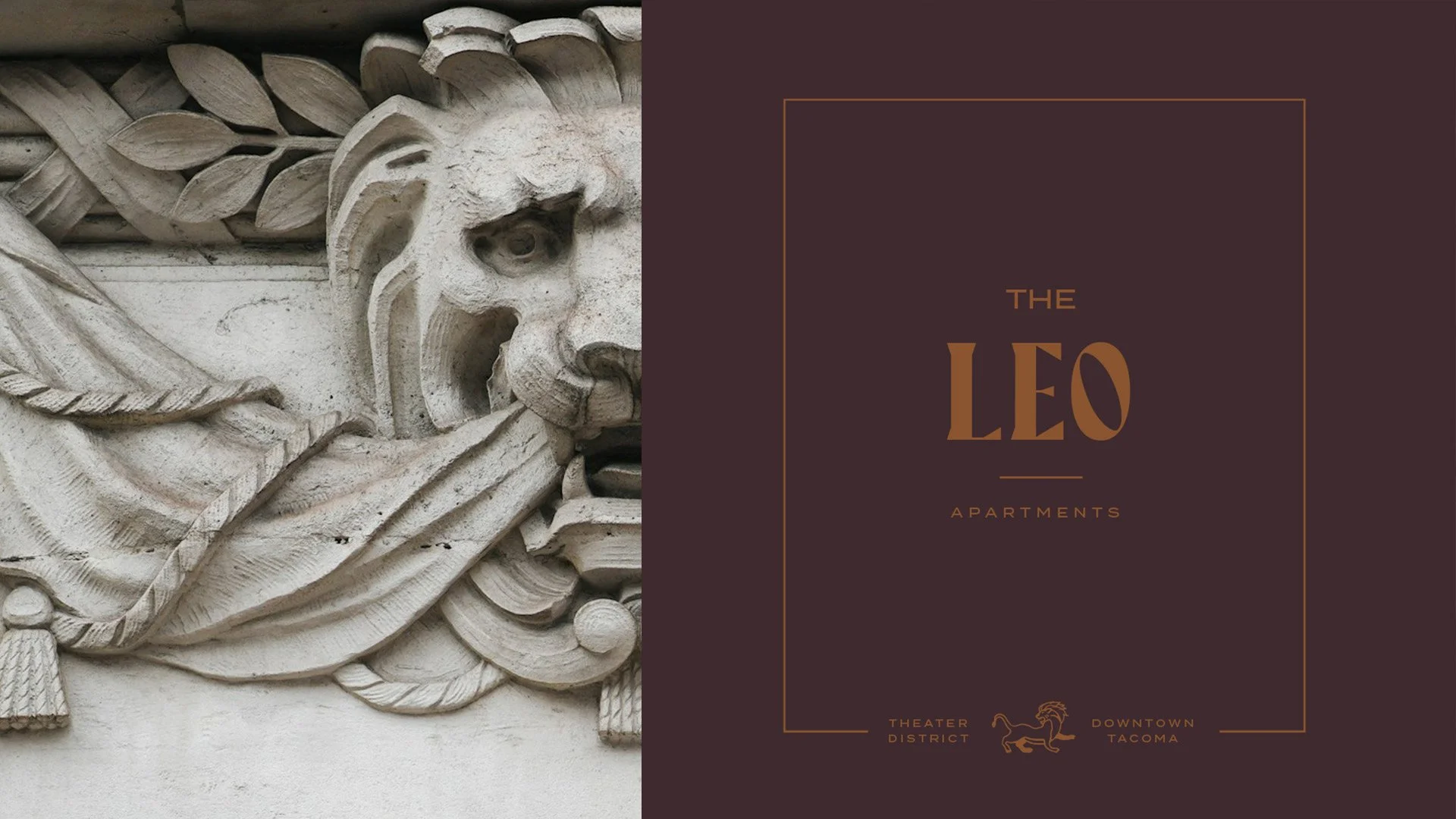
That idea became the brand's through-line, with music as both hook and metaphor. Clean yet warm modern design sets the tone inside and out, with leading-edge amenities as the steady bassline that keeps daily life in rhythm — a stylish co-working space lit by expansive windows, an on-site marketplace stocked with essential goods and local goodness, a fitness center for the days the weather keeps you off the boardwalk. The name is rooted in a real piece of Tacoma lore: in August 1930, during the depths of the Depression, MGM's world-famous logo lion — Leo himself — rolled into downtown and performed for crowds right in the theater district, parked between the Broadway and Rialto movie palaces, circling his cage before posing at center stage and letting out that unmistakable roar. The Leo honors that moment — a proud lion who once took center stage in the very neighborhood the building calls home — reimagined as a characterful mark for residents ready to take center stage of their own. The positioning was built for young, creative urban professionals — curious, unpretentious, and inspired by an eclectic neighborhood — who have never followed the crowd. There's no need to settle for one-note living when you can curate an artful arrangement of experiences. The Leo invites you to live to your own beat, and see where it takes you.
Brand Direction
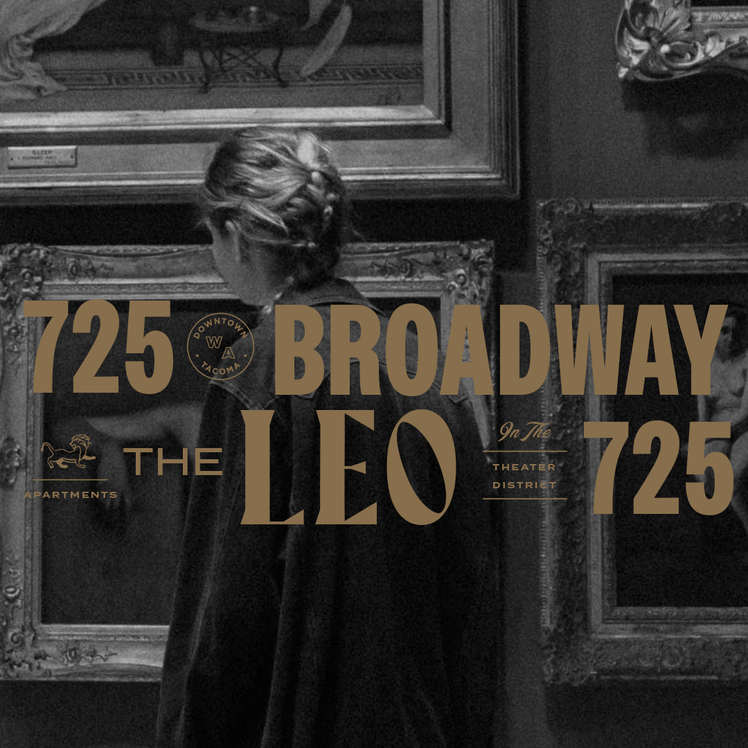
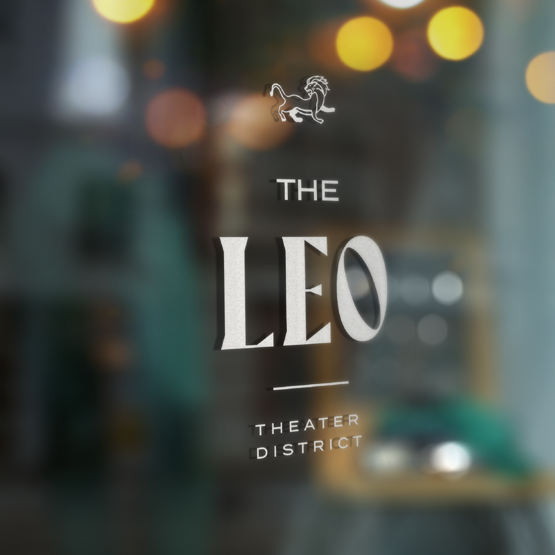
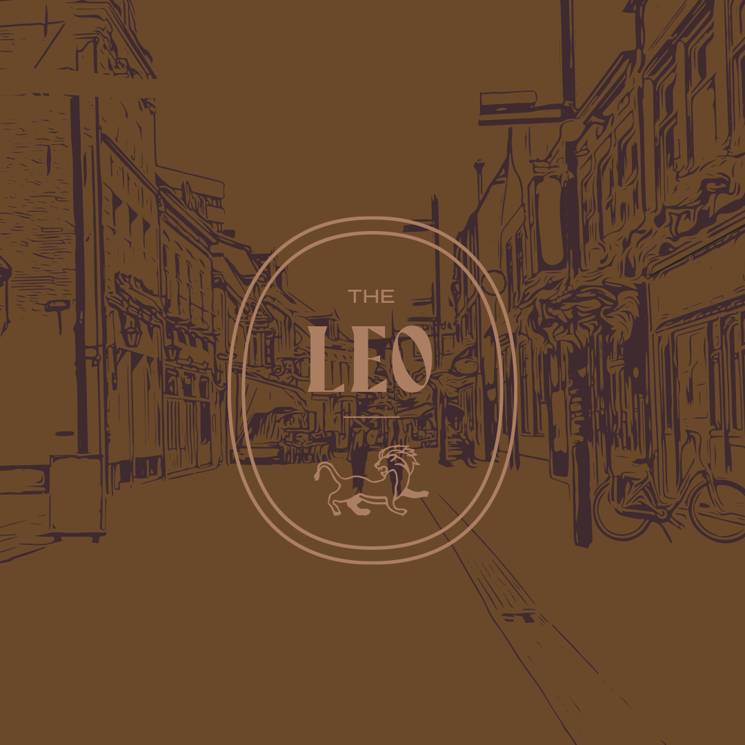
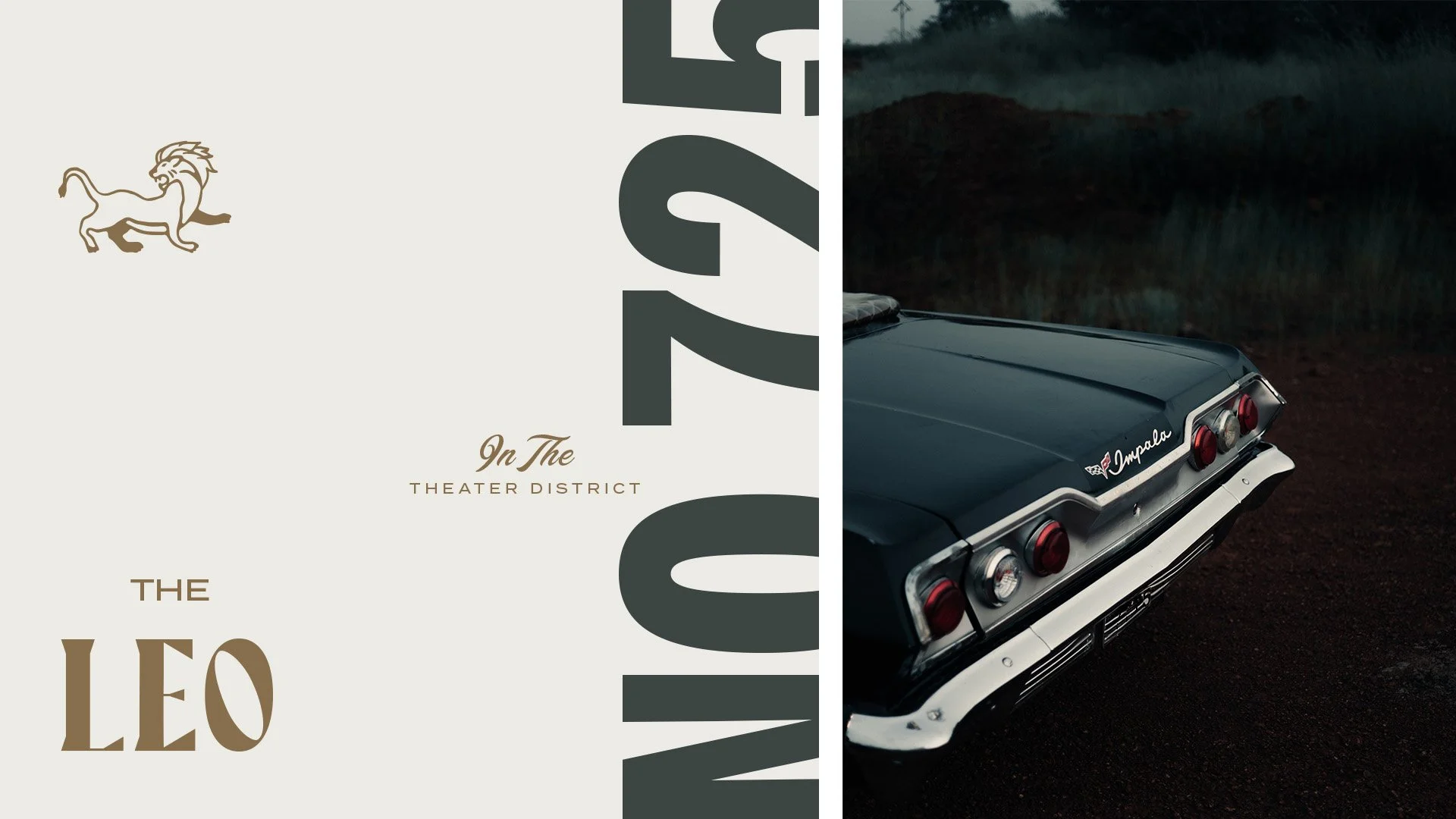
The visual language is moody, theatrical, and warm. A rich palette of deep teal-black and metallic gold anchors the identity, deepened by rust cognac, slate green, and an oxblood maroon, all softened by a warm cream. We built a flexible identity around a stacked "THE LEO" wordmark, a proud lion emblem, and a family of secondary marks — stamps, address lockups for 725 Broadway, and a "Downtown Tacoma / In The Theater District" location mark — extended through a custom illustration style that gives the brand its artful, of-the-neighborhood signature.

Brand Toolkit
We started with the brand story, positioning, and inspiration board — which guided both the identity and the interior design direction. We then developed the name, designed the logo and marks, and built out a complete set of brand style guidelines covering color palette, typography, secondary elements, illustration style, and photography style direction, all under a single art direction. Though The Leo never made it to lease-up, the brand stands on its own as a fully realized identity: original, artful, and unmistakably tuned to its own beat.