
Jack
CLIENT: Thrive Communities
MURAL ARTIST: Sarah Robbins
INTERIOR DESIGN: Board & Vellum
Objective
Jack is an apartment community in the heart of Capitol Hill, Seattle — a neighborhood with an unmistakable personality, all doers and makers, grit and optimism and with loads of style. The rebrand needed to bottle that spirit: modern and current, but rooted in something deeper and more human. We developed a brand direction, name, and identity built on a single, disarmingly friendly idea — that a place to live should have as much play in it as work — and carried it from the logo through every sign, page, and wall.

Our Role
• Brand Development
• Brand Identity
• Brand Guidelines
• Marketing Copywriting
• Print Collateral
• Branded Site Plan and Floor Plans
• Exterior Signage Package
• Website Design + Development
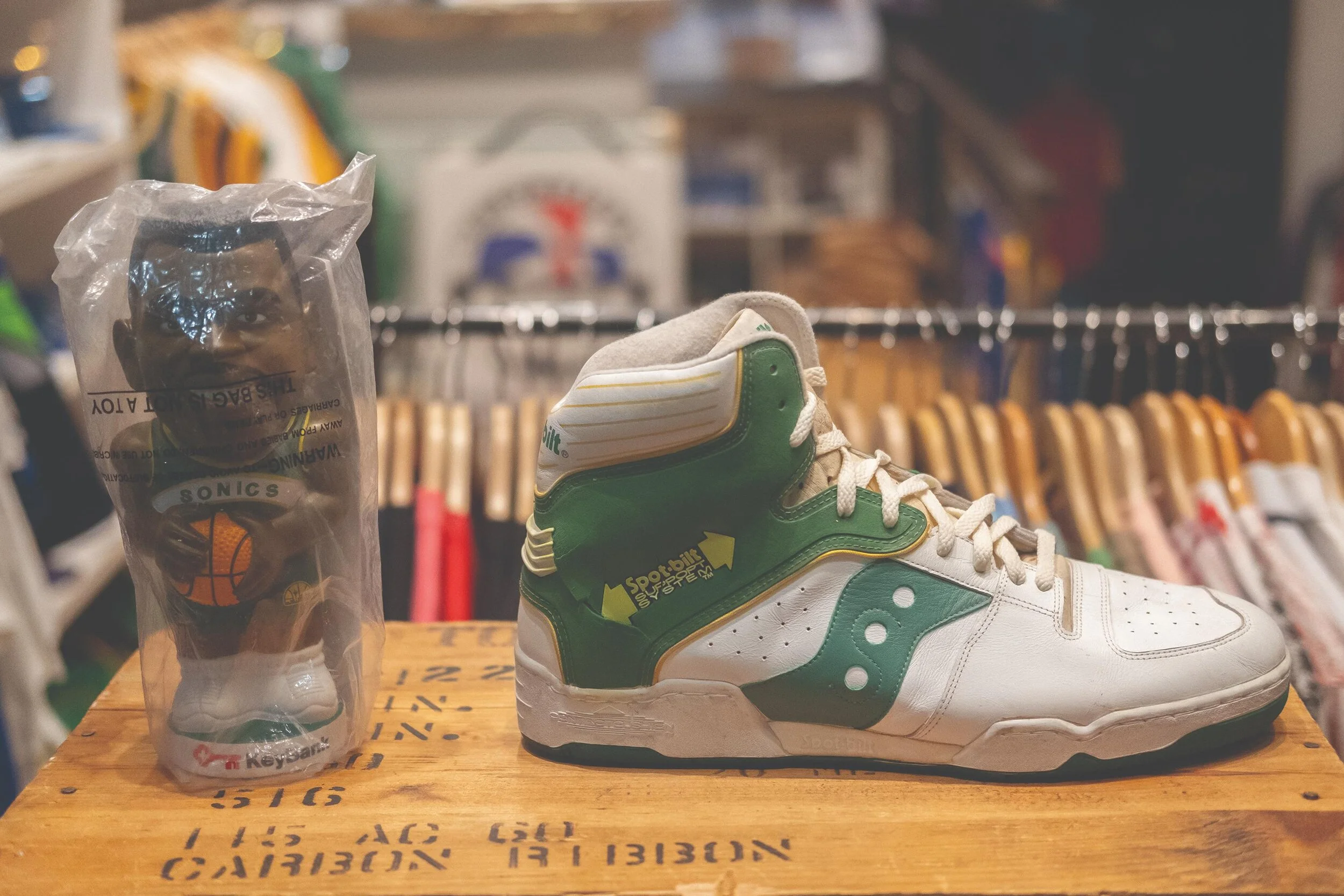
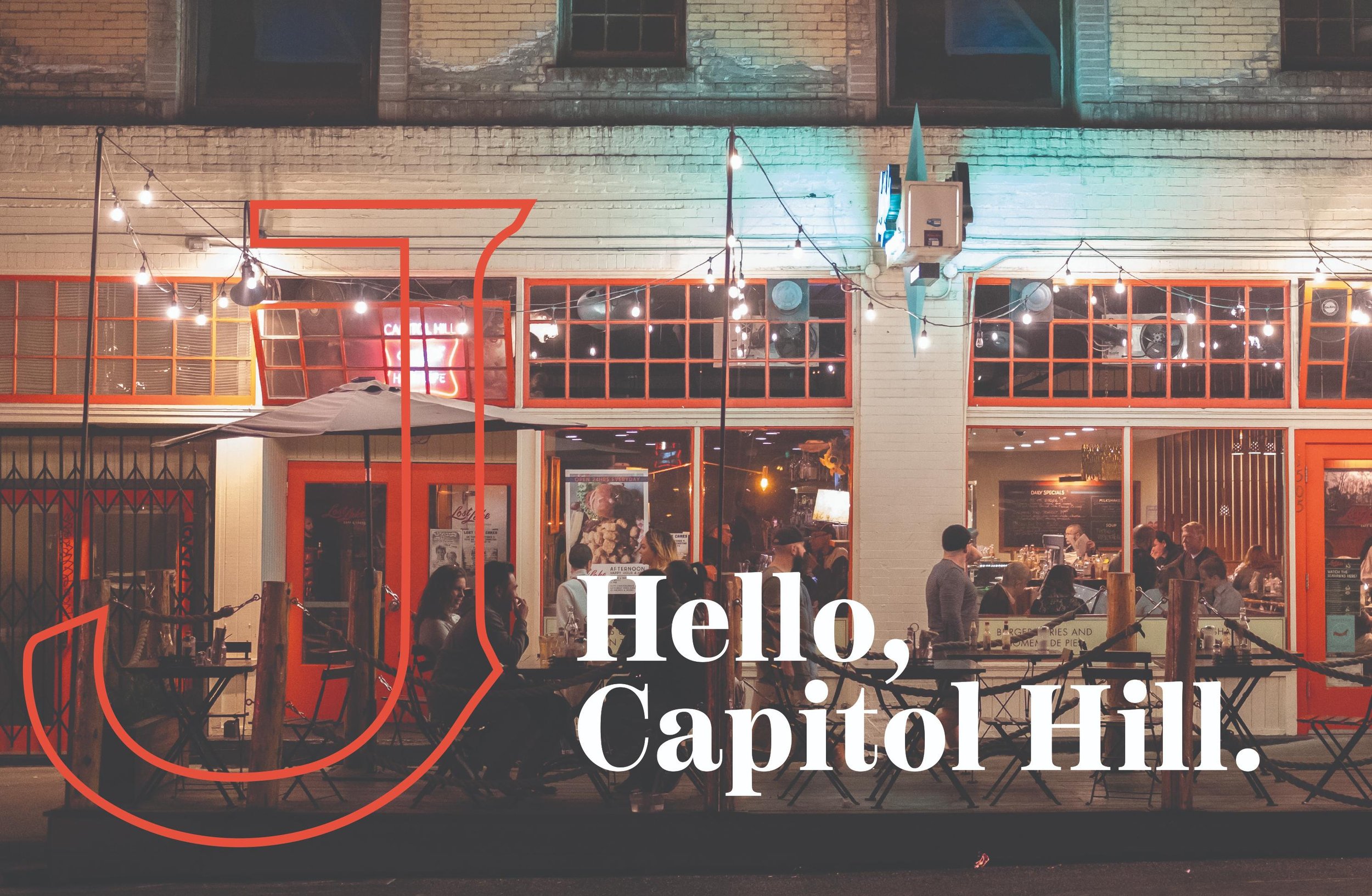
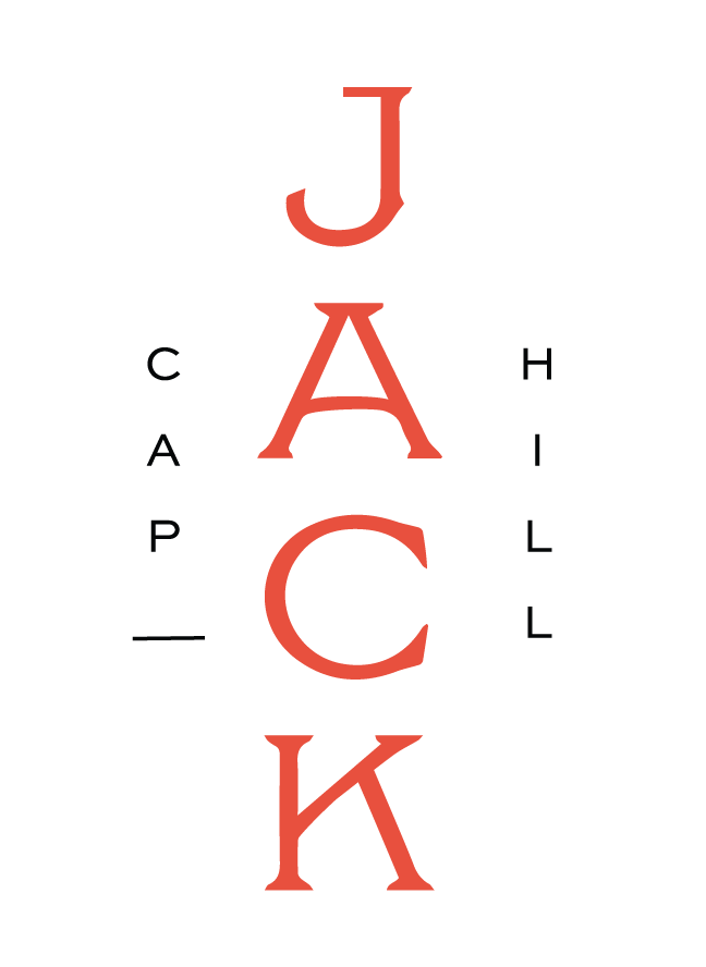
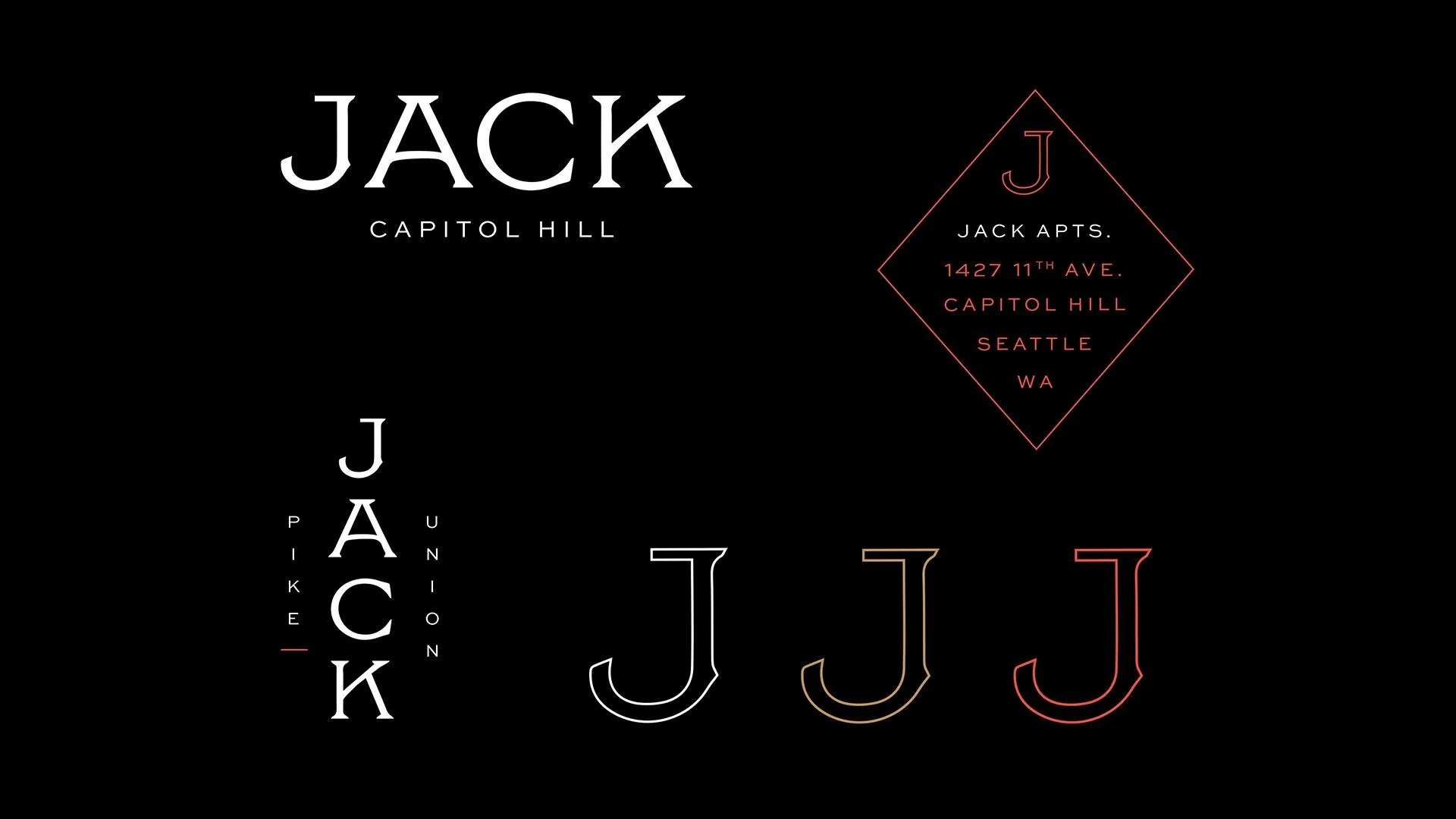
This is a brand with a real point of view: unrelenting optimism, a defined sense of self, and a let's-go-get-into-something-good energy that fits Capitol Hill to a T. Chophouse Row across the street, Neumos around the corner, Cal Anderson up the block — Jack knows exactly where it lives and leans all the way in, living joyfully, with purpose, sincerity, and style.
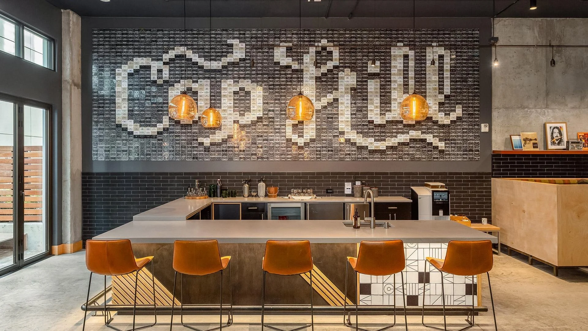
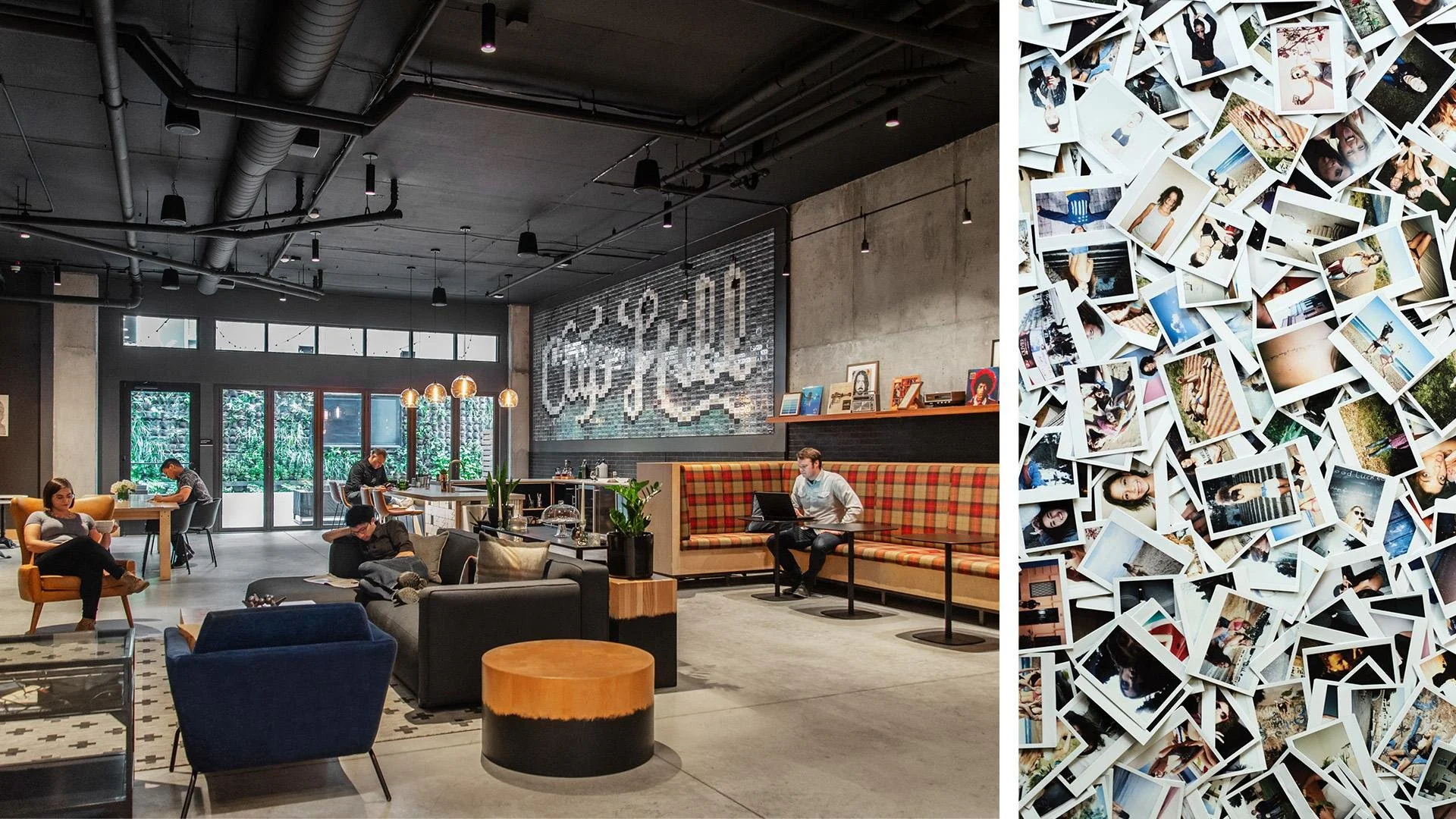
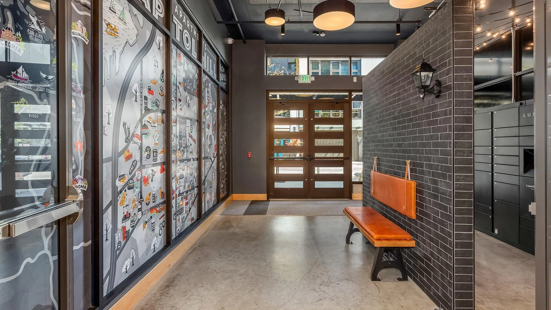
That personality came to life inside the building through custom artwork. Mural artist Sarah Robbins designed the cassette-tape wall and the amenity-map wall at the entrance, turning the brand's playful, music-loving spirit into something residents walk through every day — the kind of detail that makes Jack feel like nowhere else on the Hill.
The Story
Brand Toolkit

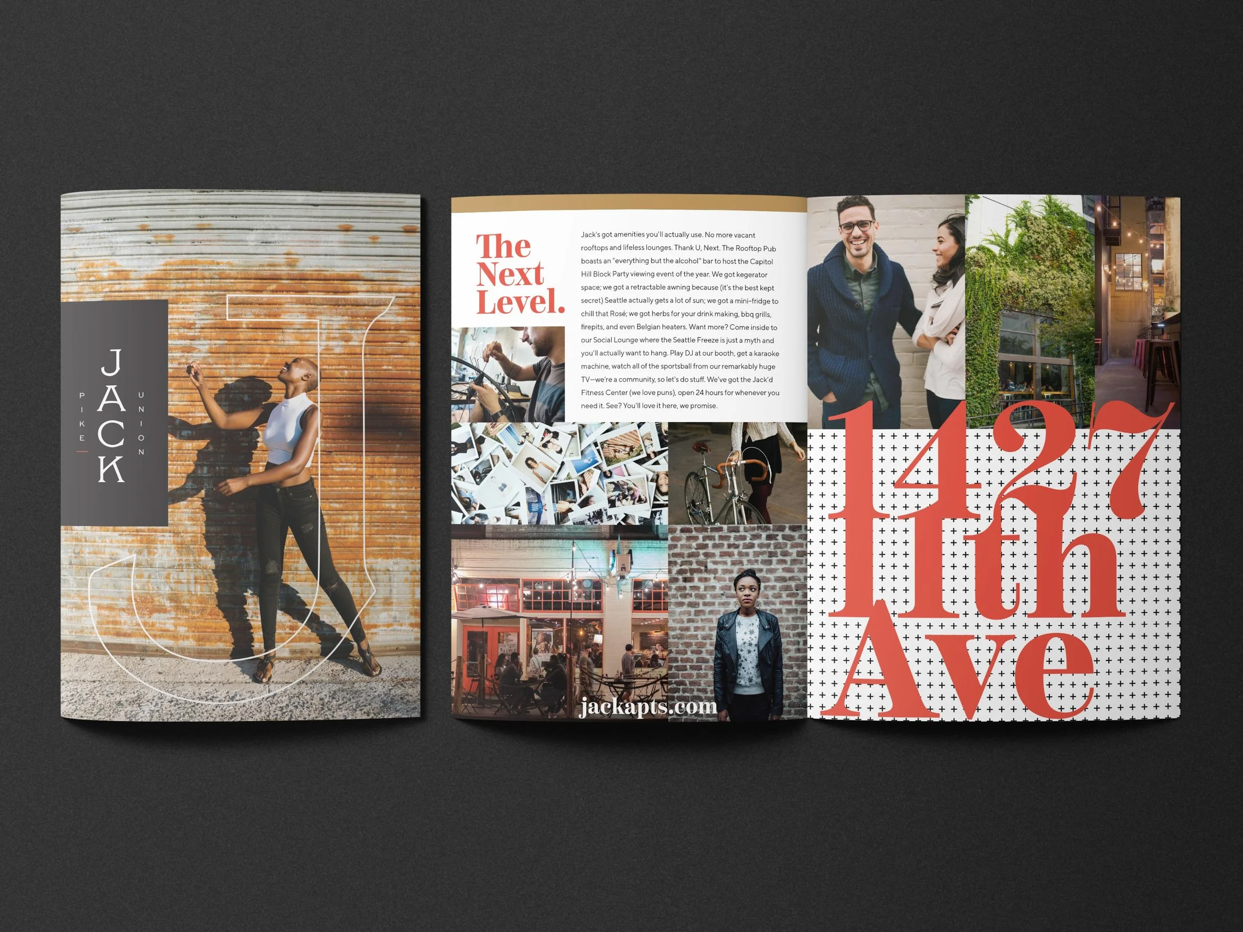
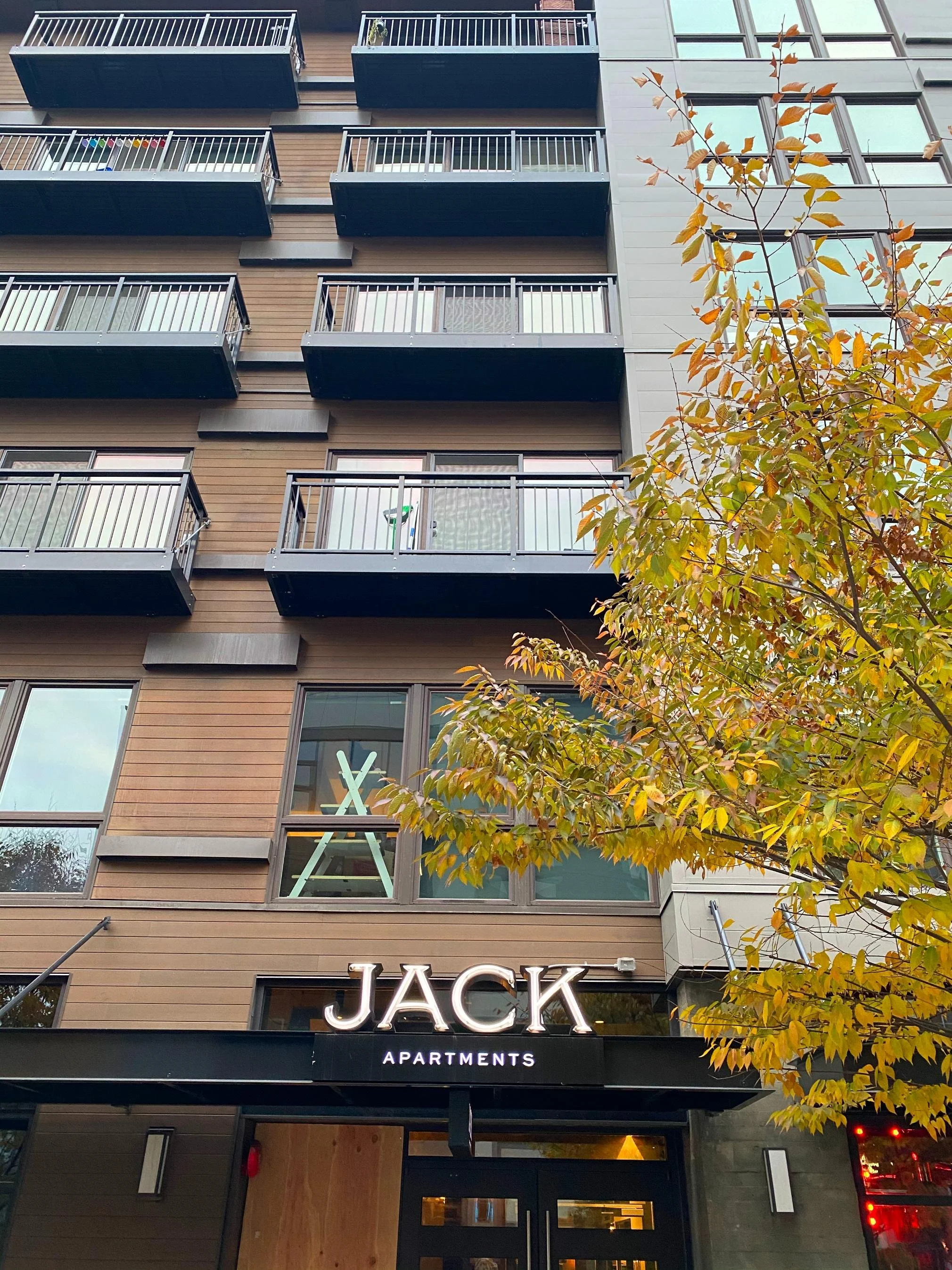
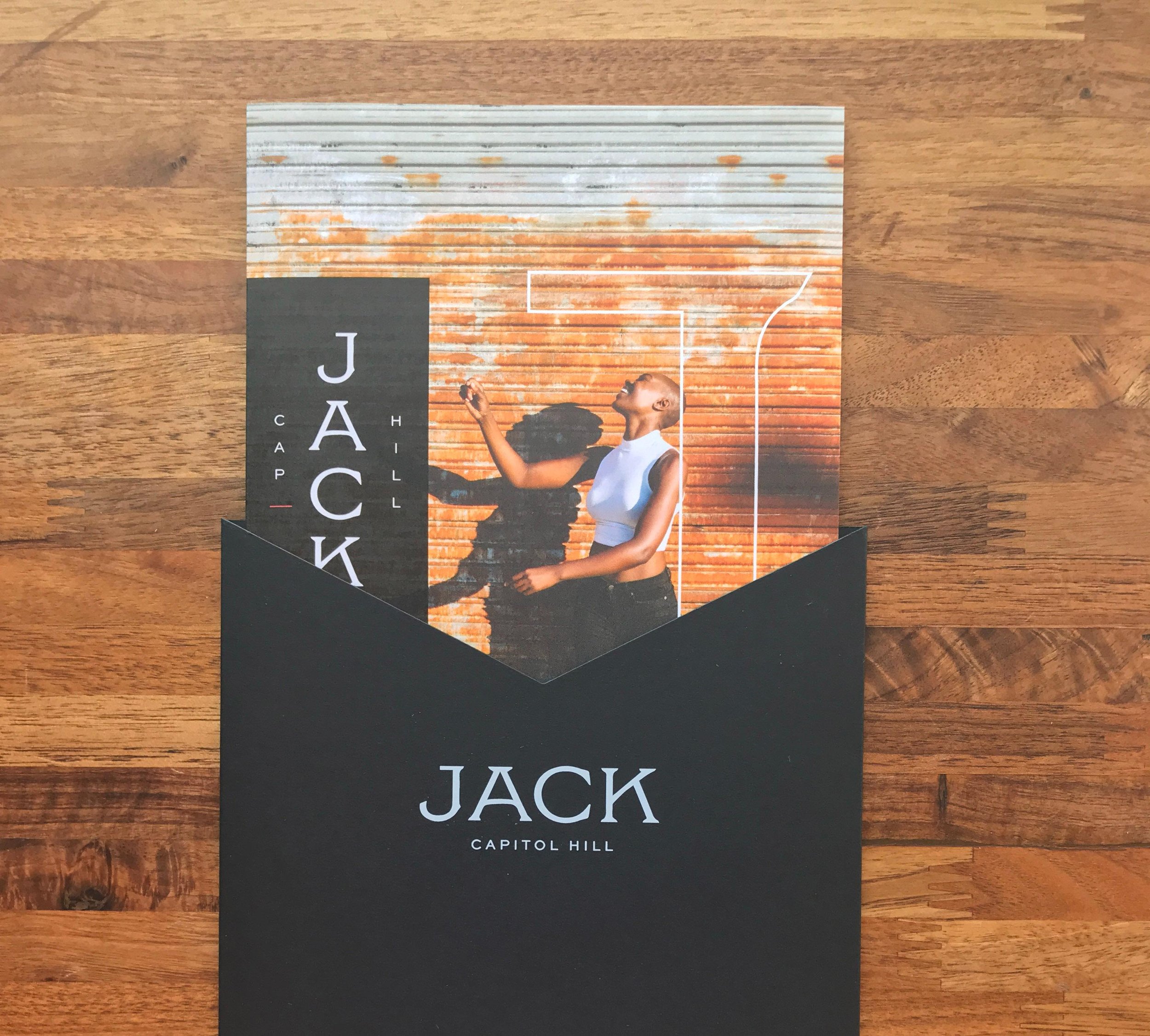
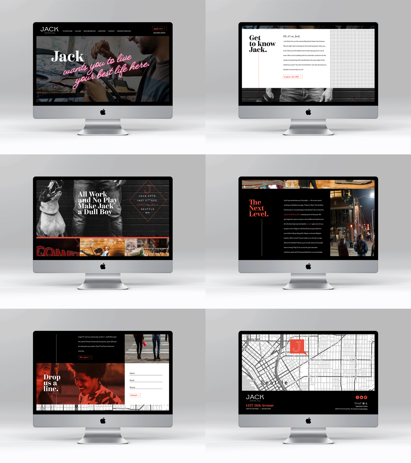
The brand was built to make a strong first impression and hold it. We launched with a custom website, designed a brochure along with branded floor plans and a site plan, and developed a full exterior signage package — including a custom neon sign that gives Jack its glow on the street. From the sidewalk to the entry murals to the leasing brochure, it all speaks with one unmistakable voice.
Brand Direction
The identity is bold and warm at once. A signature red anchors the palette, balanced by olive, sage-gray, sand, and gold for depth and a touch of vintage soul. A flexible pattern system keeps the brand lively across print, signage, and screen. It's a look with attitude that never tips out of taste.