Hearth on Broad
CLIENT: Roundhouse
PHOTOGRAPHER: Gabe Border
Objective
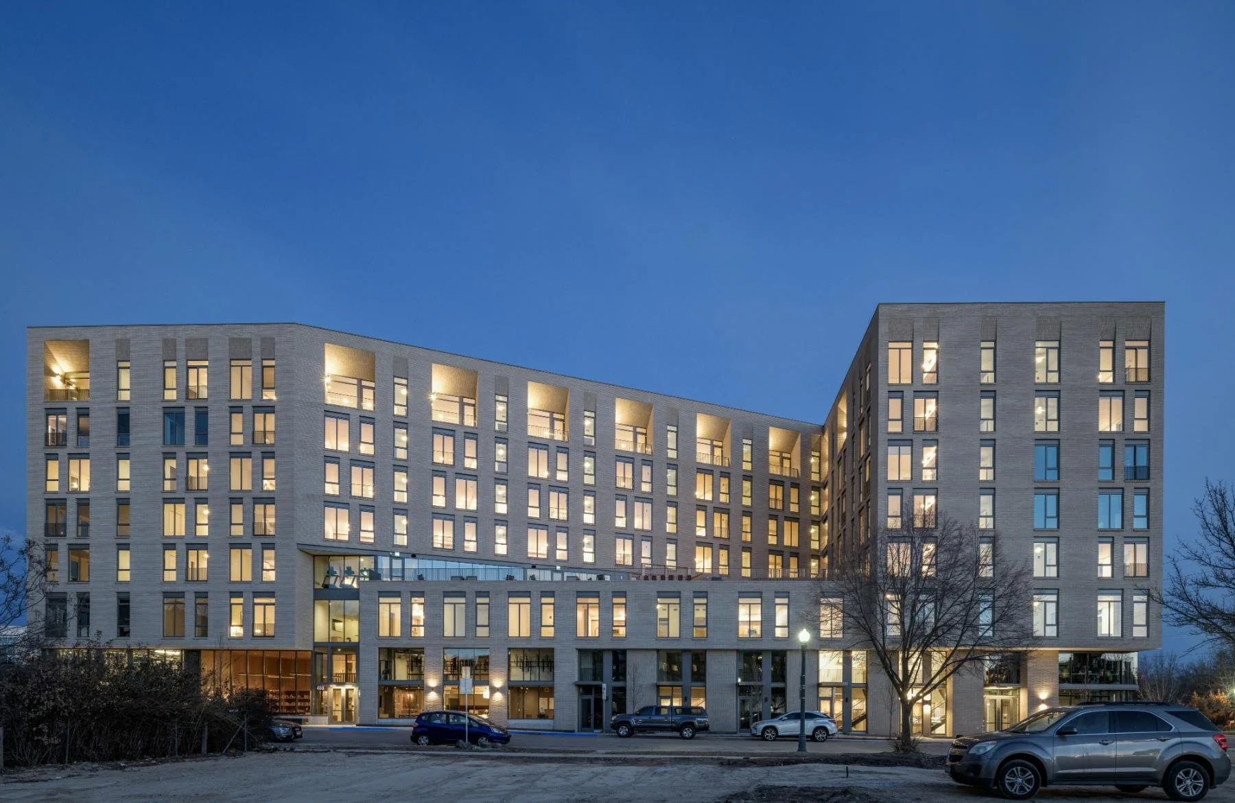
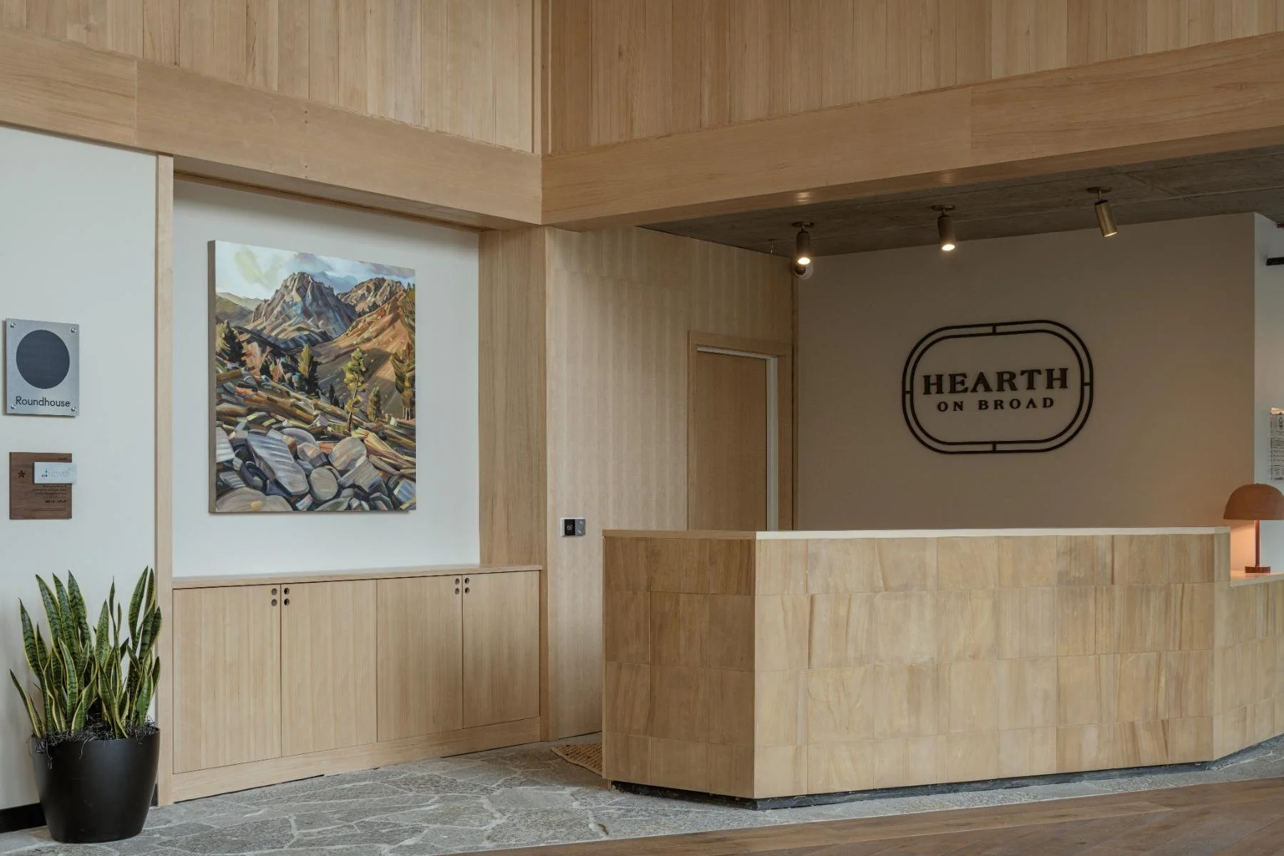
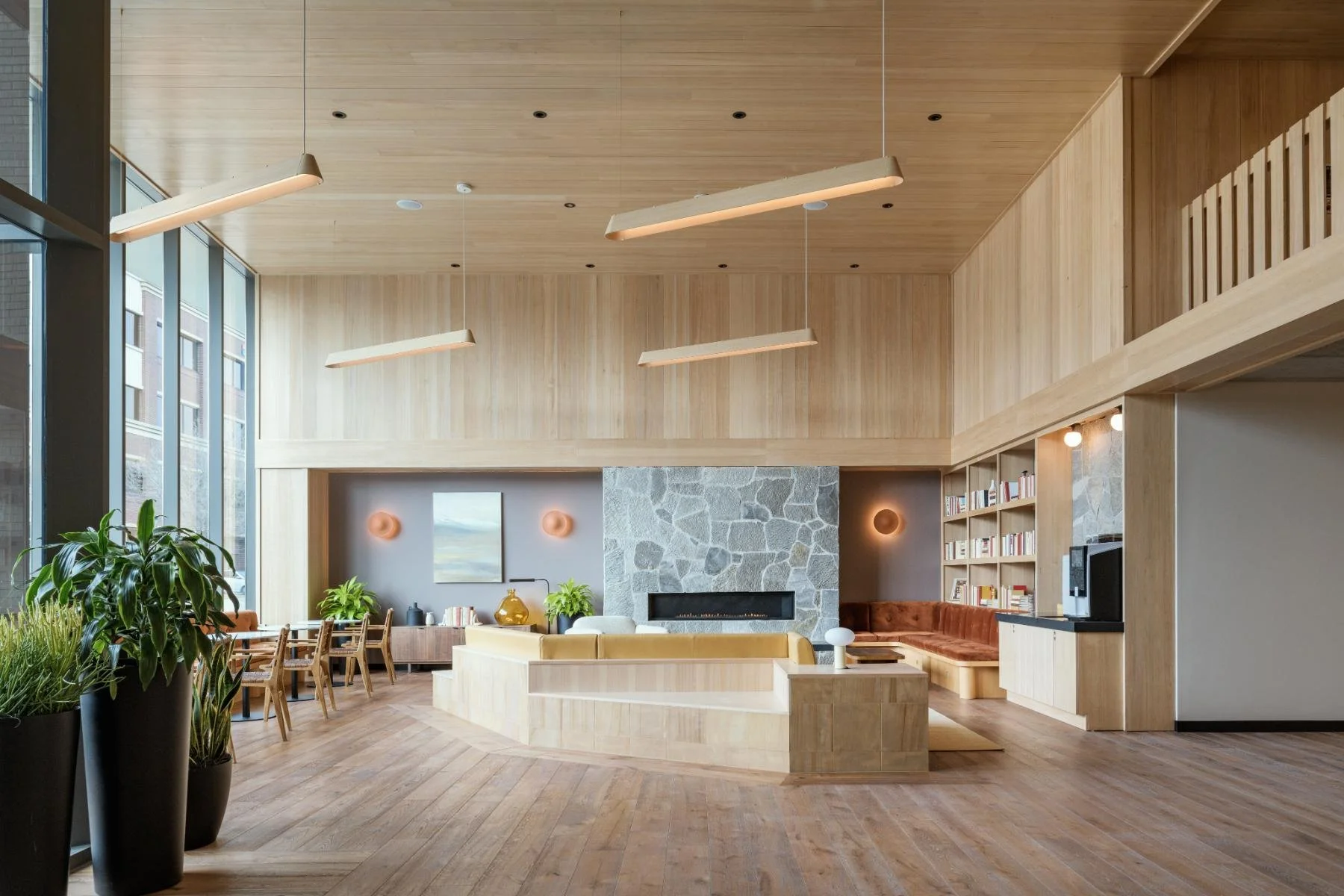
Hearth on Broad is a new community at 406 South 4th Street, in Boise's historic Central Addition. The neighborhood is walkable and full of character, and it's changing quickly. Roundhouse wanted a brand that felt like a real home, with condo-level finishes and a warmth that's hard to find in new apartment buildings. It also needed to appeal to renters looking for downtown living with more personality. Our team wrote the brand story, designed the logo, and put together the brand style guidelines. We also wrote the marketing copy, then brought the brand to life in a brochure, a custom website, and a full signage program, from wayfinding inside the building to marketing signage outside.
Our Role
Brand Development
Brand Identity
Brand Style Guidelines
Marketing Copywriting
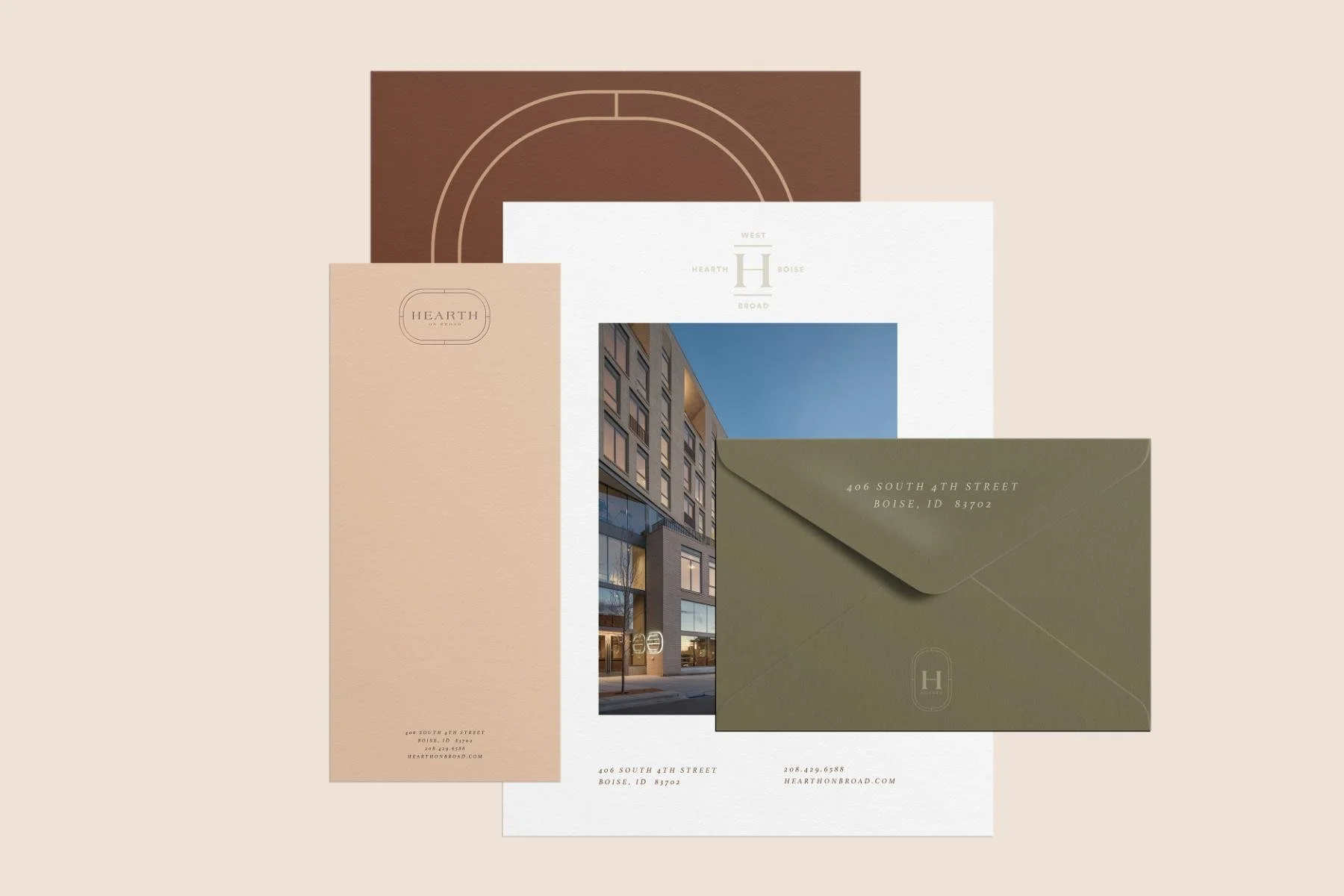
Print Collateral
Wayfinding Signage
Marketing Signage
Custom Website
The Story
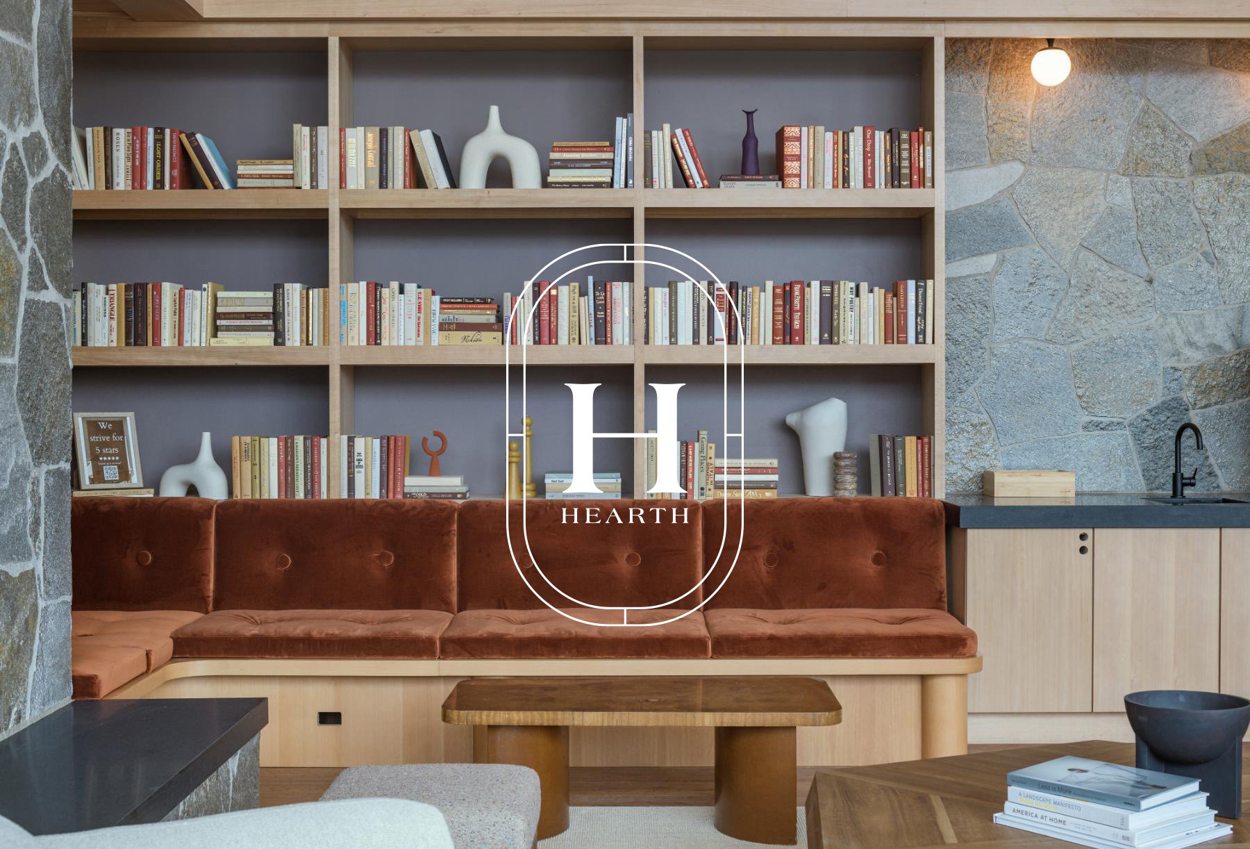
A hearth is where people gather. It suggests firelight, good company, and the comfort of settling in for the night. That idea shaped the brand from the first line: Hearth means home. In the story we wrote, the building is the center of residents' lives in Boise, a place that keeps them close and grounded. It's warm and welcoming, and it's easy to come back to at the end of the day.
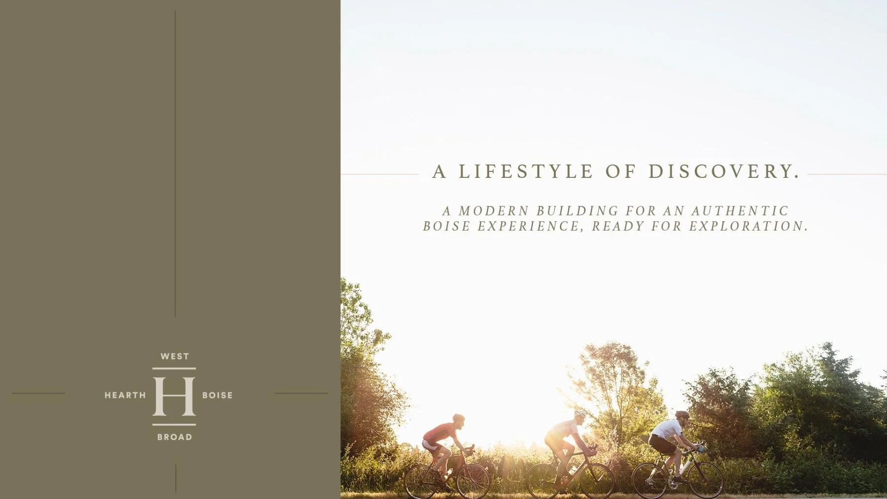
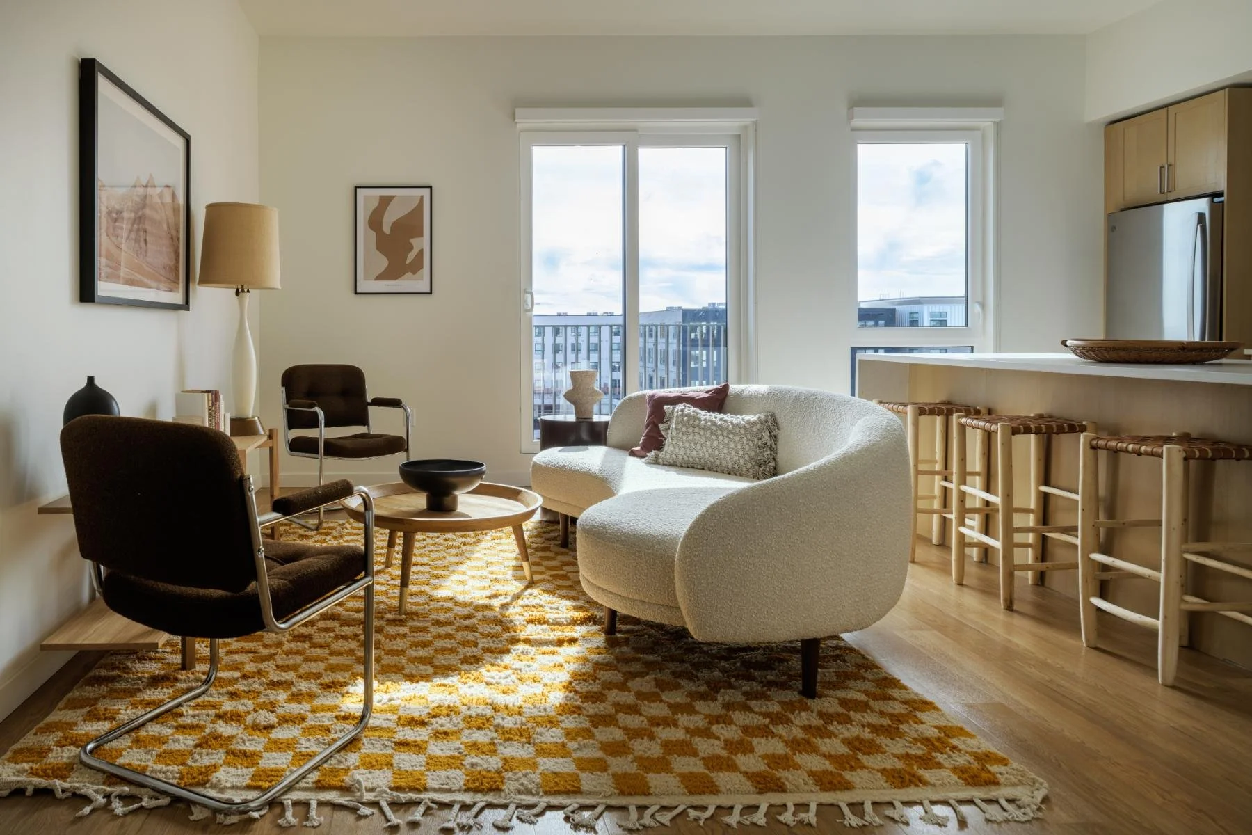
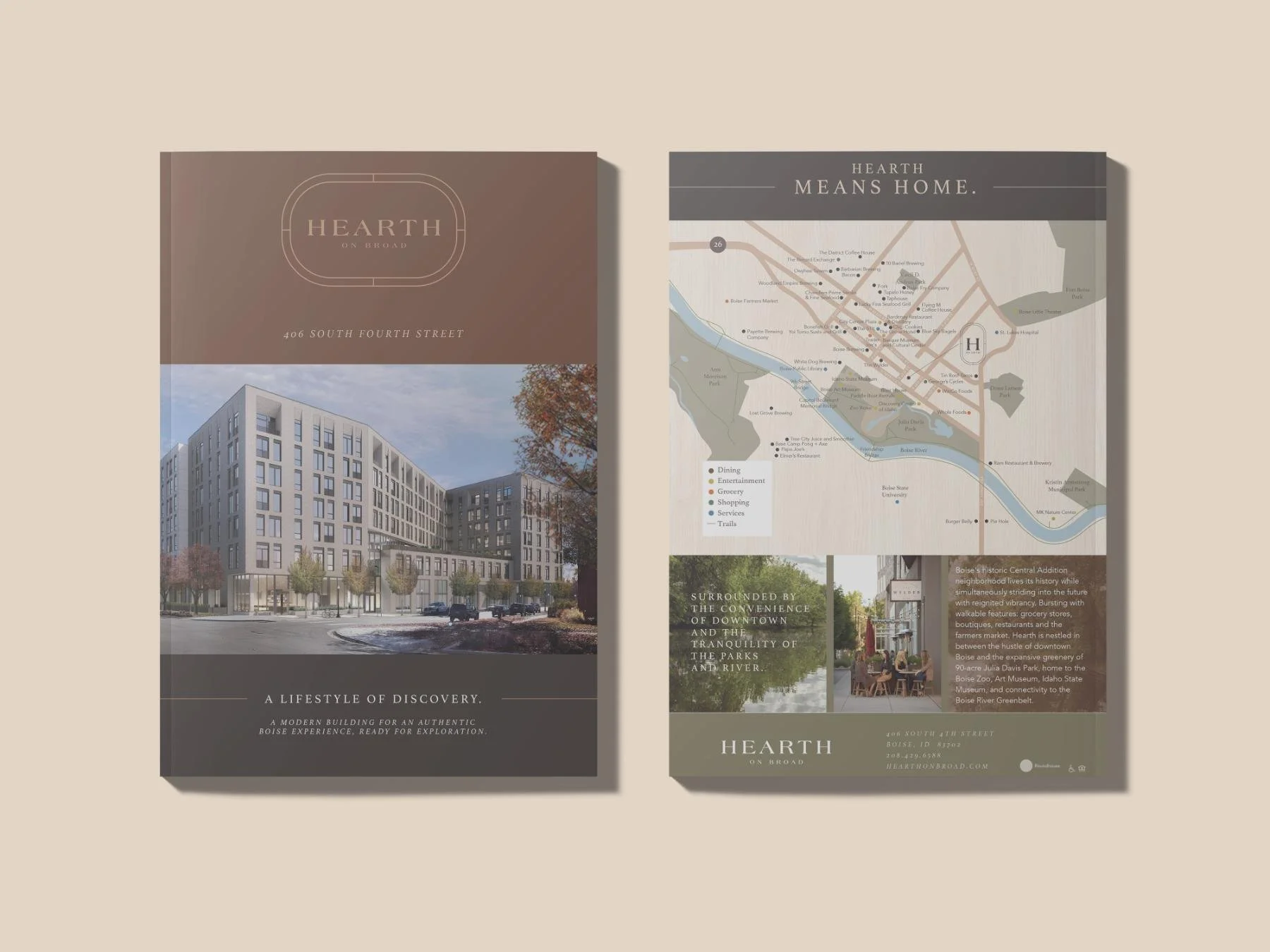
The neighborhood gave the story plenty to work with. Julia Davis Park is two blocks away, with the zoo, the Boise Art Museum, and a direct link to the Boise River Greenbelt and the city's Ribbon of Jewels parks. Grocery stores, boutiques, cafés, and restaurants fill the surrounding blocks. Inside, the amenities carry the same idea of gathering, with a chef's kitchen, a spa area with a hot tub, a sun deck with barbecues, co-working space, and secure bike storage. The copy connects it all with a relaxed, confident voice and lines like Built around you, while the site invites residents into a lifestyle of discovery.
Brand Direction
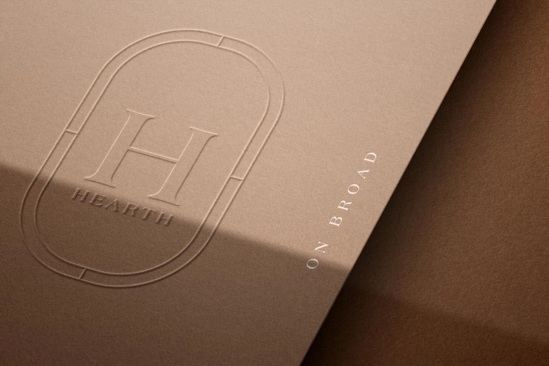
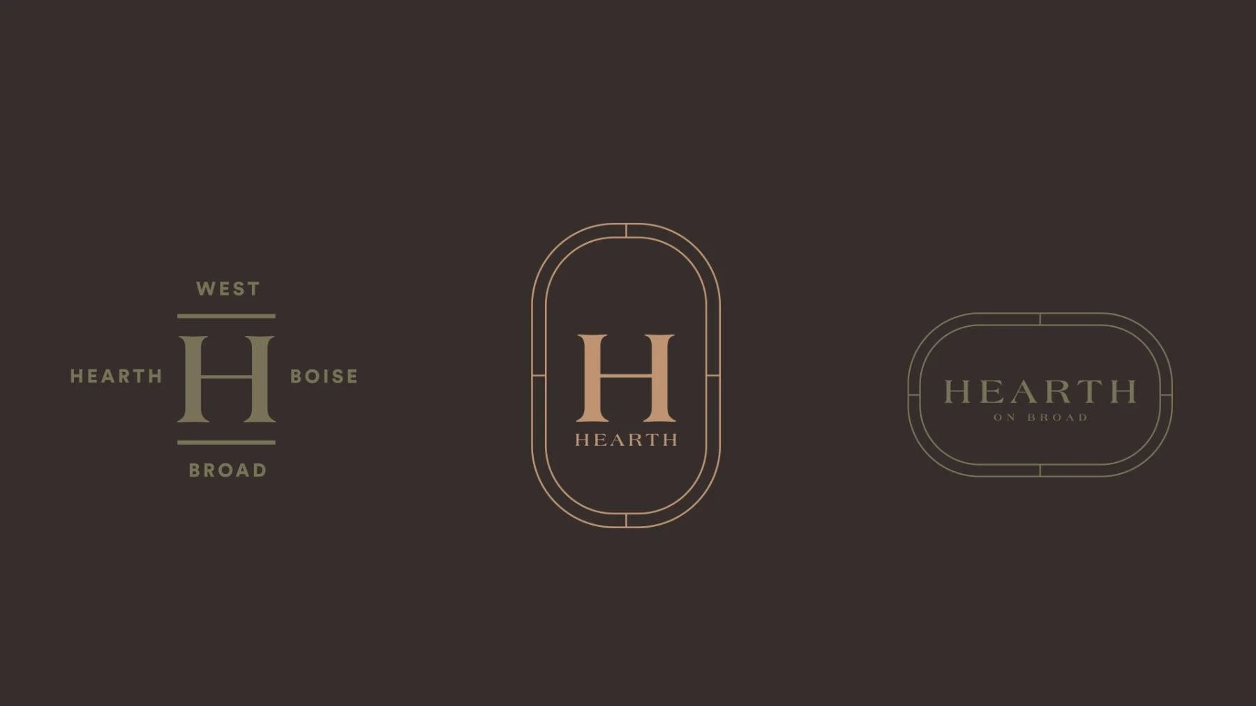
The look is cozy and refined, like a well-worn leather chair next to a stone fireplace. The palette leans into ember and earth tones: rich cinnamon brown, deep espresso, and dark evergreen, warmed by caramel and soft sand, balanced with olive, stone, and gentle warm grays. Athelas gives the headlines a classic, bookish serif, and its italic, set in widely spaced capitals, handles the subheads. Avenir Light keeps the body copy clean and easy to read. The logo system includes wordmarks with and without a border, vertical lockups, and an "H" monogram, plus a version drawn in fine parallel lines. Thin rules frame layouts throughout, and semi-transparent color tints over photography give every piece a soft glow.
Brand Toolkit
We started with a mood board and brand story that set the tone. From there, the style guidelines defined the logo usage, palette, typography, stock photography, and design elements for anyone creating materials for Hearth. The marketing copy carried the brand voice across the brochure and the custom website, which we designed to show off the homes, amenities, and Central Addition neighborhood. The same identity extends to the physical building, with wayfinding signage that guides residents and guests through the property and marketing signage that announced Hearth to downtown Boise during lease-up. Online, in print, and on the walls, Hearth on Broad feels warm, polished, and unmistakably like home.